

Fall Apple Tree, 16 x 12, pastelbord
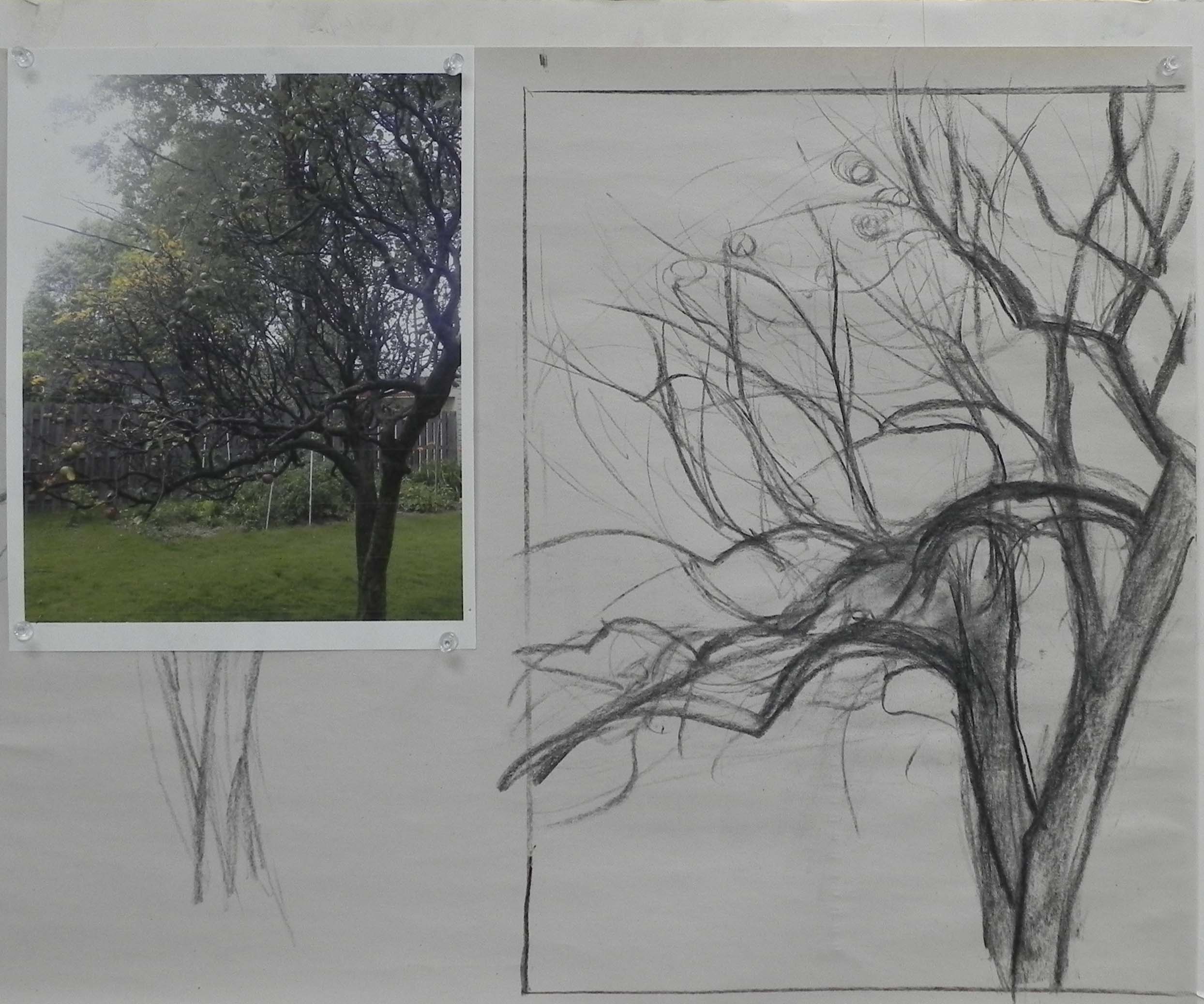
Initial charcoal drawing and photo
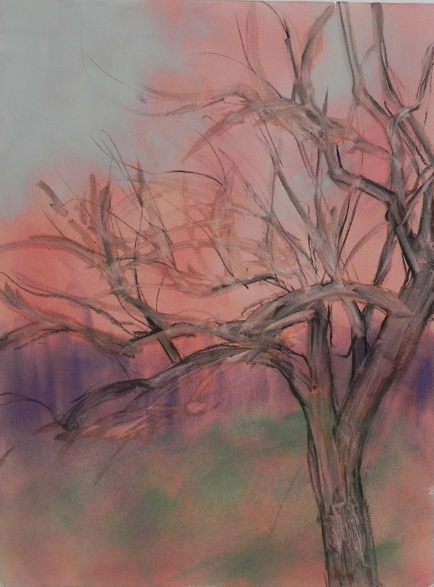
Toned board with pan pastel and charcoal wetted with a brush
Yesterday I spent a good part of the day in my studio doing a commission. The request was for a painting of an old apple tree that had been in the client’s mother’s yard, but now gone. I was sent 4 photos, all rather dull, with surrounding trees, fence and houses. I had NO idea what I was going to do!!! So I started with my favorite of the photos and drew with charcoal on newsprint to try to capture the flow of the branches, which is what the customer loved. I really wanted to find a way to keep the background abstract and suggestive as it did nothing for the tree! I decided to play a bit and started by toning the white board with watercolor-a mix of violet and orange that produced a nice warm rust color. Then I got out my pan pastels, which I basically never use, and roughed in the fence in violet and put some green in the sky. But it wasn’t doing much and I didn’t know where I was going with this. So I next drew in the tree with charcoal and added water to it. Of course, now, I had all these little branches and I realized that the color underneath them was totally unhelpful! But I proceeded to paint the trunk and major branches of the tree, using a dark grayed violet. I couldn’t decide where I was going with the color! I wanted to have some red apples, so tried using a red-green palette, using my cool red and turquoise Blue Earth pastels. I didn’t like it. I switched back and forth from soft to Giraults, then back to soft. I really thought this painting was going to end up in the sink. At one point, I took all the violet Giraults out of my corn meal box and put them away, only to get them out again and realize that this was the perfect color!!! What a surprise! When I put the soft violet into the background trees and mixed yellow into the sky with my fingers, I suddenly had some beautiful atmospheric effects. I used the violets of the “fence” to provide a colorful background. When I added the yellow leaves and red/orange apples, the colors really came alive. The client was very happy with the painting and so was I.