
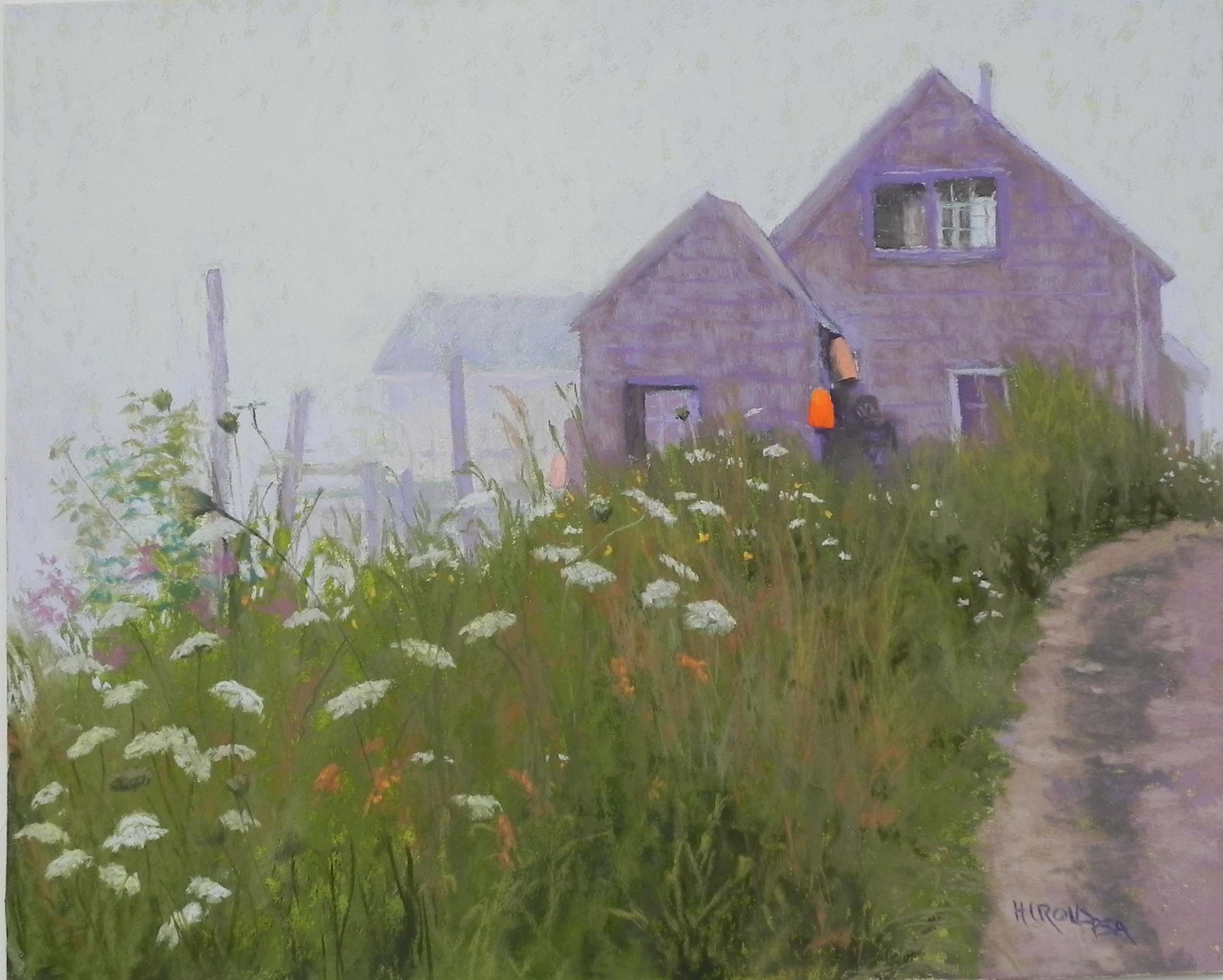
Foggy Day, Port Clyde, 16″ x 20″, Pastel premiere white
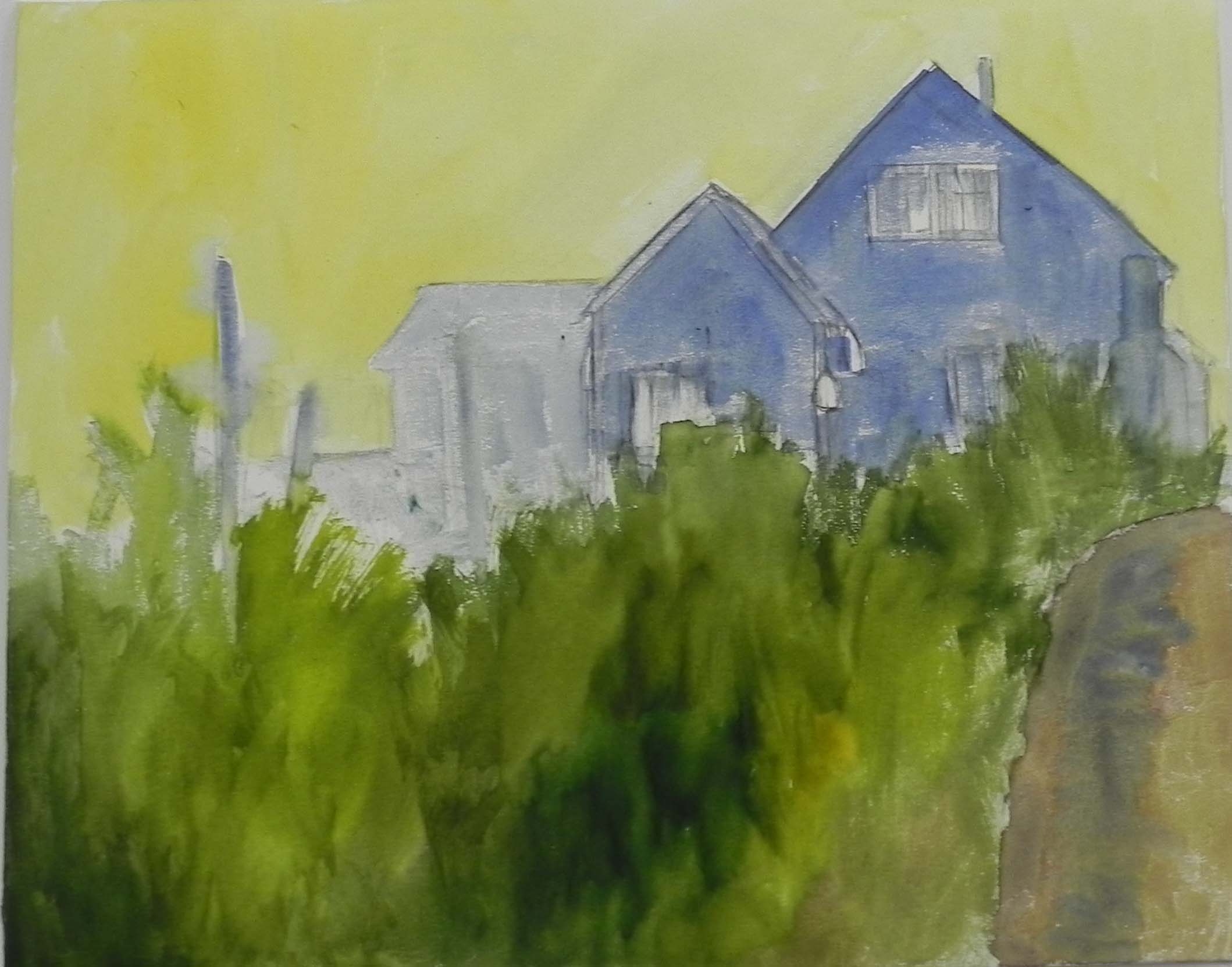
Watercolor underpainting
While working on the Monhegan picture, I decided to look through my Port Clyde photos. This one jumped out at me. I know that I tried to paint it in the past but wasn’t successful with it. Can’t remember why. But I decided I really needed to try it again. I used a mounted sheet of white Pastel Premiere that I purchased at IAPS. Since I learned that this surface doesn’t like alcohol, I used a watercolor underpainting. And I found it quite useful for the grassy area. I wasn’t too inspired by the other colors! But I have to say that the surface felt really good when I started applying the pastel.
Compositionally, I made one change. The building barely seen in the fog to the left of the others was highher up and not as wide. I decided that this would look a lot better and help fill up the vacuum. Otherwise, this is pretty close to the photo, whose composition I really liked. The other thing I really loved was that there were three orange buoys, a bright one with a duller to the right and a very light one to the left.
I used a very whitish Ludwig blue and a whitish Unison green in the sky, along with a very light violet. I ended up using primarily very soft pastels in this painting–Great American red violets and browns, and other soft greens. It was a nice change from my normal diet of Giraults!
Because this is a fog picture, everything has to be muted, except for the one bright buoy. When I first began the buildings they were a little too dark. I use grayed red violets, with grayed browns on over and used the pastels to try and indicate the shingles. In the photo, the buildings are a very cool gray, but I’ve traditionally used more of a violet for weather-beaten shingles. Getting the values right in the upper window was critical and I was pleased with the way it came out. The roadway was done with Schminckes–grayed browns and violets.
For the grasses, I began using a selection of warm greens, some very warm, I also added a reddish brown into them, seeing this color in the photo. What’s really nice about the photo is that there are purplish flowers in the grasses on the left side, which nicely pick up the colors of the buildings! So convenient!
I’m glad that I was finally able to do this painting as I really like the composition and the colors.
One problem, however. The paper buckled. This is a problem!!! If the paper can’t take alcohol, then it really has to be mounted on something that won’t buckle with water. I plan to discuss this with Dakota Pastels some time soon, since this paper was developed for them. At the convention, the fellow who produces it said that he was working on making it alcohol-tolerant. Has anyone else experienced this with their mounted boards? This is the 4-ply.