
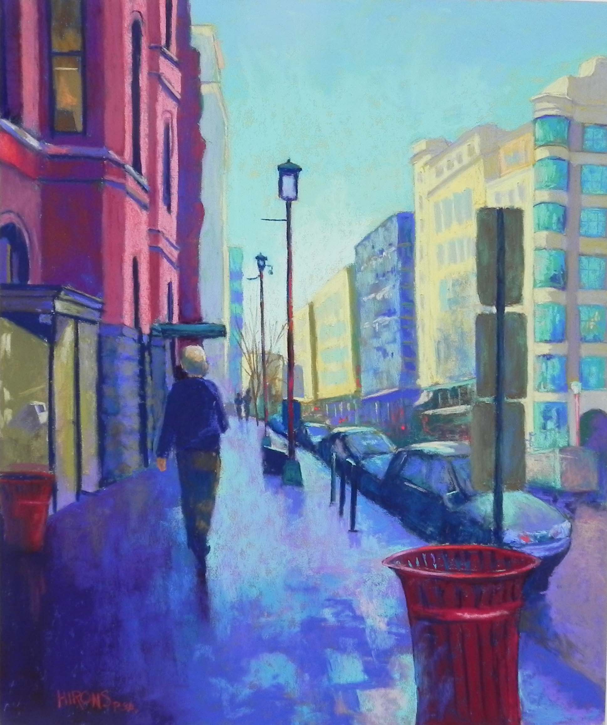
In Chinatown, 24″ x 20″, UART 320 mounted on gatorfoam
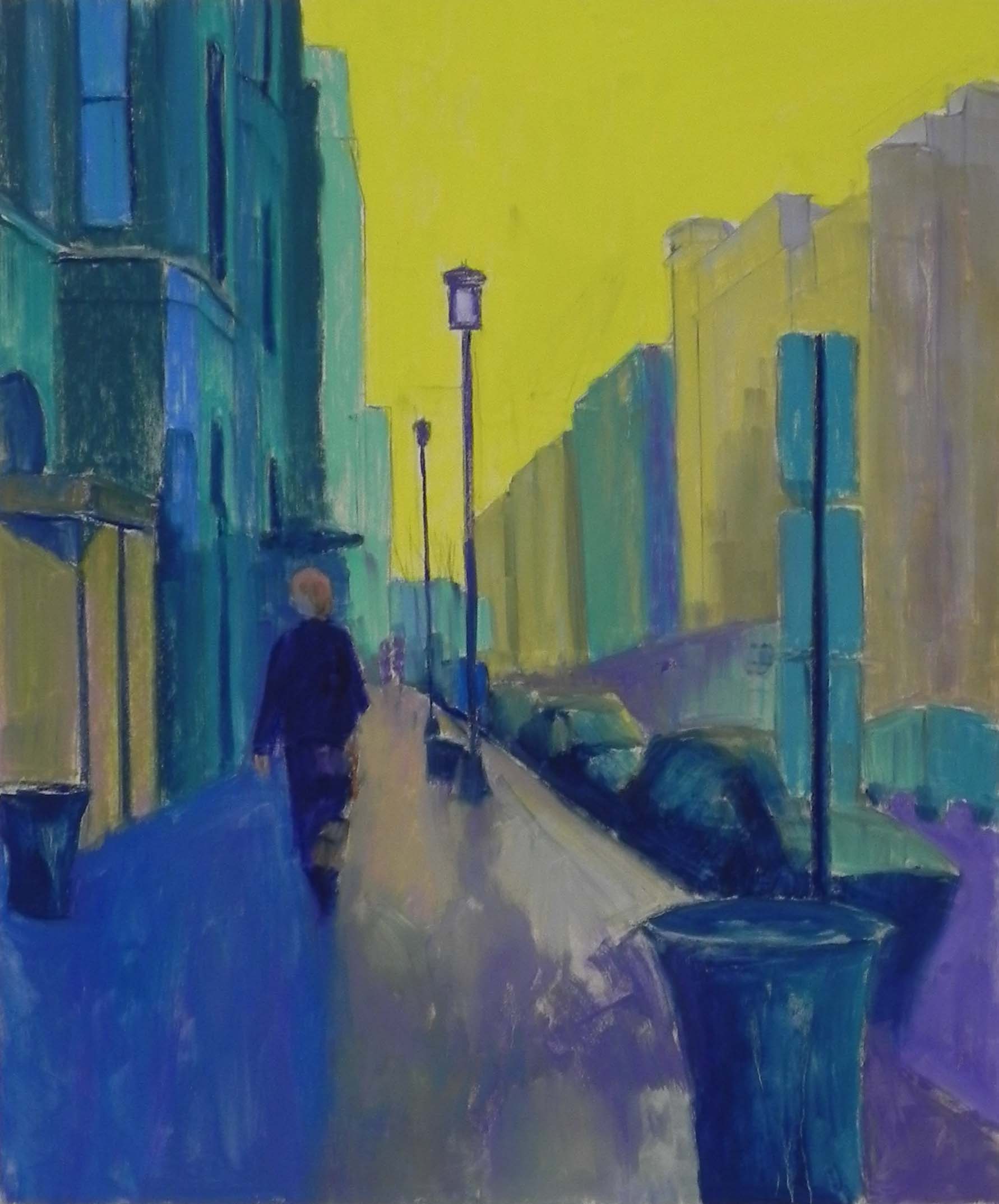
Underpainting, hard pastel and alcohol
Today I finished a 24 x 20 painting that I began drawing last Sunday. The reference photo was taken several weeks ago when it was unusually warm. John and I went to the National Portrait Gallery to see the Obama portraits, then walked around Georgetown and Penn Quarter with me taking photos with my cell phone. The colors are really vivid in them–a wonderful change from the dull landscape. This one struck me right away because of the reflection of the sky in the sidewalk. It wasn’t a wet day, but the bricks must be treated to reflect and shine. The bright red trash cans really appealed to me, along with the lantern lights and colors of the buildings. I had to get rid of a lot of people, however! I kept the one man walking and added two small people in the distance. Much better! Some of the people I removed were to the left of the walking man. I replaced them with another red trash can (note the lovely, elegant design of these trash cans!!!)
I gave a lot of thought to the color as the palette is basically the primaries–red, blue and yellow. Not one I normally use. My main concern was balance. I really liked the fact that the red can was in the right foreground, to balance the buildings on left. And, in the background buildings, there are little bits of red from street lights, signs, etc. And the yellows of the buildings on right are mirrored by the darker yellowish brown glass enclosure on the left.
For the underpainting, I use a yellow for the sky, greens and blues under the reds, and brownish colors under the yellow buildings. I just kind of winged it! No real pattern. I combined a yellow and light violet for the sunlit sidewalk and was quite happy with the way it appeared with the alcohol.
I dealt with the cars by keeping them simple, focusing on shapes of dark and light. They all seemed to be gray with reflected light from the sky, which made it a lot easier. I also added a truck on the right and tried to keep the buildings as suggestive as possible, not worrying about the windows or the details below.
My main concern was getting the glow on the sidewalk. I began by using a red violet underneath, then brushed on various blue greens. What I really liked was the fact that the man was the dividing point between the shadowed and sunlit sidewalk. This worked quite well, but I added a small hint of the light aqua on the left so that it wouldn’t seem unreal.
I used my new Roche pastels for the buildings on the right, mixing a light blue with yellow oranges to make the shadows.
Last Monday, my students wondered whether I’d be keeping in the pole with three signs on the right. I definitely wanted them! They provide a contrast to the sunlit buildings behind. And I also decided to add the bicycle rack that wasn’t in the underpainting. Signs, trash cans, light posts–all part of the city and important. But I was glad that I could minimize the people! The one guy walking away from me was quite easy to do. Much harder when someone is facing you.
One concern today was the awning above the man and whether that looks like a hat or something odd. I toned it down a bit and decided to leave it.
This was a really fun painting to do, even if it required a lot more thought and effort than my typical landscapes. I have more pictures to work from, but probably not this month. I’ll be moving downstairs, to a larger, sunlit studio at the end of the month. All of my classes will be held there and i’ll no longer have to deal with stairs, nor will my students. A positive move for the future. But a lot of work to do to get there!