
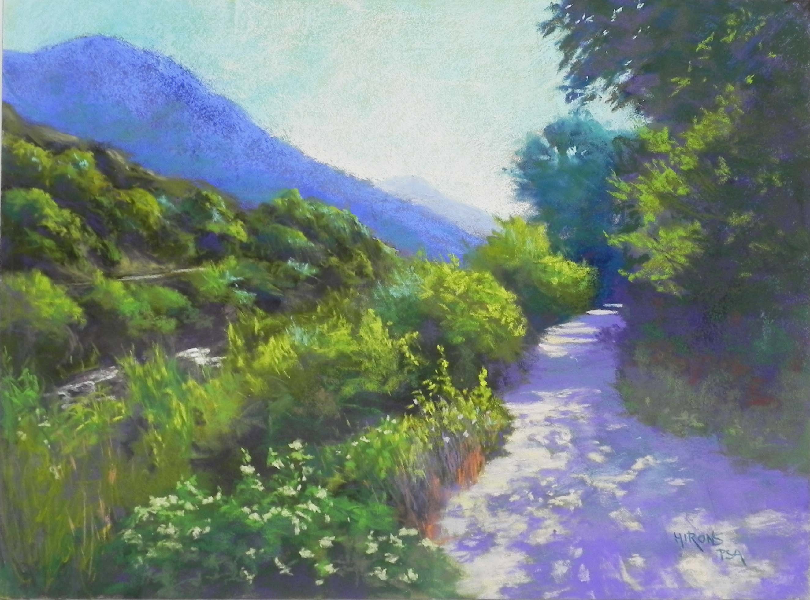
In Logan Canyon, 18″ x 24″, Pastelbord
Today was a rainy day and I was happy to be in the studio with two good friends. I finished my first painting from our recent trip to the West. I have a number of 18 x 24 white Pastelbords and a number of 18 x 24 frames that I bought years ago. So I’ve decided to do a series of paintings using the boards and the frames. I decided to begin with the first day of our trip when we surprisingly found that we were driving up a gorgeous canyon with many stops and a lovely path along the river. What a great way to begin our trip!
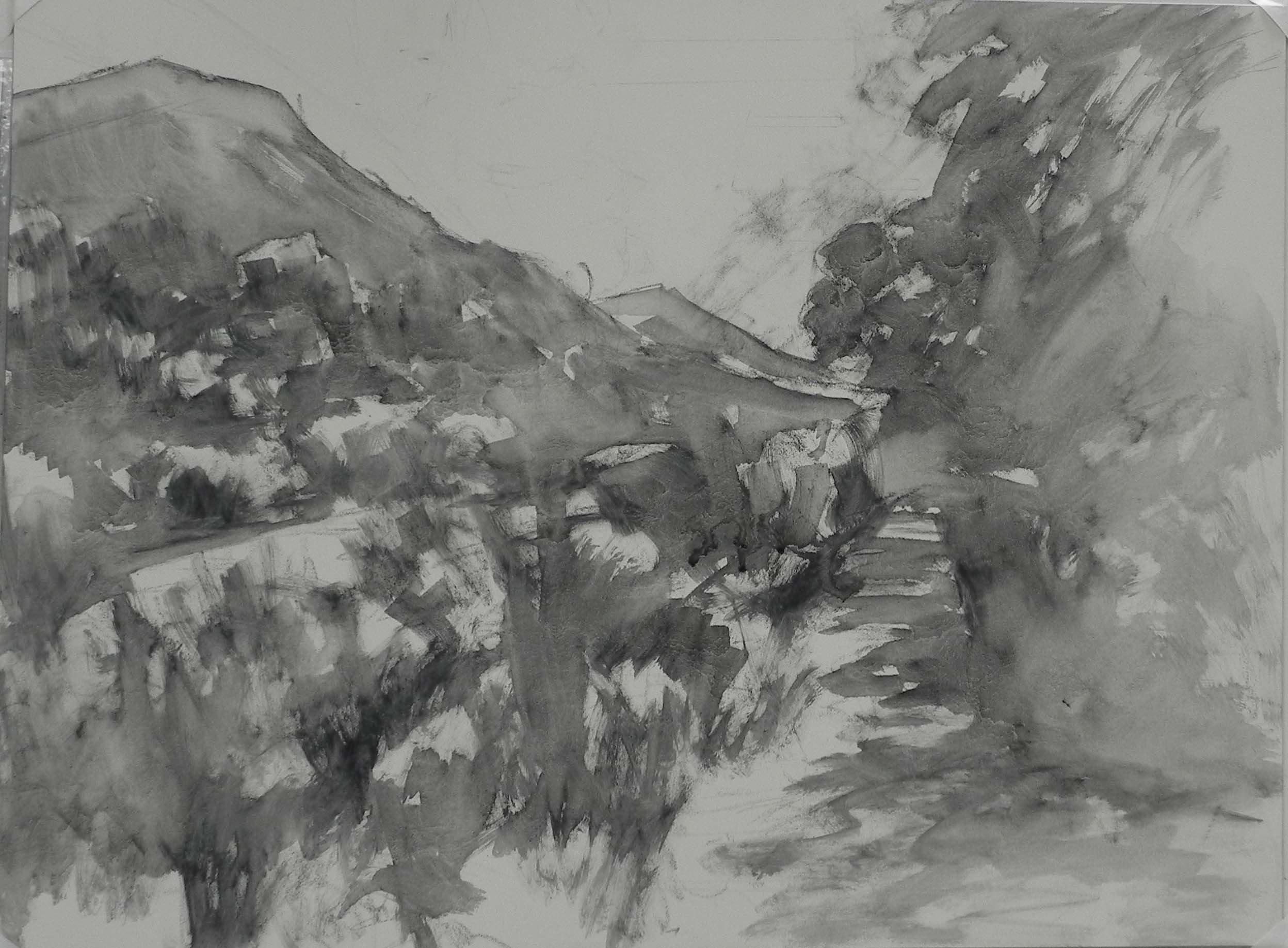
Water-soluble grapite drawing on the Pastelbord
I decided to try out my new water-soluble graphite sticks that I got at IAPS last month to draw in the composition. This was not such a good idea! It came out very dark (unlike when I’ve just added water over regular pencils). And then it mixed with the watercolor underpainting! So I probably won’t do this again.
For the underpainting, I used watercolor as I like the way it leaves lots of the tooth in the board. I did it fairly loosely and it became quite dark, with the addition of the graphite! But it worked.
I began with the sky, using Terry Ludwig blue greens, then a light orange over the top. These have become my favorite sky colors for sure. I like the way they go on loosely and the ability to layer.
Compositionally, I added the faint distant mountain, which was not in the picture. The printed out 8 x 10 was more narrow and the 18 x 24 format needed something more of interest.
When I took the picture, it was the distant tree, the tree above it, and the light and shadow on the path that really made me love it. So I decided that the path had to be the main thing. The idea of walking up the path should be inviting. At one point, I had more water to the left, and in a very bright yellow. I decided it was a competing force with the path and changed it. Used the dark colors from above and added some light to indicate moving water, but left it as a minor element in the painting.
When we were there, I remembered the beautiful light on the bushes, so I wanted to highlight that, along with the small flowers, and other details in the foreground. On the right, there was a tree in light with a darker tree in front of it. I worked on that and then added slightly lighter color as the bottom to indicate small grasses and plants. I also added some orange on in the flowers to left of path and some dark orange brown on the right. Adding warm to cool, or vice versa, always gives more depth and interest to an area of color.
For the path, I began with a violet and a pinky-orange for the light. Then I added some of my very light blue violet Blue Earth pastels into it to give it more variety. I have to say that the Blue Earths are wonderful on Pastelbord. Because this is a very hard surface, and they are soft, they go on lightly (particularly if you can use a light touch!). So much of the finished painting is from the green and blue violet Blue Earths.
It was lovely to be in my studio reliving my trip and sharing the experience with good friends!
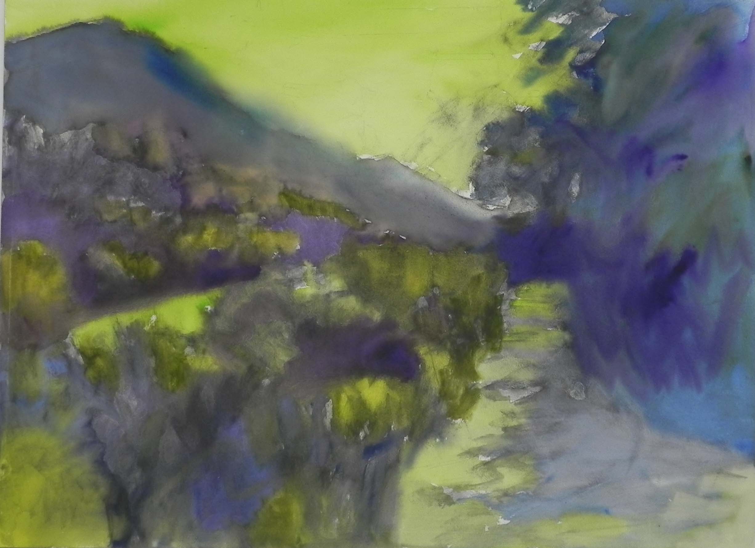
Watercolor underpainting