
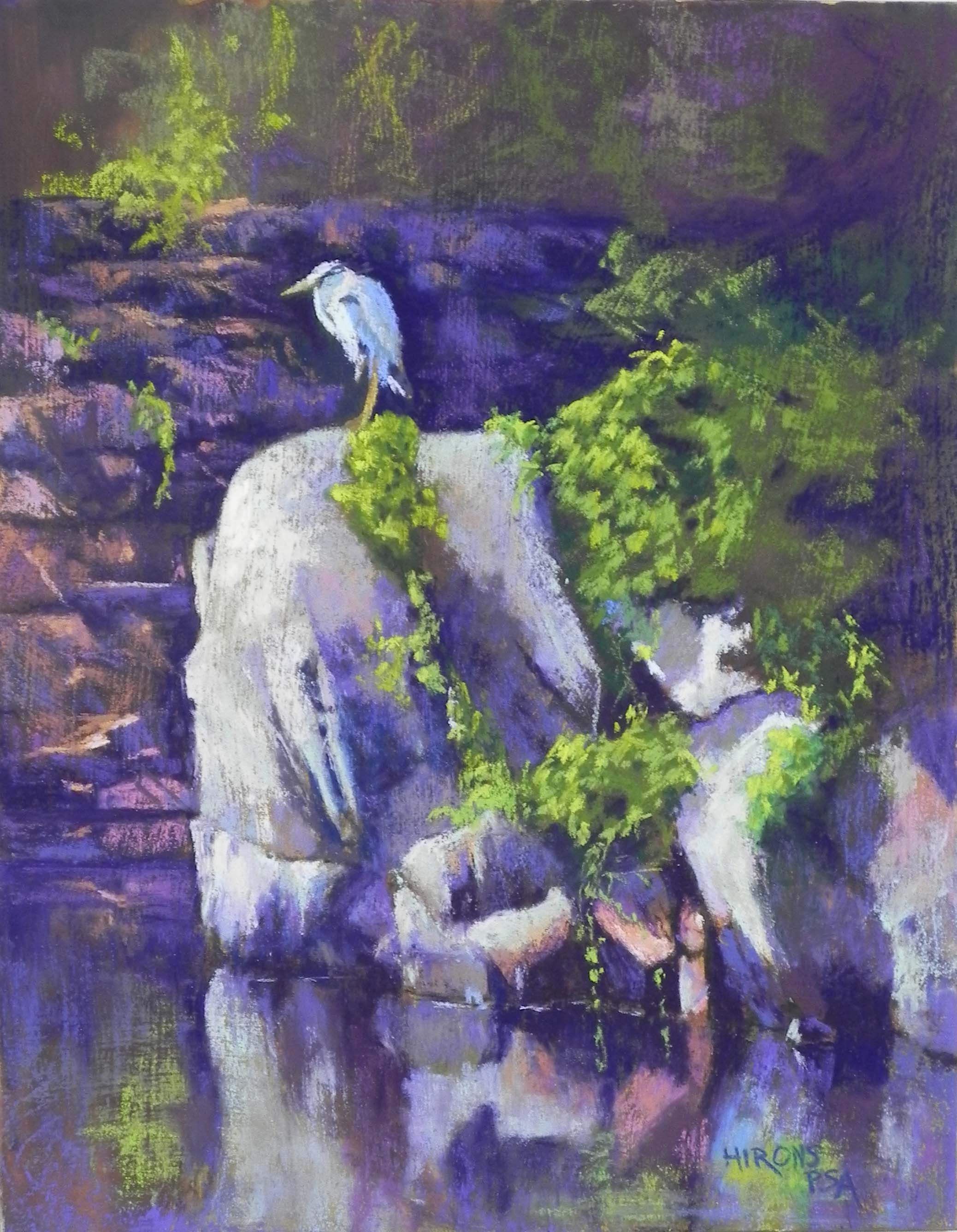
Keeping Watch, 14″ x 11″, resurfaced Pastelbord

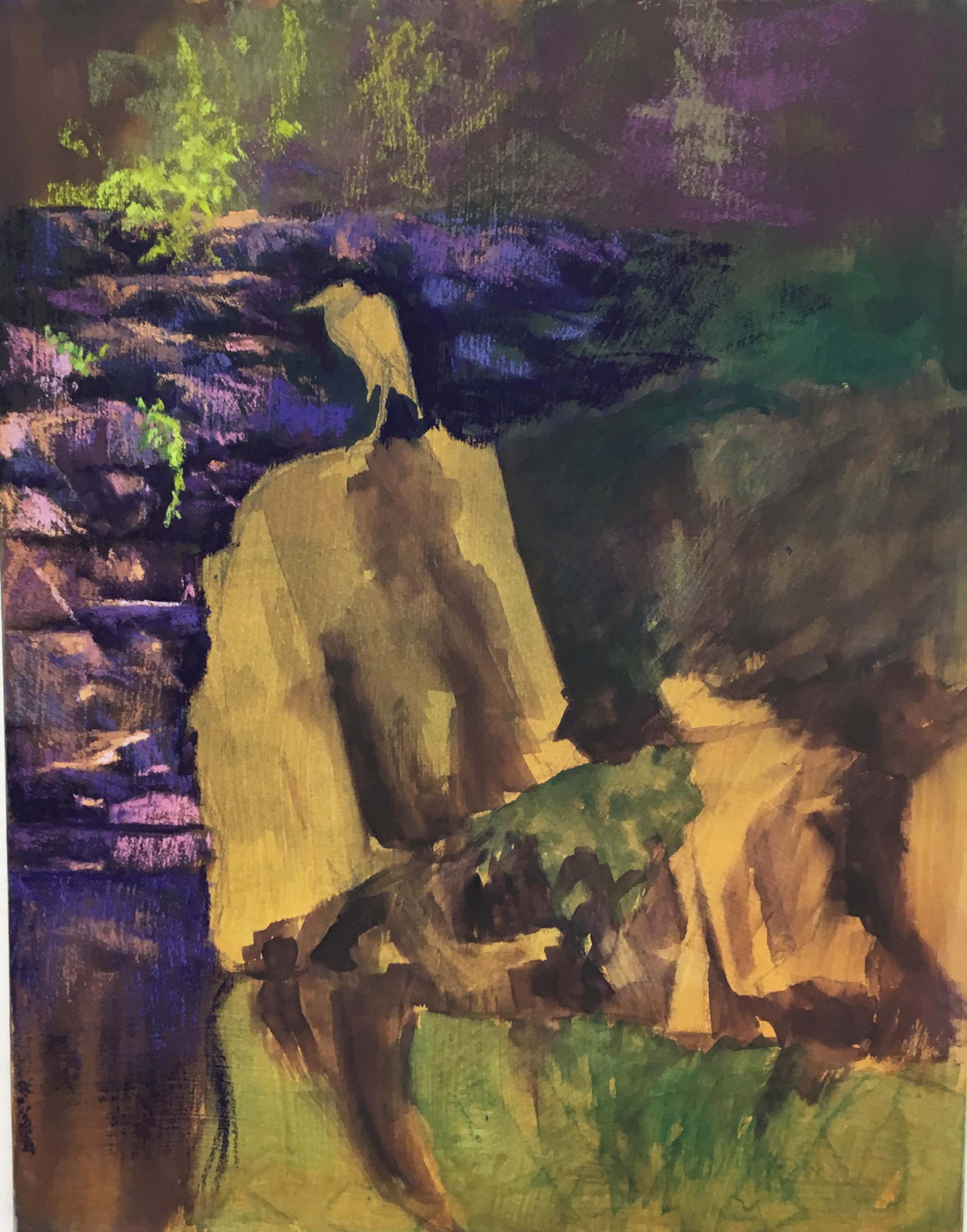
Initial stage
After first applications of pastel
These past weeks I’ve been “playing” — using resurfaced Pastelbords and old photos. I came across a photo I had taken of a heron sitting on rocks at Wide Water, near Great Falls on the C&O Canal. The photo was in black and white and it was a horizontal photo that showed a lot of foliage on the right side. I had spent time drawing it some years ago but thought it was going to be too complex. Upon finding the photo, I realized that I could do it as a vertical and leave out a whole lot of boring greenery. What I loved was the way the light was coming in and strafing the background rocks and that the bird and foreground rocks were light against dark. I also loved the fact that the photo was B&W and I never went to look for the original. I know that there would have been a whole lot more green!
I had a board with gold-toned liquid primer on it from a batch I made up this winter. I drew the bird and rocks onto the board, then added watercolor around it to further tone the board, leaving a lot of the gold showing in the light places. I wanted to keep the detail in the center and let the top and bottom go off into less description. So I was careful laying in the color, beginning in the upper left with the rocks and the green bush. I used Ludwig pastels to lay in the color in the background rocks, using a combination of dark “eggplant”, a lighter red violet, and several oranges. I added small details of light and tried very hard not to overdo it.
For the rocks that the bird is on, I used a combination of pastels, but began with muted Giraults. The greens were all done with my Blue earth green set and the bird was also done with soft Blue Earth blues. I couldn’t use anything harder as it wouldn’t make enough of an impact on the hard, textured board. I used the dark to go around the bird’s head and refine the beak, etc.
This was painting that I absolutely LOVED doing! It felt really good to lightly layer in the pastel and I tried really had not to overdo it. I was also concerned about the light on the right overpowering the area where the bird is standing. I added orange on the left side of the rounded rock and added aqua to the rocks at right to try to keep them in check. I also brought greenery from the right on over the rock on which he was standing, a change from the photo that makes a bit different. There was a large gap there that didn’t look realistic. You can see it in the initial stage.
I’m really happy with the way this painting came out and hope to do more like this!