
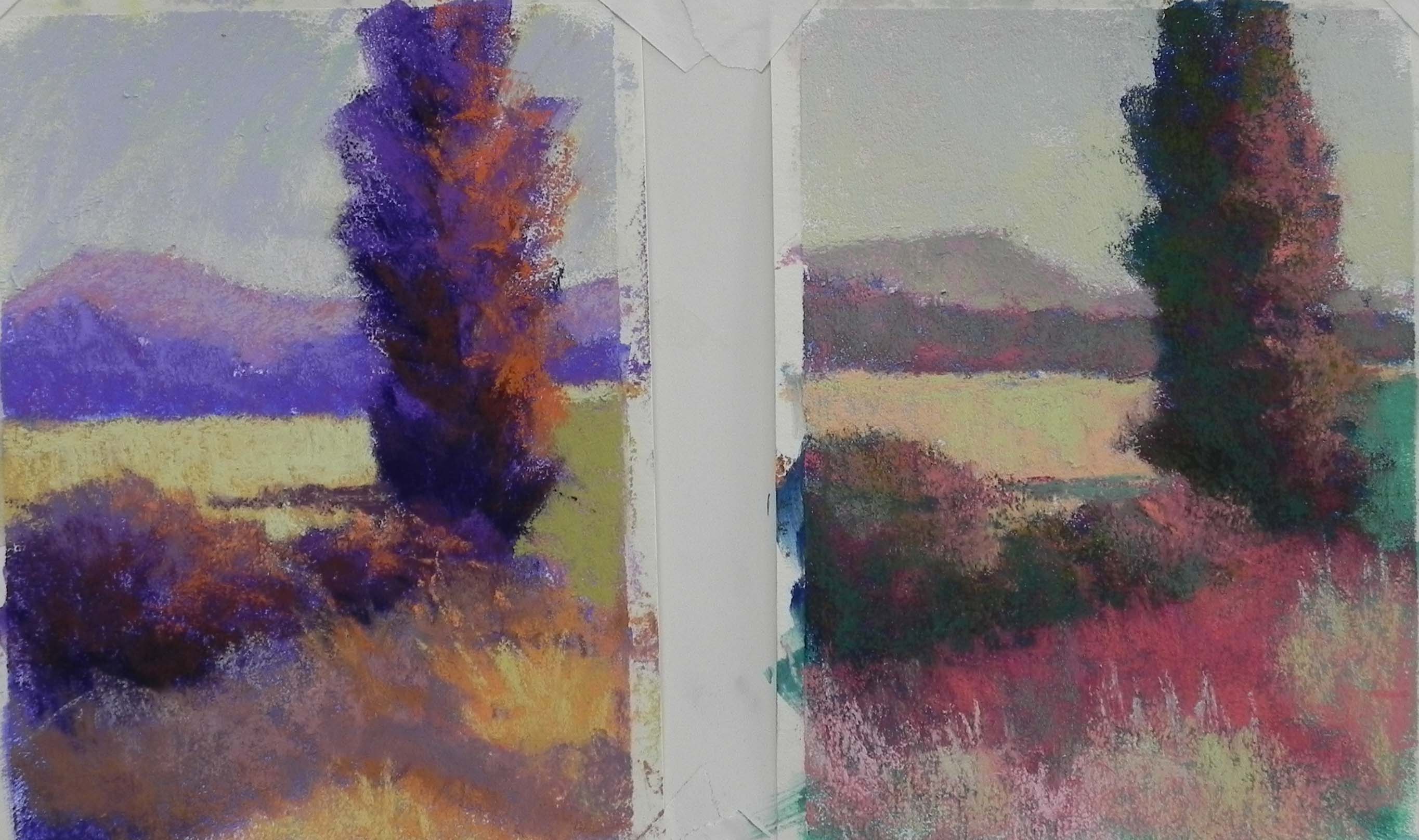
Set 1. 7 x 5 on Richeson white
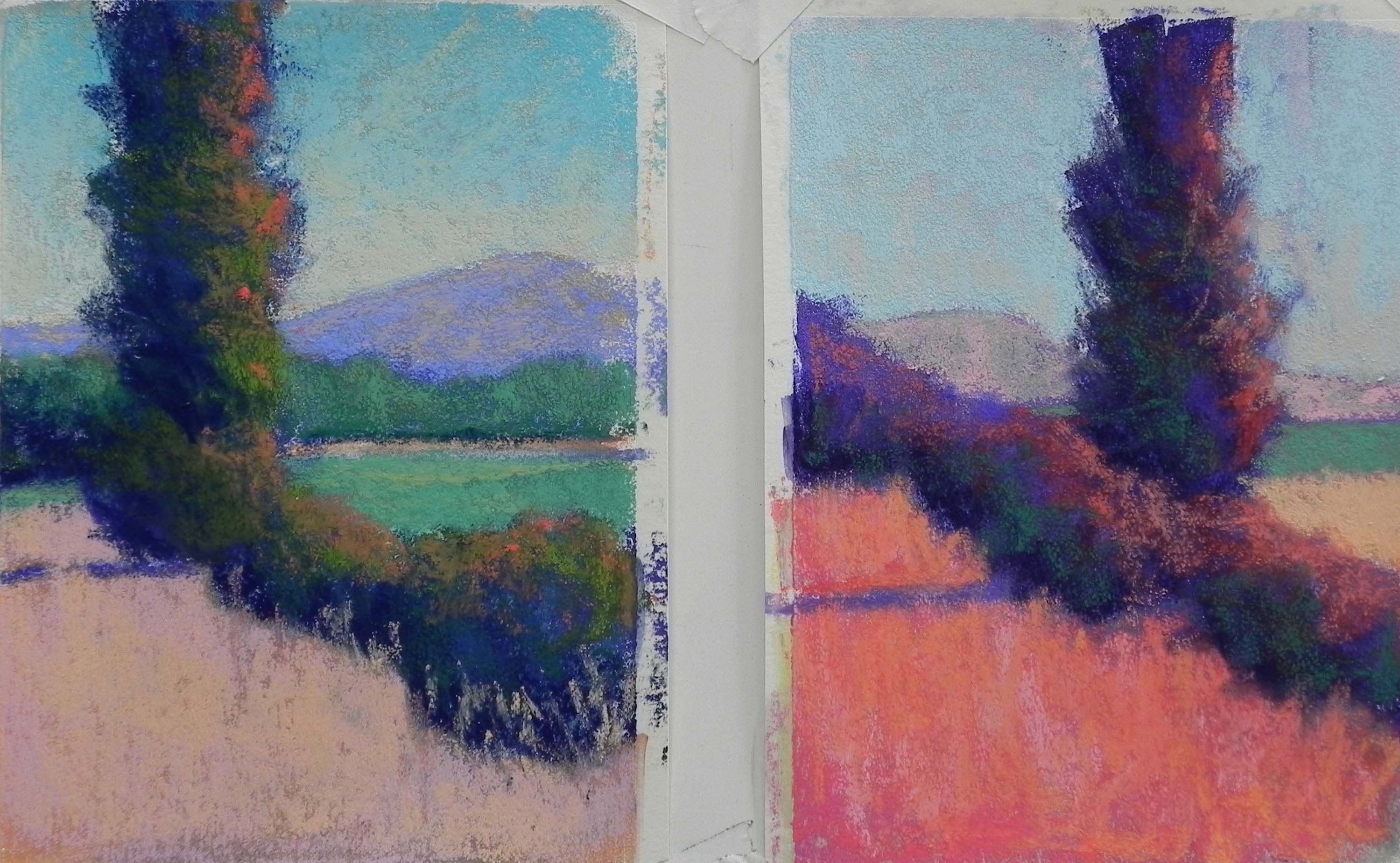
Set 2. 7 x 5 on Richeson white
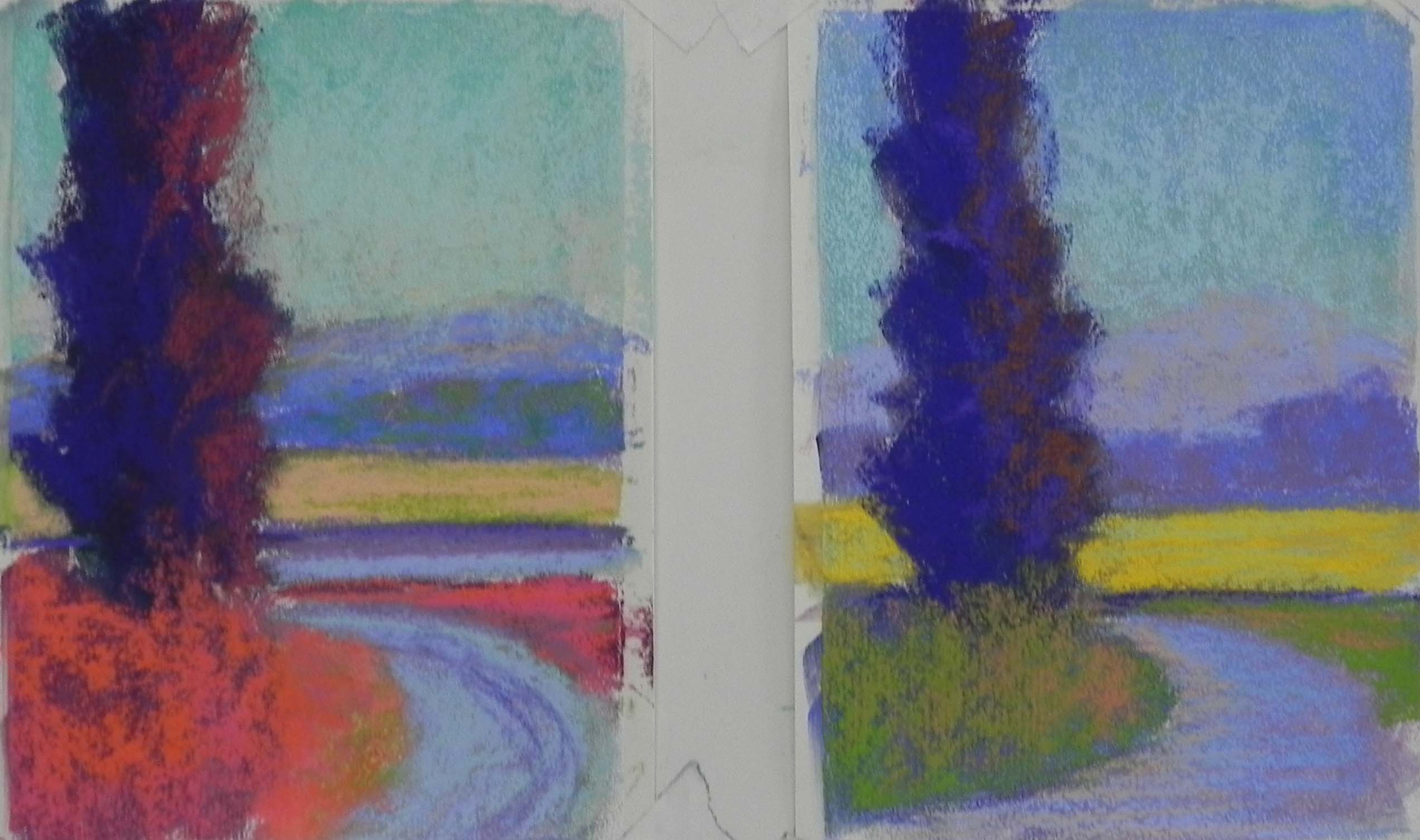
Set 3 7 x 5, Richeson white
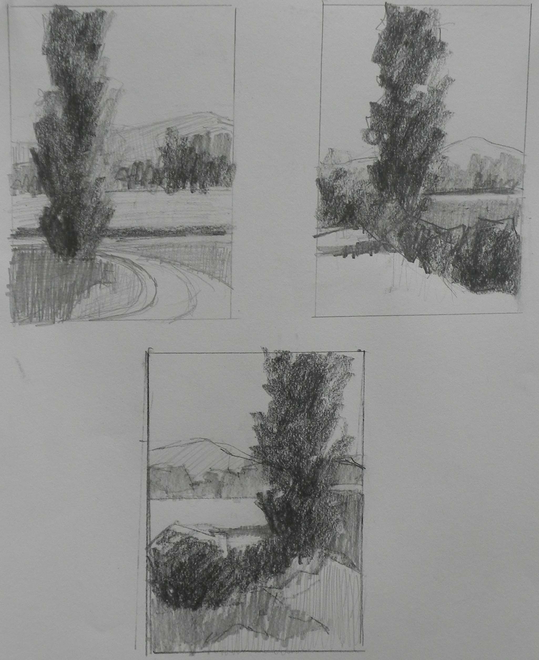
Initial sketches
The weather is abysmal here in the DC area and I’m planning to spend as much time as possible painting, experimenting, and playing in my studio! Today I decided to print out three black and white photos of poplar trees that I took in France. I began by doing a number of drawings. The last three are on the same page and I’m including them. The major issue is the placement of the tree. In all of them, I’ve added a mountain in the background to give a little added interest. I’ve decided that the one with the road is my least favorite, and you’ll see the results in the color studies.
For the color studies, I used 6 5″x 7″ sheets of white Richeson paper that I acquired some time ago. They were perfect! I was afraid they’d buckle with an underpainting, but they were fine with alcohol. I used a variety of hard pastels and Holbein sticks to do the underpaintings, primarily looking for different darks. Got tired after awhile and just used the same colors to establish the shapes (blues and violets), then played with different colors on top.
My favorite set is the first. I began with a dark red violet and used browns and oranges in the first study. This is a fairly typical palette. I liked the darks and the composition but wanted to get beyond violet. The second of these is my favorite. I used my Blue Earth pastels: cool greens (turquoise), cool reds (quindo), and green. Also used some oranges. The texture of the Richeson paper was great for layering (unfortunately, I won’t be using it for the large paintings). I loved the way the warm and cool greens combined on the tree and the color of the red in the foreground. Mixed complements for the mountain and used light values of the greens for the sky. This was fun!
Moved to the next composition and played with more real colors in the first one. I used a very dark blue for the basis of the trees, then other blues and greens on top, as well as oranges. The field was very light in the photo, so kept it light in this one. For the second, I made the field darker and completely unreal. Also changed the composition (like the first one better). I really wanted to used reds and oranges and play with shapes of different values, so I liked all four of these studies.
When I got to the last photo, I was tired. I ran out of inspiration and by the sixth study, I’d had it! My plan, at the moment, is to do 18 x 24 paintings of the first two compositions, using mounted Wallace (the last of my stock). I’m hoping that the lack of texture won’t be a problem. I’m not sure where I’ll go with the color, probably use the second study of the first set, and the first study of the second, but who knows! It will be a different day!