
I’m doing a 16 x 20 demonstration this coming Saturday in McLean and spent this morning working out the composition and colors. When I do a formal demo like this, I like to paint the picture first, using a small version. This is really a small painting, not just a color study. One of the challenges of the picture is that it’s beautiful, so not a lot to add to make it a better painting. Me being me, I added a building! I like the opportunity to add something of interest in the background and a little warm color in the roof. I also added a mountain that wasn’t there. Otherwise, followed the photo pretty closely. I really liked the way the charcoal wash came out and thought about leaving the light triangle on left as a field. But stayed with my idea of the building. For the underpainting, I decided to try to use colors that would tie the sky and land together. Because one is blue-violet, the other green-red, I decided to start the sky with greens and use violet in the darks of the tree and shadowed grass. I also used warm pinks in the louds, along with violets. For the grass, I used a combination of warm sienna and greens. I was concerned about putting the red poppies over the green grasses, but by using Giraults for the grasses and softer Schminckes for the poppies, there was no problem. I’ve done the charcoal layin for the big picture. Have no idea how close it will look to this one! But at least I identified the pastels in my travel box and know that i have what I need to do the painting.
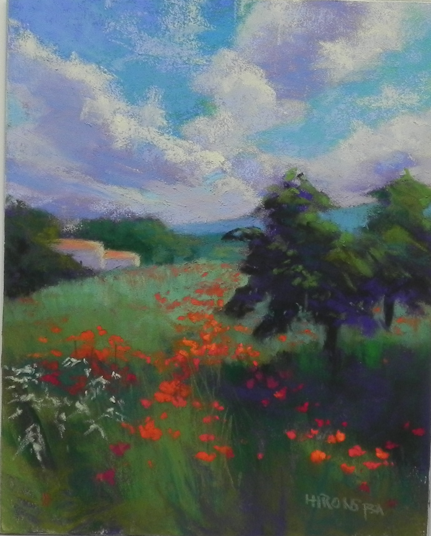
Color study for Puglia Poppies, 8 x 10, Pastelbord
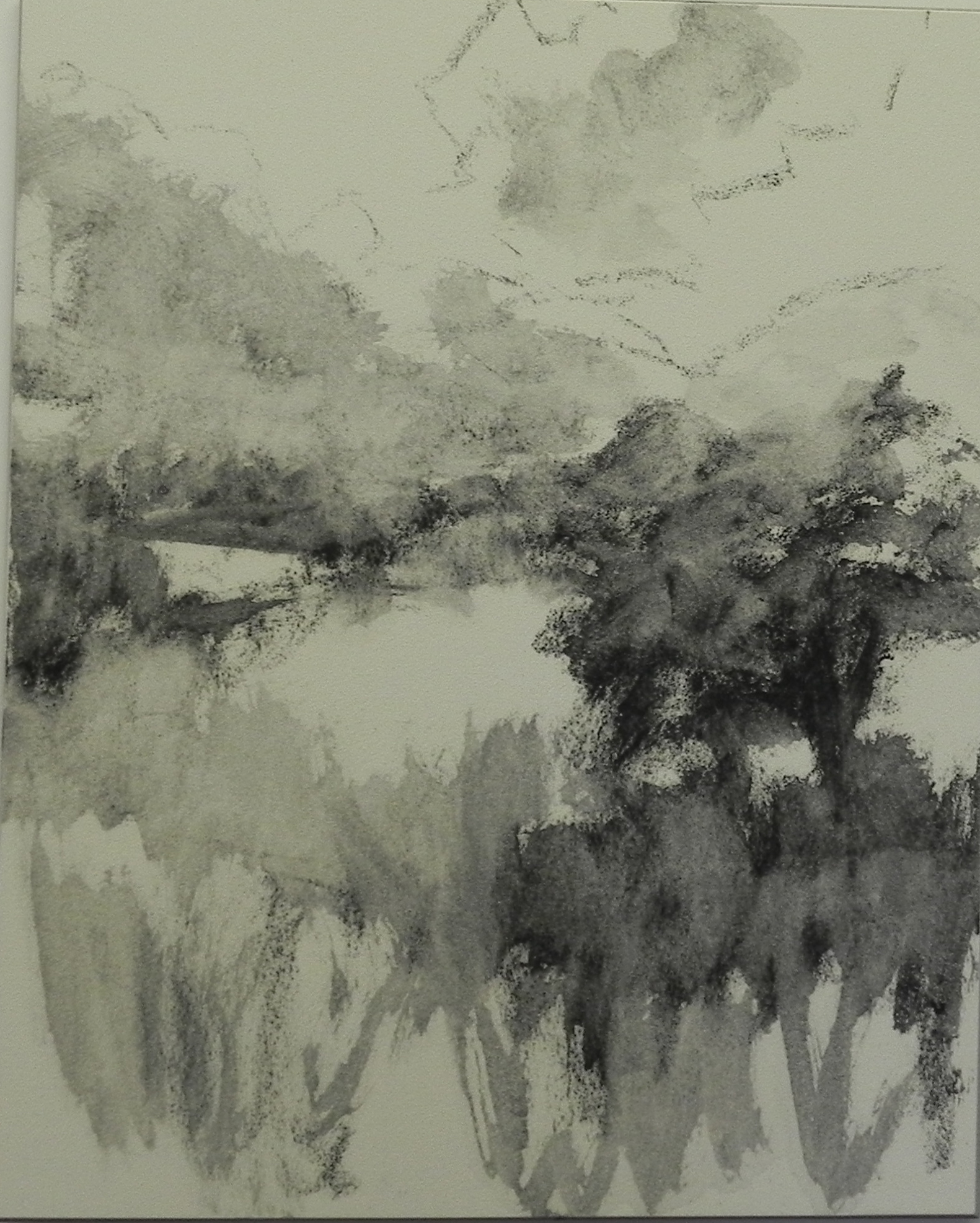
Charcoal lay in
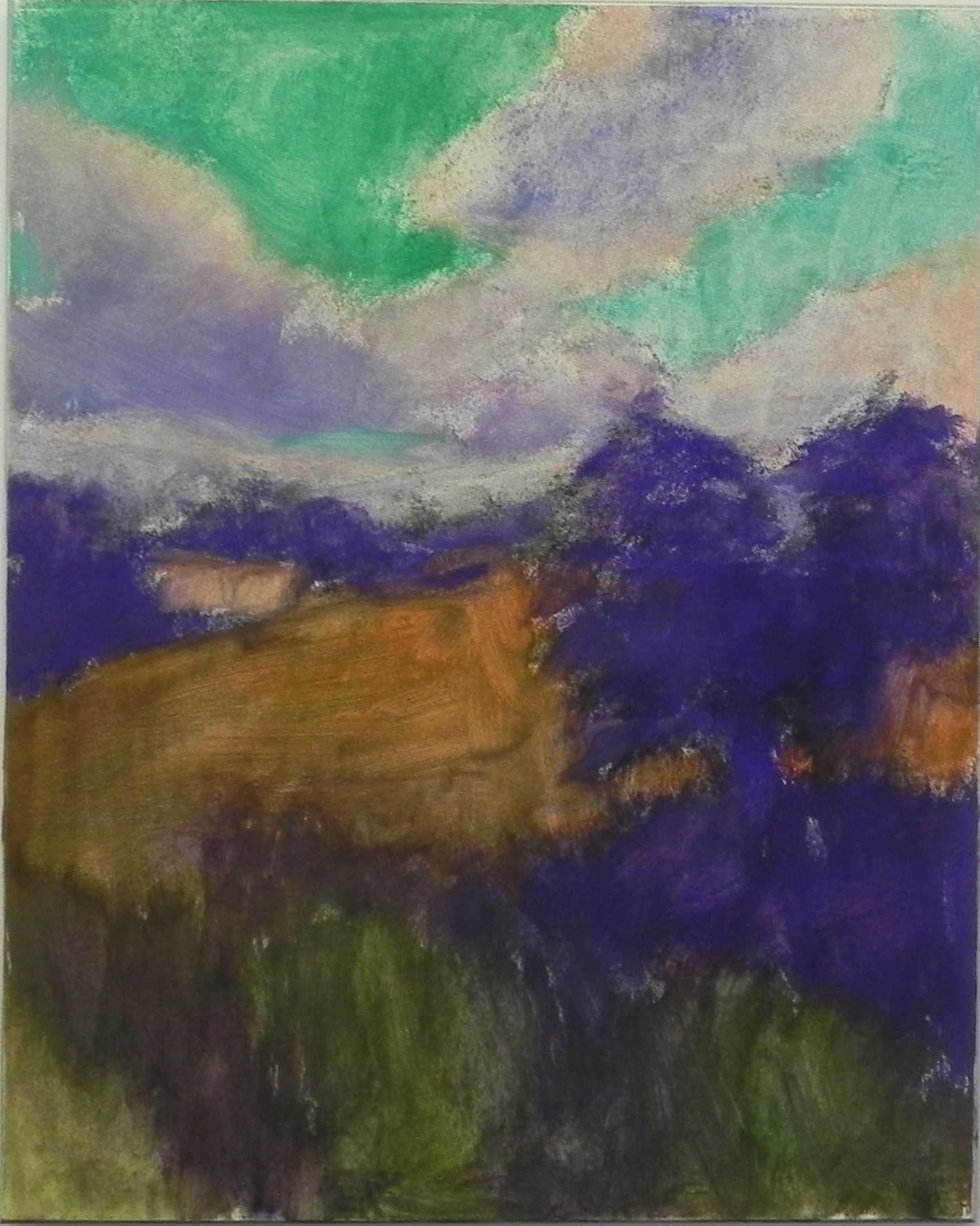
Hard pastel underpainting
Glad that you are back from your vacation; I bet it was a wonderful experience.
This painting is spectacular! The colors sing. Beautiful.