
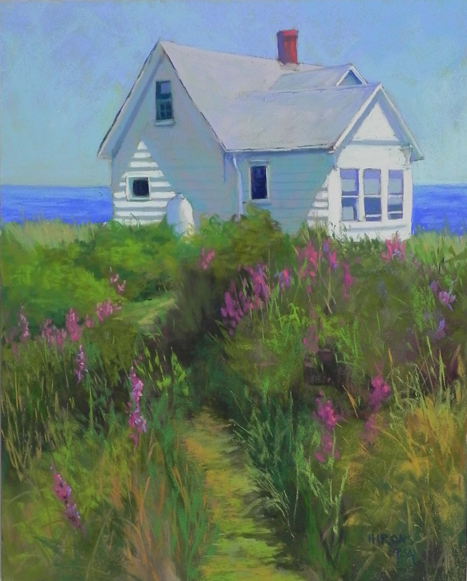
Shore House with Loosestrife, 20″ x 16″, Pastelbord
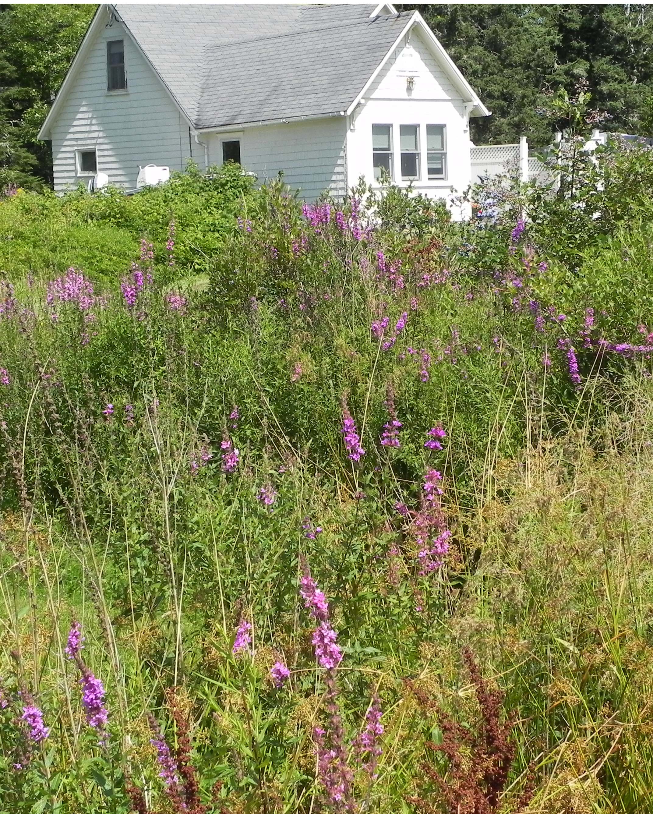
Reference photo
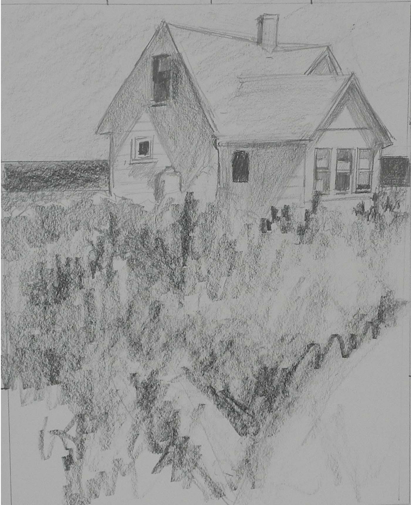
Graphite sketch, 10″ x 8″
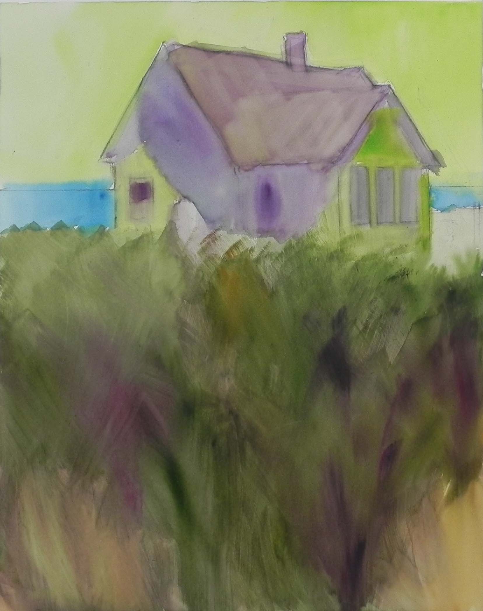
Watercolor underpainting
I’ve just completed my first painting of 2016. This is one of four that I plan to do for the summer ArtHamptons fair on Long Island. I’m including the original photo (taken in Port Clyde, Maine), along with my drawing and underpainting. There were significant compositional changes that occurred at various stages, that I wanted to show. I liked the house in light and shadow, but not the fact that the roof was cropped in the photo and that the background was just trees. The dark green would provide nice contrast, but not a lot of interest. So I decided to open it up with sky and water. You can see from my original sketch that my plan was to have the field take up the entire foreground with a swath of dark leading the eye into the picture. I began with watercolor underpainting because I like this on Pastelbord. But I’m having a hard time getting it dark enough. (Today I bought a couple tubes of gouache to see if that will be better and still retain the tooth of the surface.) I wasn’t too concerned with the colors of the underpainting, just wanted to cover up the white. I do like using the yellow green under the sky and this has become something I’m using more and more. I finished the house and the top part of the field on Monday. Yesterday I went in and sat and looked at it. I saw the small piece of grass showing just below the gas tank (also added by me!) and realized that what this painting needed was a path! I converted the patch of dark to a path and immediately loved the effect. I’m glad that the path is broken up by the bushes. But it serves to lead the eye into the picture.
Some other observations. I did a painting of a white house and loosestrife years ago as a demo in Mass. There wasn’t much sky in that one and I used greens and magentas of the same value to create the shadows in the house. I tried to do that this time and it didn’t work. So I added some warm blue green over it and it was just right. There was so much blue around the house that it had to be in the shadows as well. The roof is a combination of light pink, cool green and violet. I had to make up the chimney! I was thinking of adding the white fence from the photo in to carry the house over to the right, but decided it wasn’t needed. Fortunately, the spaces to the right and left of the house are not even! So I’m happy with my first painting. Hopefully, it will find a home in some beach house somewhere up north!
Happy new years to you all.