
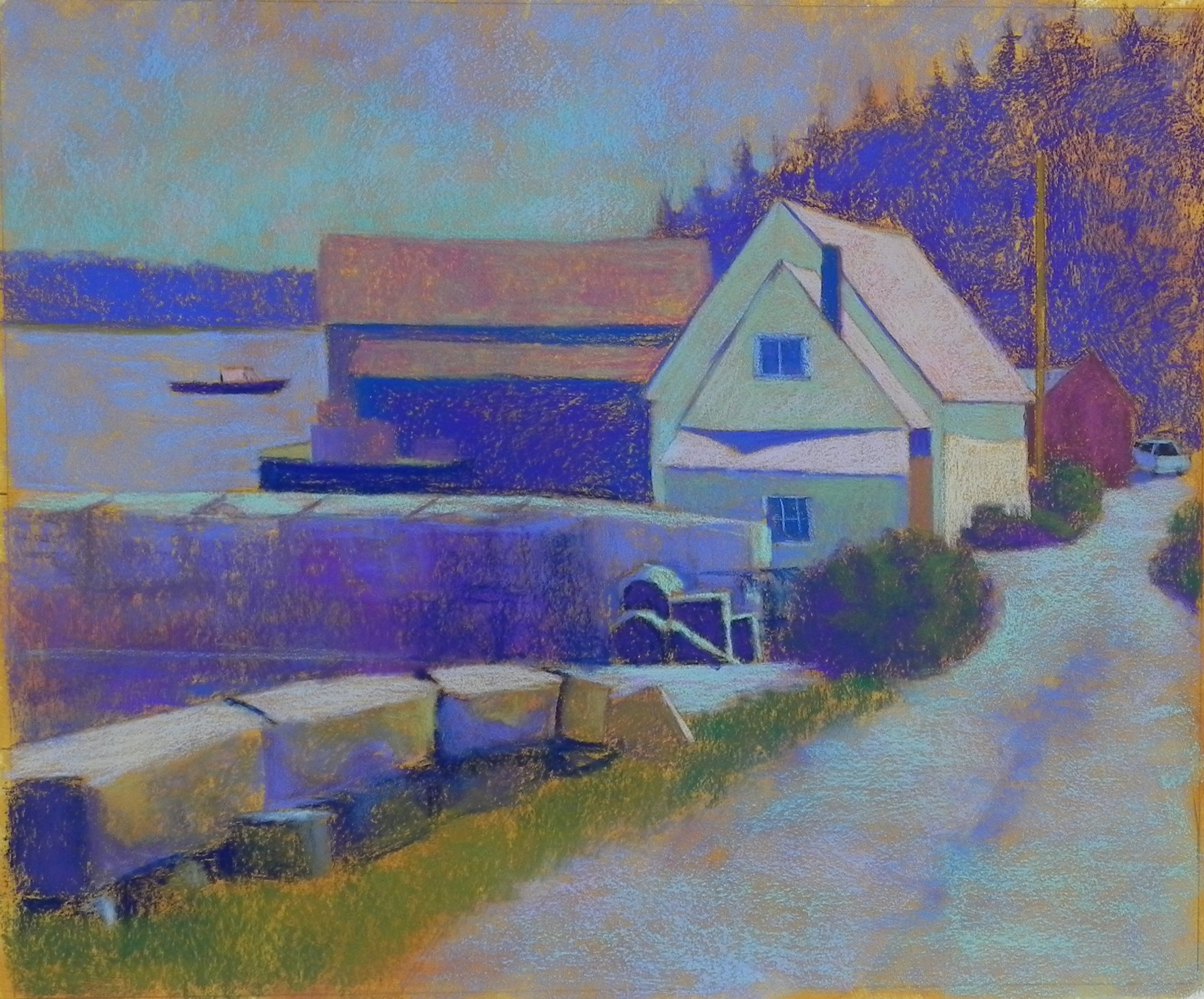
Initial layers in hard pastel
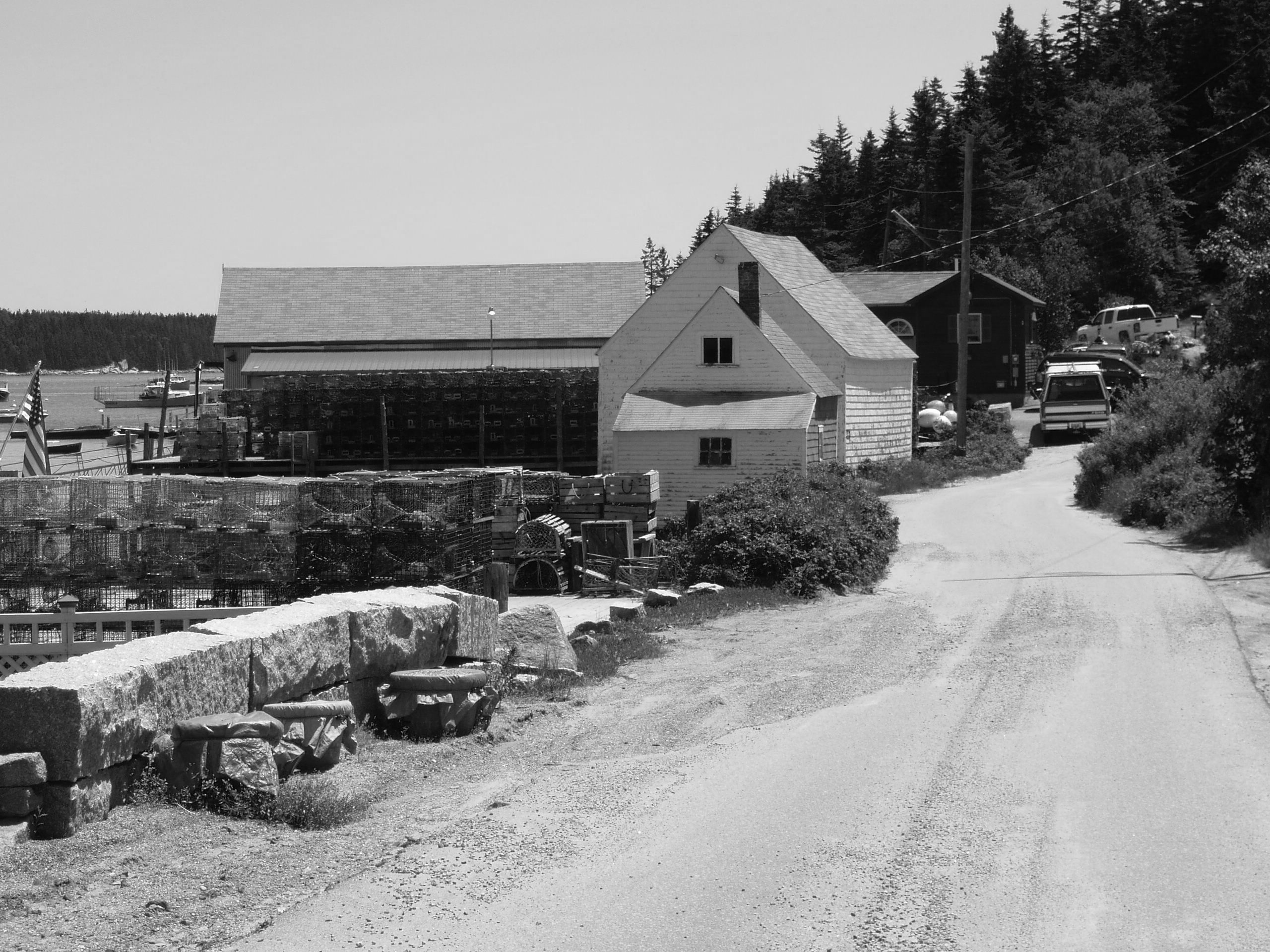
Happy snow day! We have over a foot and it’s wet, but not too bad (of course, I’m not the one doing the shoveling!). I just finished this picture that I began in the studio on Monday. This is from a photo I took in Maine in 2009. I woke up at 4:30 thinking about potential paintings and remembered this picture. What has always stumped me about the photo is the large expanse of the road. I decided I could take care of that! And, indeed, in going to a squarer format than the photo, it narrowed the road and gave more prominence to the house. I used a very gold tint for the gel and I love the way it looks with aqua and violet. I began the painting using hard pastels and basically doing warm under cool and cool under warm. I worked from the black and white photo and was really pleased when I added the orange over the cool lavender in the house roof. I put a violet over the aqua in the shaded areas and it produced a perfect grayed color. Before adding the softer pastels, I sprayed it with workable fixative (something I won’t do again at CAN!). This morning I looked at the color photo and realized that the lobster traps are yellow and red! I added some more color to them, but didn’t really like the bright colors very much. I was much happier with my interpretation of the traps and the roofs, color-wise. And, I think the road expanse is just about right. It’s really interesting how the different pastels go onto this surface. The Giraults tend to fill it in, which can be good or bad, depending on what I’m looking for. I think that the perfect pastels are the Unisons and Ludwigs because they aren’t as soft. I used my Ludwig “vibrants” set to add various reds to the roofs this morning and found it so easy to add them lightly. Thanks to Catherine and Renata, who painted with me yesterday, and gave me helpful comments.
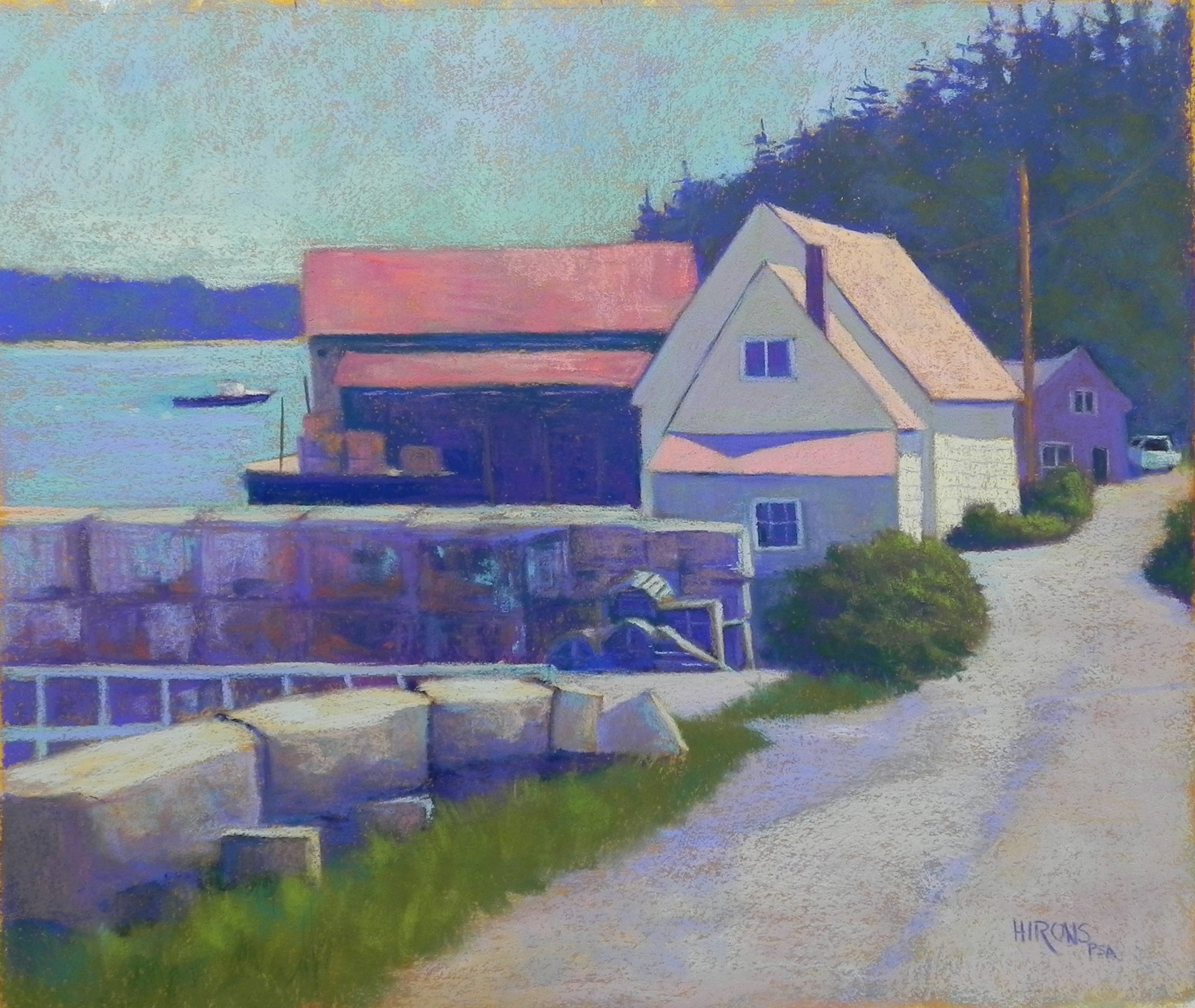
Stonington Harbor, 20 x 24, BFK Rives and AS Liquid primer
Jean, nice painting. I really like how you interpret the photo. I also like how you changed that last building. It really helps give the painting depth.
Love the bold colour you use in your shadows. More please!
I look forward again to seeing some summer pictures. You are having a pretty serious winter, over there. Best. Fiona
Great to hear from you Fiona. Glad you like the picture. Yes, we are all getting a little tired of grayish white–the color I’m seeing out my window at the moment. But nothing so bad as what’s happening in the south of England. I feel so bad for them. Are you in Provence? I hear that France has been pretty wet as well, but maybe not where you are. I’m entering the Pastels en Perigord show that will be up in July, so have been in contact. Wish I could be there, but I’ll be on the west coast.