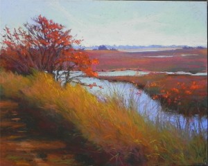
 About six years ago I did a painting of this scene from Prime Hook Wildlife Refuge on the Delaware Bay. I was in a phase of painting with very bright colors and using very few neutrals. If you want to see the original, look at my website (www.jeanhirons.com), go to the MidAtlantic gallery and click to get to the second page. It is near the bottom. You might want to put your blinders on first! While scanning through old photos in preparation for an October 2013 show, I came upon the original photo that I used to paint the scene. I loved the composition and saw the possibility of doing a more subtle painting. I had a 16 x20 pastelbord that I had washed off and brushed with a red-toned gel and decided it would be perfect for this. This time I was careful to limit the really saturated colors, and began with dark browns and greens under the grasses. The background marshes are a mix of warm and cool reds with violets and green on top. There is still a lot of bright color but I am much happier with this version. (Keep in mind that digital photography heightens the reds and oranges, so the reproduction is probably a little brighter than the painting.)
When I started painting in pastel, I tried to use color rather than neutrals. Some people really liked the heightened sense of color, but I’ve found that I am not more drawn to nuanced color with a few bright spots. I guess this is the aging process! But I do think it makes for paintings that are easier to live with.

I really appreciate hearing that your work and taste have evolved from high chroma to more subtle moods. As a student, still, I find myself attracted to color intensity and worry a bit about that. Glad to know it is a learning process and that coming back to the same subject a few years later can be worthwhile.
Thanks Susan! We are all drawn to the brilliant colors of pastel. But I do agree with Duane Wakeham, that a little goes a long ways!
Thank you for your article, really interesting. Currently, I have decided to work again with pastels. I think my latest paintings are too bright, too purple. The choice of colors is often difficult for a landscape. Especially the greens are not always green! OMG! I understand the need for a neutral color palette rather important! I’ll try to work it;-)
While both of your paintings are beautiful, I definitely am drawn into and even want to linger longer to view the one with more neutrals. Those neutrals provide
a framework for the center of attraction. I myself am drawn to vivid color and after having read your blog I began to look at some of the paintings I have finished, my eyes were opened. I can see now why many of my paintings are not as pleasing as I would like them to be. I have not provided an opportunity for the viewing eye to be lead to the focal point, nor have I provided a place of “rest” for the eye.
Love your blogs. Thank you so much
I was confused by your conclusion, until I realized you probably meant “…I am NOW more drawn to …” instead of “…I am NOT more drawn to nuanced color with a few bright spots…”
Yes, sorry about that! I just noticed it in rereading. I DO reread and try to edit my posts but sometimes these errrors slip through. Jean