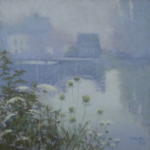
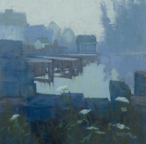
One of the things I like about painting skies that are basically “white” is the opportunity to work with a limited palette and choose whatever color I like for the sky. These two paintings are from the same spot in Maine. They were painted in my studio from photos, but I painted there on site as well. Each suggested different colors to me. Fog Study in Blue has the stronger composition, with more darks and stronger shapes. I used my new boxes of Dakota’s Blue Earth pastels (blue and cerulean) for the painting and really enjoyed them. I think this is one of the bluest paintings I’ve ever done! Fog Study in Blue Violet was painted the day after we learned of the death of a dear friend who loved Maine. So I painted this with him in mind and it is a much gentler, almost ethereal painting. I used more detail in the foreground since there was so little in the background. The colors are more in the blue violet range, a color I use a lot and love. I will continue with more fog pictures, as the opportunities arise. While the focus of the discussion has been on color, the most critical aspect of painting fog is edges! I kept all of the distant buildings very soft edged. Only the lobster traps in the foreground of Fog Study in Blue have hard edges. The resulting contrast with water highlights the importance of the water shape, an important element in the painting.


These paintings communicate the mood of a foggy day in Maine very nicely. They help me to recall how it feels, sounds, and smells on a foggy day, having spent my childhood in Boothbay Harbor (now high and dry in Colorado). The limited palette is very inspiring and didactic. Maybe a snowy/blowy day in Colorado could be the focus of a similar study for me to tackle? Thanks for rejuvenating the blog, Jean!
Yes! Snow is the perfect complement to fog. Was hoping to see some falling in New England at Christmas, but alas, nothing but rain.
hello!,I love your writing so much! proportion we communicate more approximately maillot de foot pas cher your post on AOL? I require a specialist in this area to solve my problem. Maybe that is you! Looking ahead to peer you.
Maillot–this message isn’t very clear to me, but thank you anyway for commenting. Jean
Beautiful painting Jean. Great idea to have a new blog to compliment your outstanding book.
Thanks Loriann. It’s fun sharing what’s behind a painting, as I’m sure you well know. Jean
Jean, these fog paintings are very beautiful. Come to Ireland – you can paint for nearly every day, in shades of blue, grey, violet – and green of course.
I have posted you on http://www.artistsinpastel.com, with a little publicity for your book.
Best wishes
Niall O’Neill
Niall–thanks so much for the comment and for the publicity. I really appreciate it. Have been to Ireland once and we hope to get to the west country of England in Sept. I love it all! Jean