
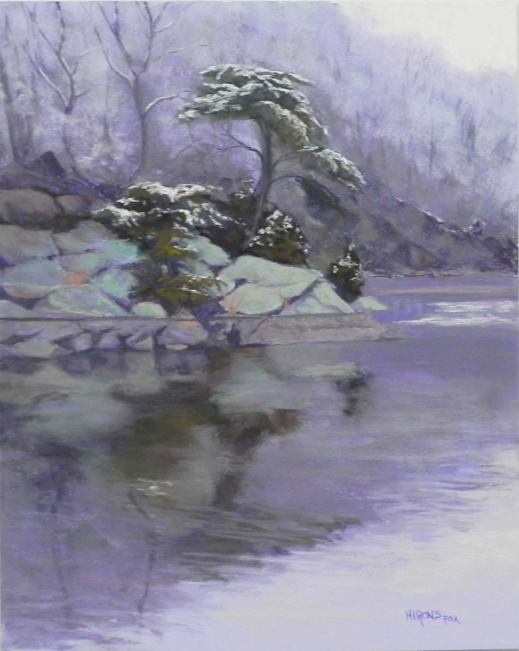
A Touch of White, 20″ x 16″ Pastelbord
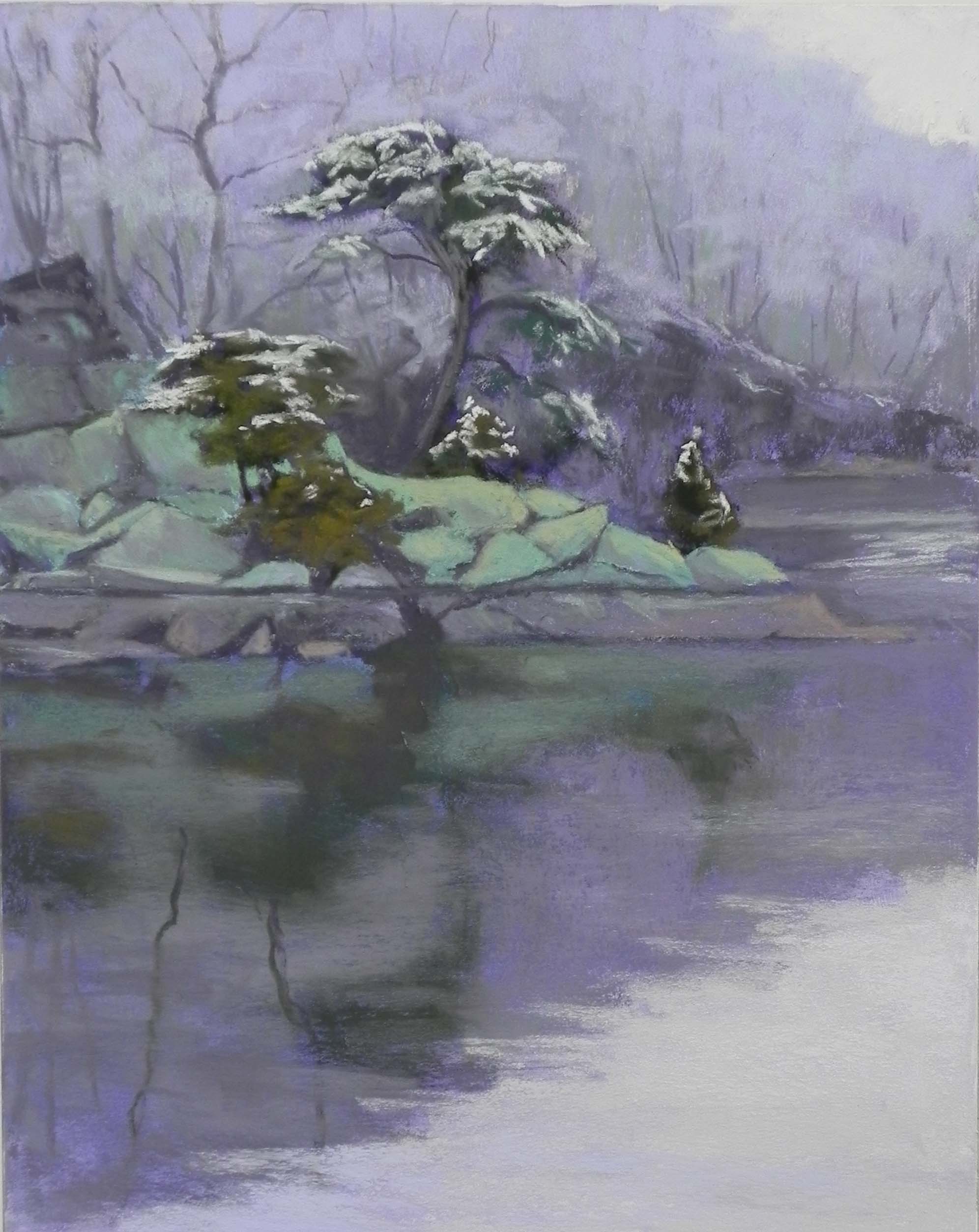
A Touch of White–Study, 16″ x 12″ , pastelbord
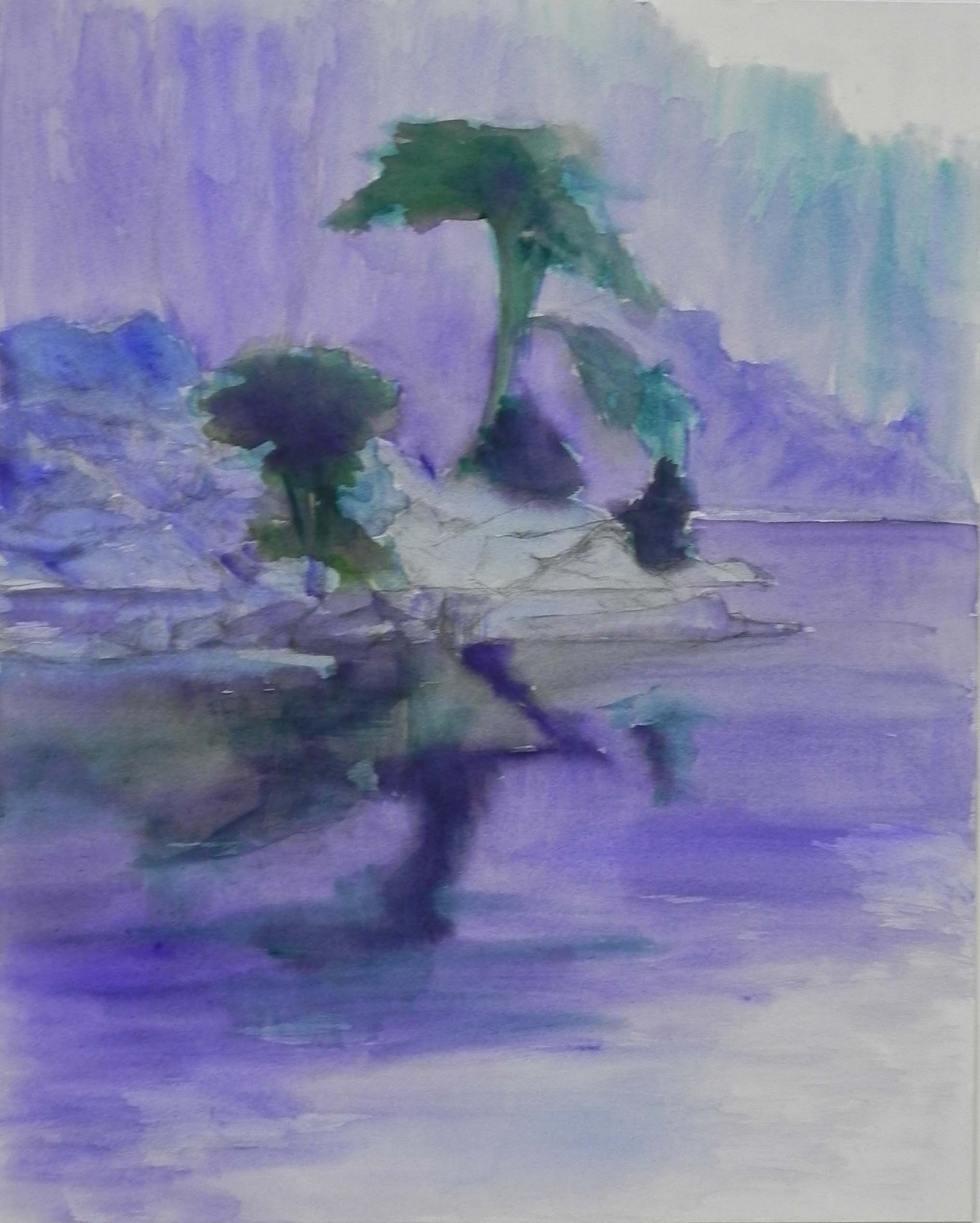
Watercolor and gouache underpainting
Last week I gave a demonstration for a local art league, the Montgomery Art Association. Two weeks ago we had a lovely, small snow fall that left an inch or two on trees but nothing on the roads. I knew it wouldn’t last long, so I left the house at 8:30 AM and headed for Wide Water. I walked with frozen fingers taking pictures, all of them pretty gray! I thought I’d have a lot of material to work with, but in the end, I decided that this one scene was the best and probably the only one worth doing. What was really lovely was the snow on the trees and the yellow sky that was beginning to lighten but wasn’t blue. There was only snow on the tops of the trees, none on the rocks, as I’d hoped there might be (I guess they retained too much warmth from the sun). But the white on the dark pines against the slightly darker background was quite beautiful. I knew that I had my demo subject.
I made some compositional changes by removing other trees behind the main tall tree. I wanted that to stand alone against the background trees. I loved the fact that the background trees, though snow-covered, formed as shape that was darker than the sky but lighter than the tree. I spent some time doing small color studies on LaCarte, just playing with the color of the rocks, which were their actual green color in this unsunlit photo! (The green is lichen that covers them.) The color studies were fun, but I felt I needed to have a better sense of where I would be starting. Since this was pastelbord I’d be working on, and because I wanted the picture to have a lightness to it, I decided on a watercolor underpainting. AND–I decided to do the whole thing first in a smaller size! So I used a 12 x 16 board and did the entire painting. This was useful, because I knew I couldn’t finish the painting during the demo but I could show them the finished 12 x 16 at the end. There is one major difference in the two paintings. In the smaller one, I followed the photo and divided up the rocks on the right side. In the demo, I followed the suggestions (pleading?) of some of my students in attendance, and left them larger. I do like it better.
The colors in this picture are all grayed red violet and subtle greens. There is a little warmth in the orange grasses that grow among the rocks but that’s it! The coolness and simplicity of color and shapes, gives this picture a more poetic feel, I think. The small portion of sky was done with two layers: a very light red violet Unison and lemon yellow Art Spectrum tinted white (a very useful pastel!). I added just a little of the yellow at the bottom but wanted the water to read darker.
The background trees were really easy. Having done both color studies and an initial painting, I had chosen a light violet that would be used to indicate the snow covered limbs. I used Girault grays to indicate the darker under areas, and the ridge on the far right. For the rocks, I wanted the area on the right to have the most warmth, so I started out the others with grayed violets and cooler greens. There is a subtle difference that I think works. For the light area of the water at bottom, I used a light violet and an interesting Ludwig pastel that looks cool but goes on warm. Again, my color studies helped with this (I thought I had filmed them–sorry!).
The watercolor underpainting worked fine. I did two applications of it, so that I had a little richer color to work on. It’s really not my favorite way of doing an underpainting, but sometimes it’s what’s needed. I wanted to avoid really bright colors, so I used an analogous palette of cool blues, greens and violets. The color is still quite a bit brighter than the painting, but it wasn’t a problem.
This was fun to do but now I’m ready for spring! I have my tiny Heilmann box filled with Giraults and hard pastels and someday soon hope to go out and sketch or paint.