
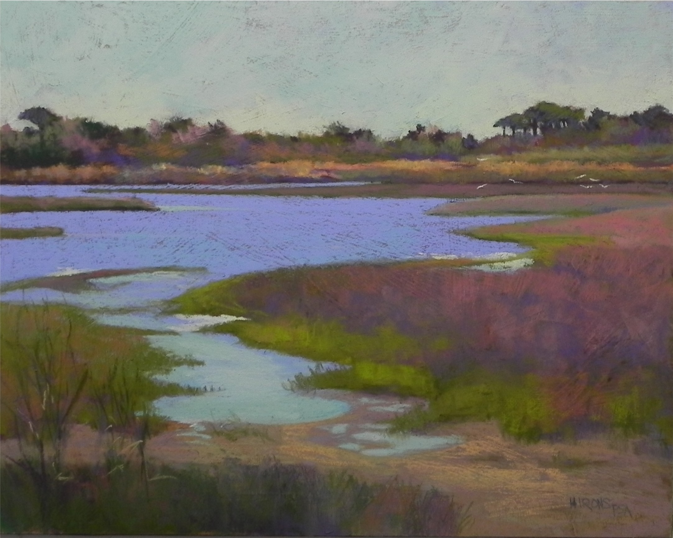
Assateague Pines Revisited, 16 x 20, pastelbord
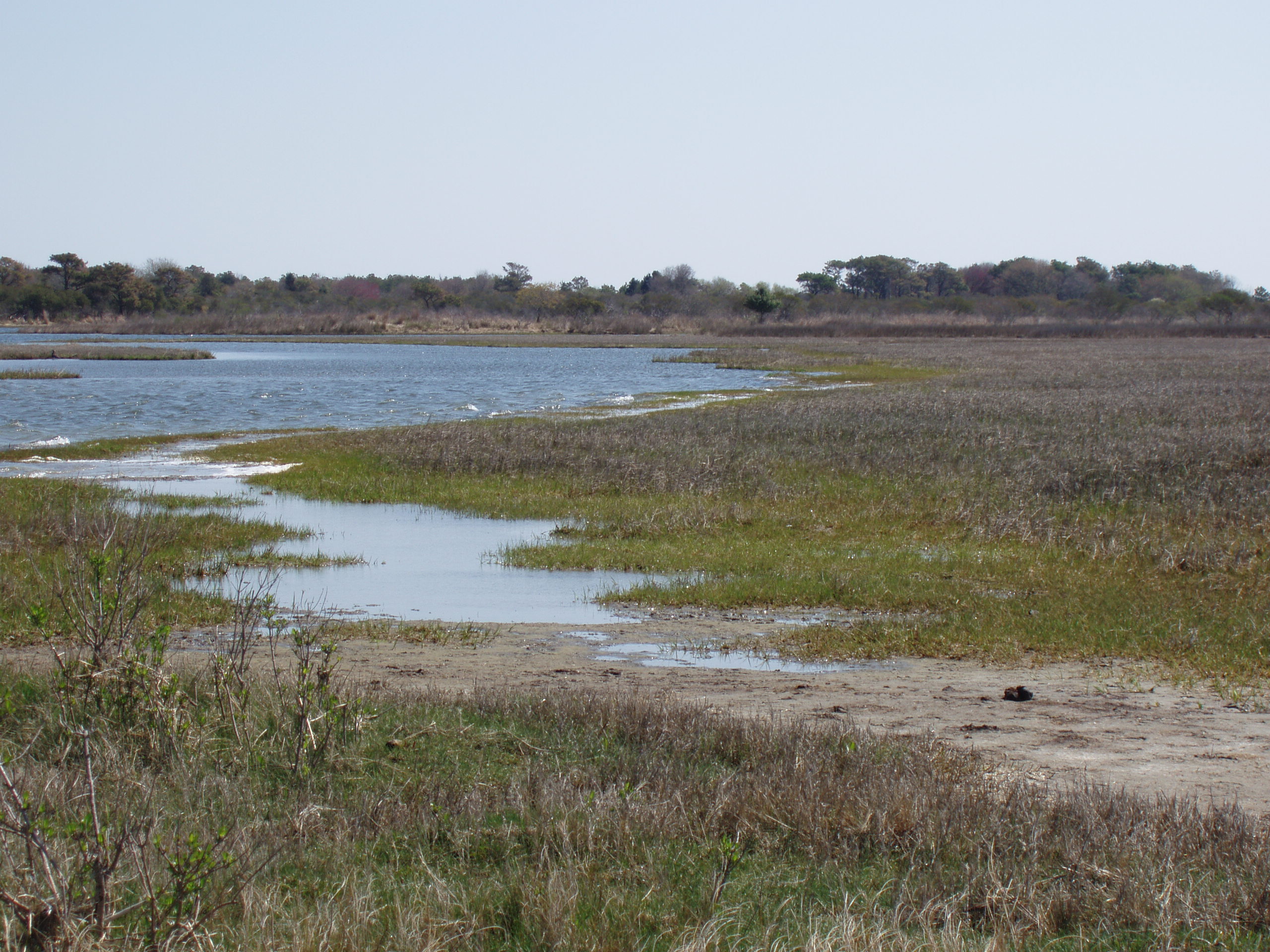
Reference photo
I’m done, for today, at least. I’m quite happy with this picture, after struggling to get the shapes the way I wanted them. There were a number of challenges with this painting. First, is that the major interest is in the background! I made the pine trees on right taller to give them interest but had to tone everything down to keep it back. Nevertheless, this is one of the primary parts of the painting. The second challenge was the large area at the right of the picture, which in the photo, is a dull gray. I tried to make this more interesting with the use of blue violet, cool reds, and greens brushed over one another. I do like the way the cool red shows against the blue violet of the water. (Note: I cropped the photo when I printed it, cutting off much of the right side.) I think you can see from the photo the challenge with the color. But I hope you can also see what drew me to the scene as well. While far from perfect, this is a much more successful painting than the one that is currently on my website and will be removed soon!
Nice painting!
Very beautifully done. The translation from the photo to the board was certainly accomplished.
Thanks Claire. I still see a few small things I need to tweak before it gets filmed this week. But I like the way the colors work together. I used up a wonderful piece of Ludwig blue violet on the water and am hoping to get some more at the convention!