
I am struggling!!! I took a long time to get the drawing on the paper the way I wanted it. The houses are bigger than in the original drawing, but I’m happy with that. I wasn’t sure how to begin the painting so I decided to use the same color of a light, dark and mid tone Girault and put in some of the key areas. The first picture shows this. Then I decided I’d better get started with the sky and background trees. The Giraults weren’t working! I don’t have the right values of blues in that brand so I went to soft, in the trees as well. I was also fighting the red! I decided to stick with an up and down stroke in the sky and liked the way that looks but it’s not done.
My other problem is with the colors in the roofs and buildings. After putting in some blue green as an intermediate shade, I decided that it would really be better with all of the greens to have warm colors in the roofs and buildings. I’m hoping I can go over them successfully with some of my Ludwigs. But right now, I’m still struggling with the background. (And it’s snowing harder than ever!!!) BTW, I’m not sure why the surface looks so orange at the top and red at the bottom–it’s all the same color and not really orange! Looking at the lightness of the first picture, I’m wishing I hadn’t gotten into the soft pastels so soon. Oh well. My cloud shapes need help also!!!
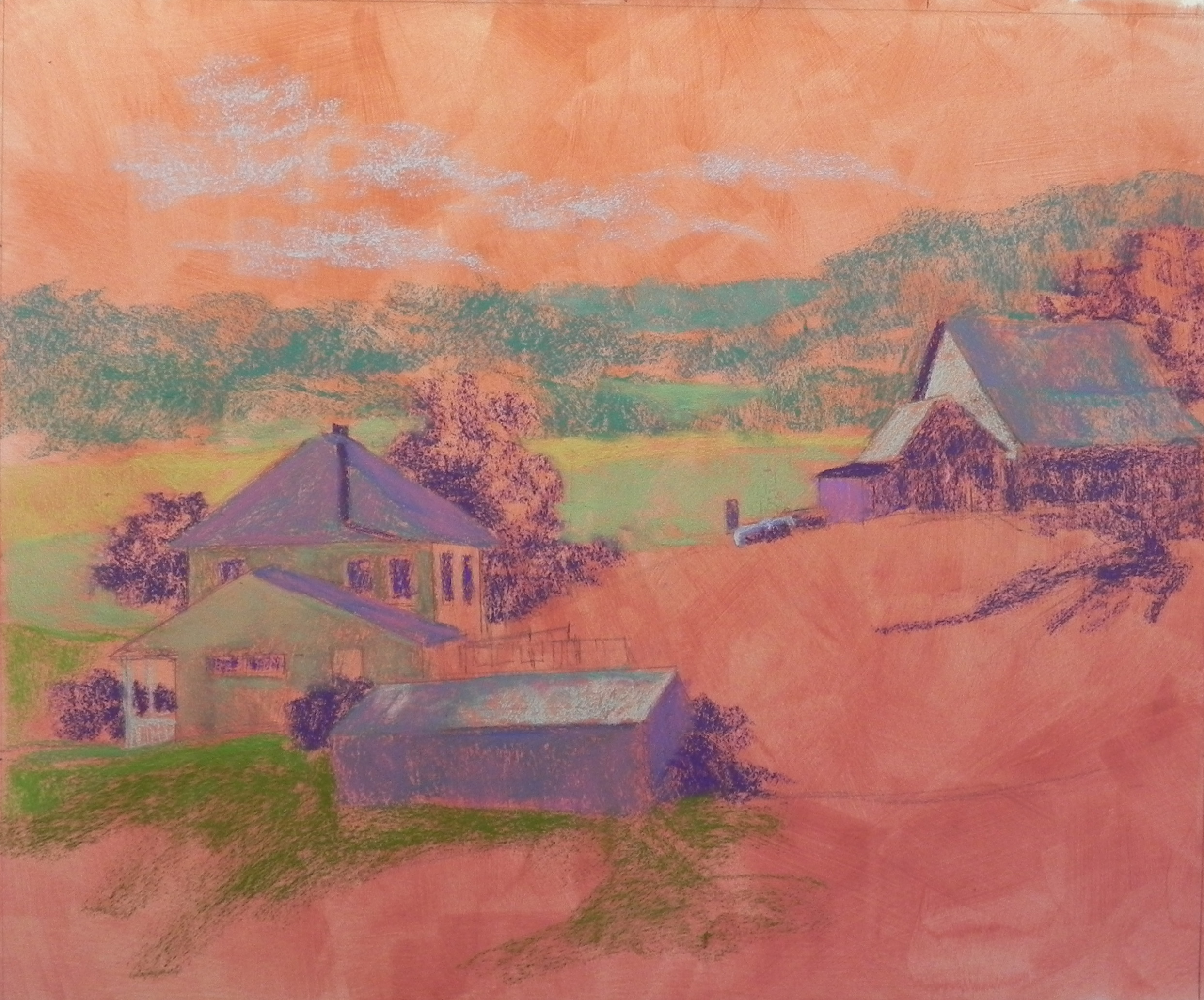
Initial layers of Girault
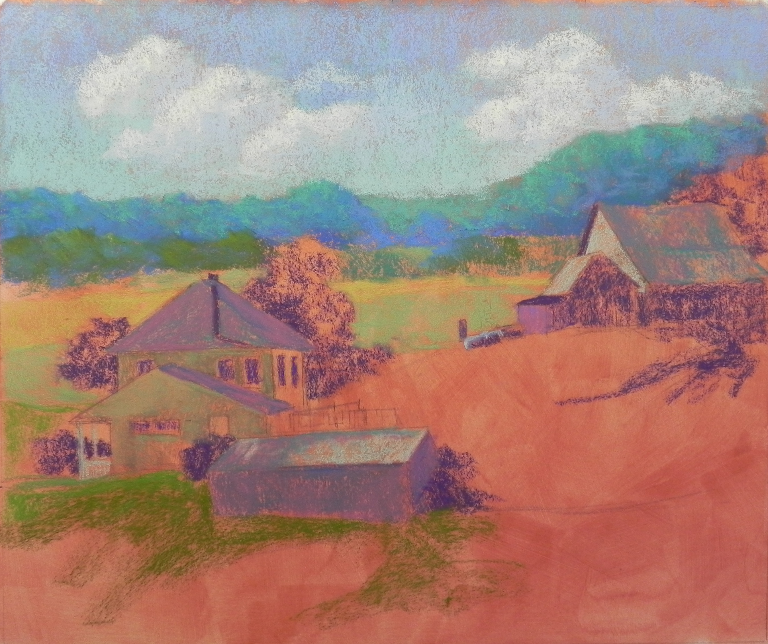
Soft pastel in sky and background hills