
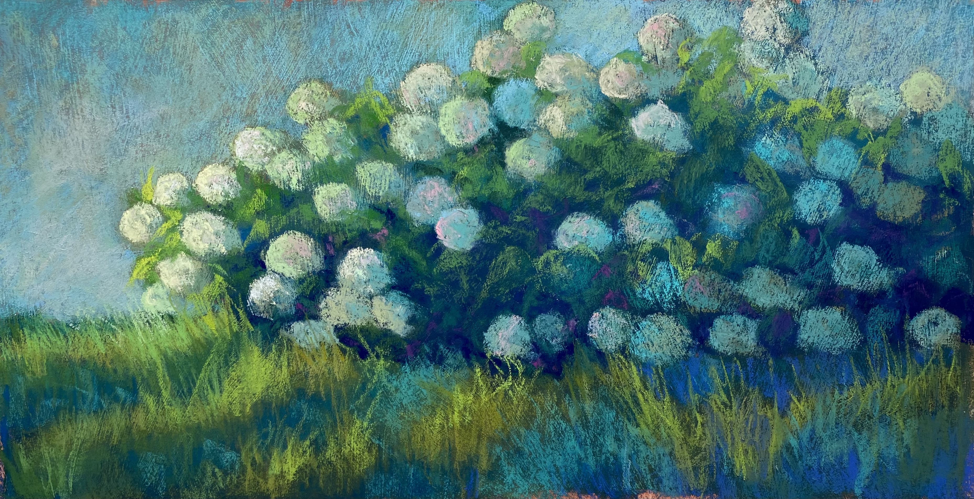
Hydrangea Blues, 12″ x 24″, Stonehenge
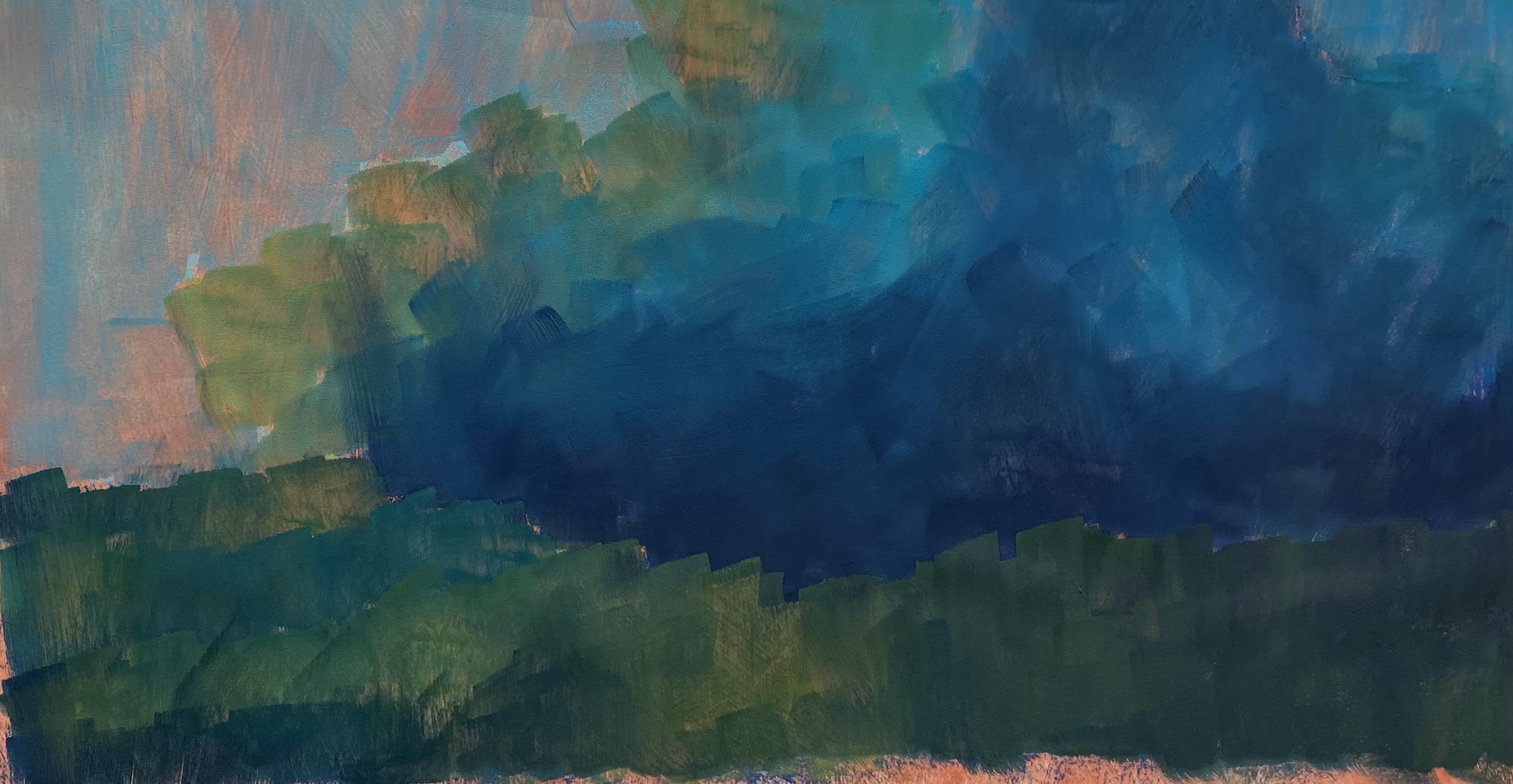
Underpainting over toned surface
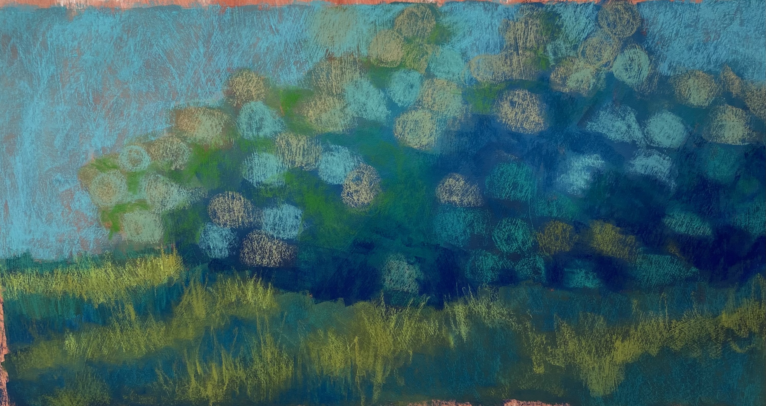
Initial layin
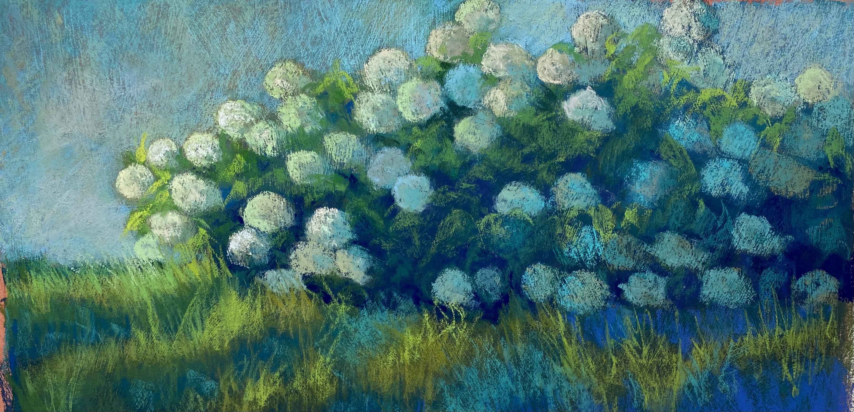
Almost complete
Happy July 4th! (Although I”m not sure women can celebrate something called “Independence” day!) Anyway, I finished off a painting today and thought I’d share it with you. I was going to do another Lake Bonneville picture, but I was struck by the beautiful hydrangea bush in front of our building. So I took pictures from a lot of angles and decided to do a 12 x 24 on the Stonehenge paper. I am really loving this surface. Nice and sturdy.
The primary challenge for me was the composition. It’s just a long bank of bushes with grass in the front and light coming primarily from the left. So I tried to vary the flowers as they rise about the bush and played with varying colors to give more interest to it. The pattern of light on the grass also provides some directional movement, which I think helps.
I decided to do something different in beginning the painting–use hard pastel. I put in the sky and added Girault on top and really liked it. Then I decided to do a hard pastel underpainting for the flowers and grass in order to provide the darks. This worked really nicely. After that, I used various hard pastels in greens, blue greens and warm brown greens to lay in the flowers and light and shadow on the grass. I then used soft pastels to develop the flowers, grasses, leaves, etc.
One of the things that I’ve liked least in this series of paintings has been the skies. Using Ludwigs and other soft pastels has made them too cakey. I really liked the effect of the hard pastels and Girault for the background and I plan to do more with this in future paintings. My initial thoughts were to do this one quickly land loosely like the Fog and Poppy painting (which I have sold). But when I began this one, I realized that I wanted to take my time with it. I loved playing with the various warm greens and cool blue greens. When I was almost done, however, I felt that it was missing something, and I decided to add pinks. I got four values of very light, medium and dark pink/magenta and added some of the lights to the flowers and some of the dark to the undergrowth. It can be hard to see, but it adds just enough contrast to make it more interesting.
Working on these pictures has been really energizing for me. Unfortunately, my back isn’t cooperating and it’s also been painful. Nevertheless, I plan to continue to explore and see where it takes me. I hope that you are also enjoying whatever creative endeavors you are involved in. Best wishes for the holiday. Hopefully you aren’t flying somewhere!
Jean