
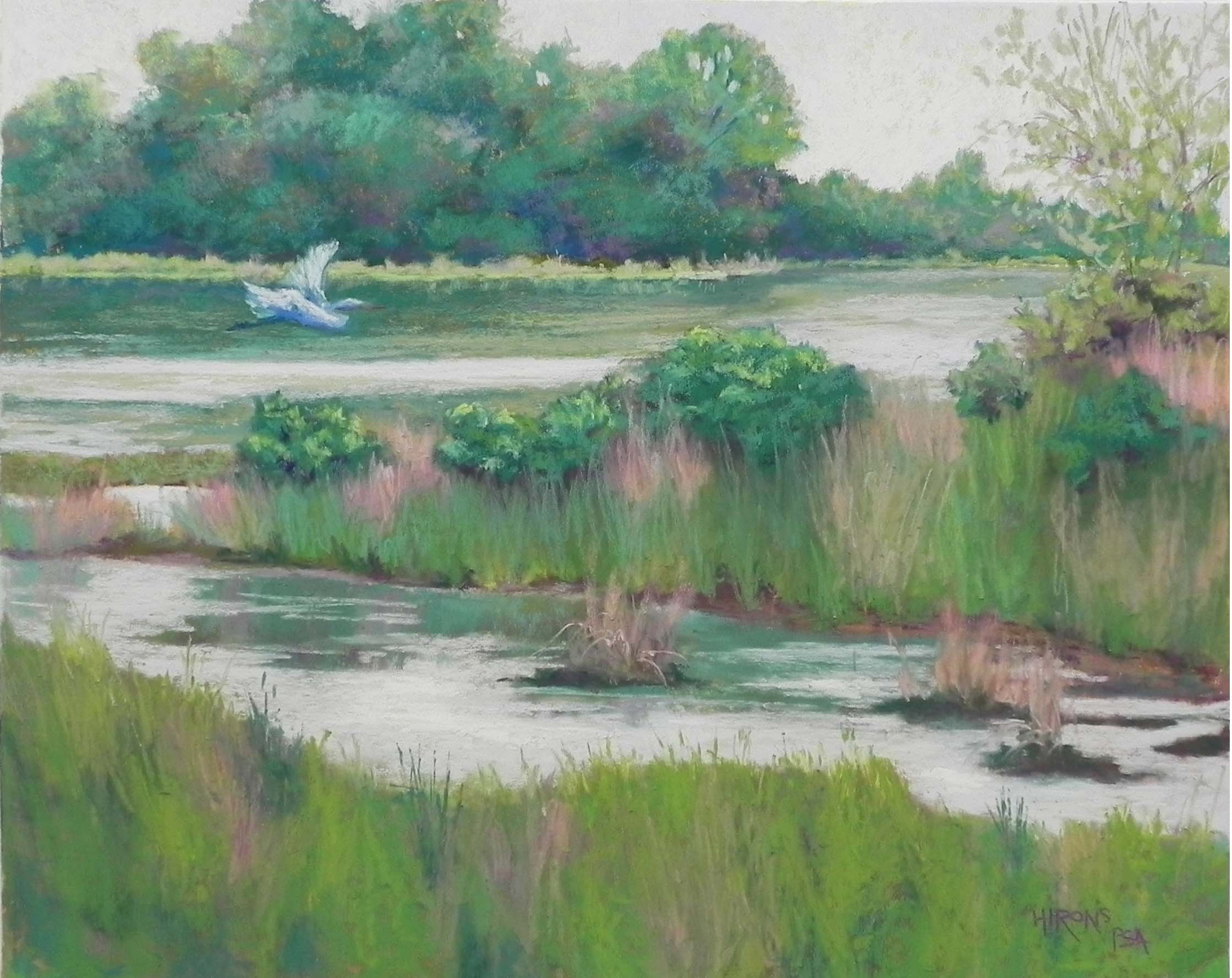
Marsh Greens, 16 x 20, Pastel Premiere white
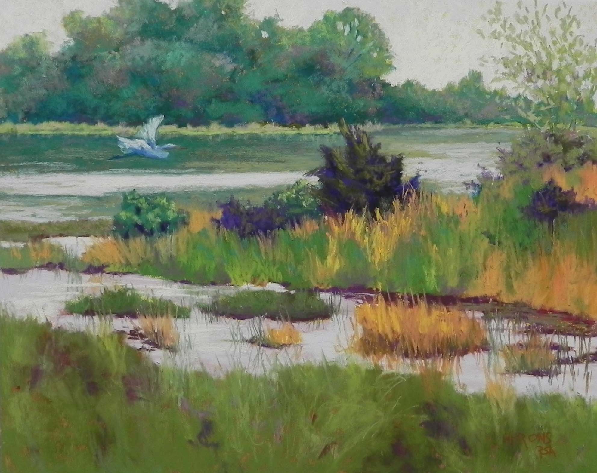
Flying in (original painting)
Today I spent the entire day at the studio fixing up paintings! One that I thought was done yesterday, one from 2016, and the one I posted last! That one was by far the most difficult. I’ll post the others separately and tell you about my changes.
While I put my original version of this painting on Facebook and showed it to visitors in my studio on Friday night, I told them that I planned to change it. I was NOT happy with it! The primary problem was that the midground and foreground didn’t work with the background colorwise and with the addition of the bird, the dark bush was now competing for attention. I’m including both images the same size so you can compare them. There are a lot of things I didn’t like but the dark bushes were the main thing. However, I also didn’t like the orange grasses.
So I began by brushing out the bush, putting the water in behind it, then developing the lower green bushes. I used a combination of cool and warm greens in the bushes, to keep them in harmony with the background. For the grasses below them, I used some warm and more cool greens, and cooler pinkish colors to replace the orange. I made other changes, as well, such as filling in the little tree at top right and adding branches in a soft brown. I also added a sense of reflection below the middle strip and then added the sky color on top so that there would be a combination of greens and lighter colors. I also softened the dark areas under the grasses, which I didn’t like in the first version.
The bottom third was a challenge as I really wasn’t sure what to do with it. I brushed some of it off, layered various colors on top. I ended with a warm green, given that this is the foreground, and I added a hint of the pinkish grasses into it. I like the basic shape of it and think that it works OK.
You might notice the difference in light. I think that I forgot to enhance the original by adding a little more light to it, as I always find necessary. I did not make any changes to the background trees and they definitely appear darker in the original.
Finally, I changed the title! I never liked the original one (John just suggested “For the Bird”!!!). I like the new title and I think it more aptly suits the picture.
I’m happy with this picture at last and will probably frame it and include it in a show next spring. It’s often the test of “am I happy enough to frame it” that makes me realize that changes are needed!
I welcome your comments!