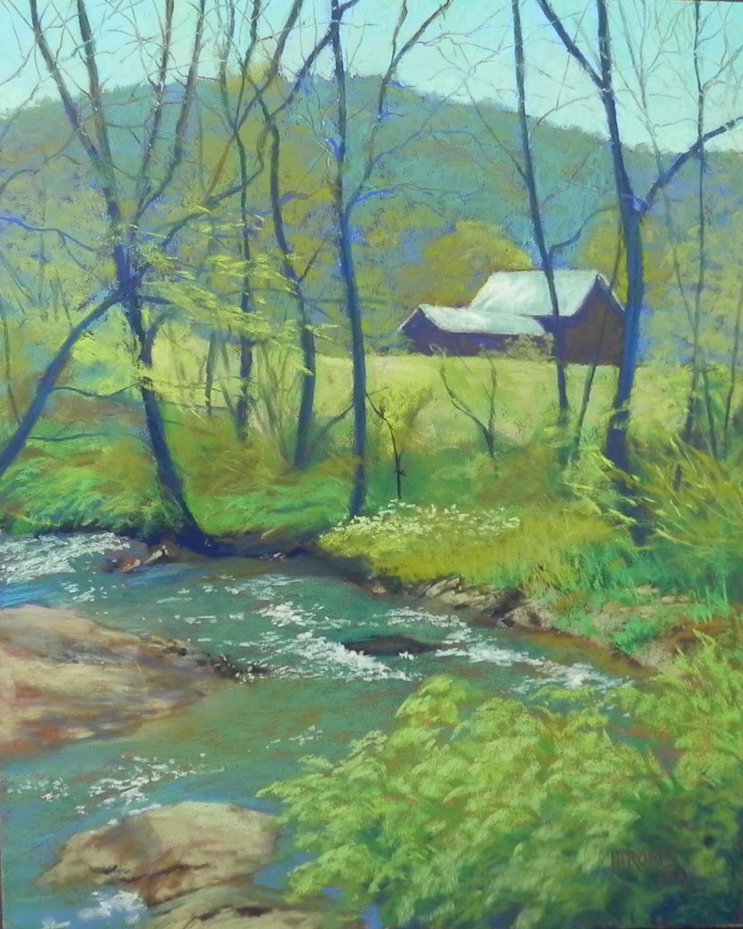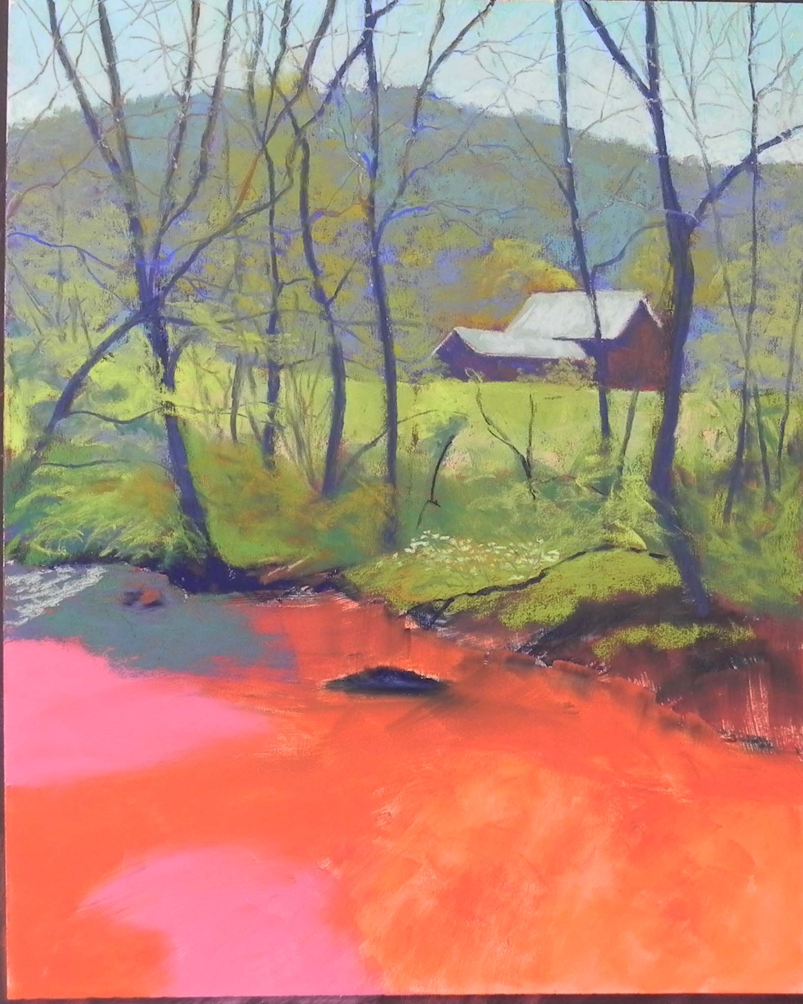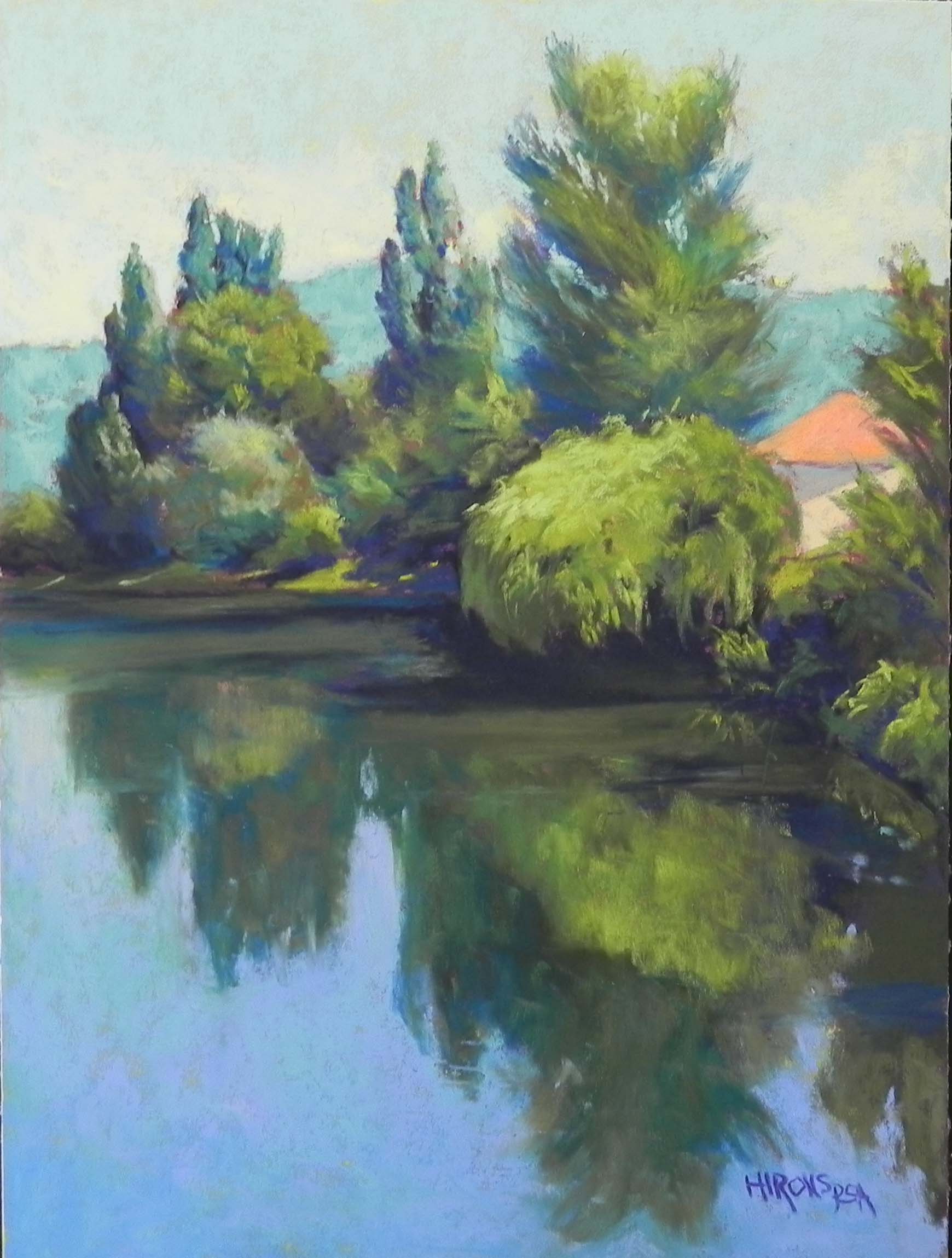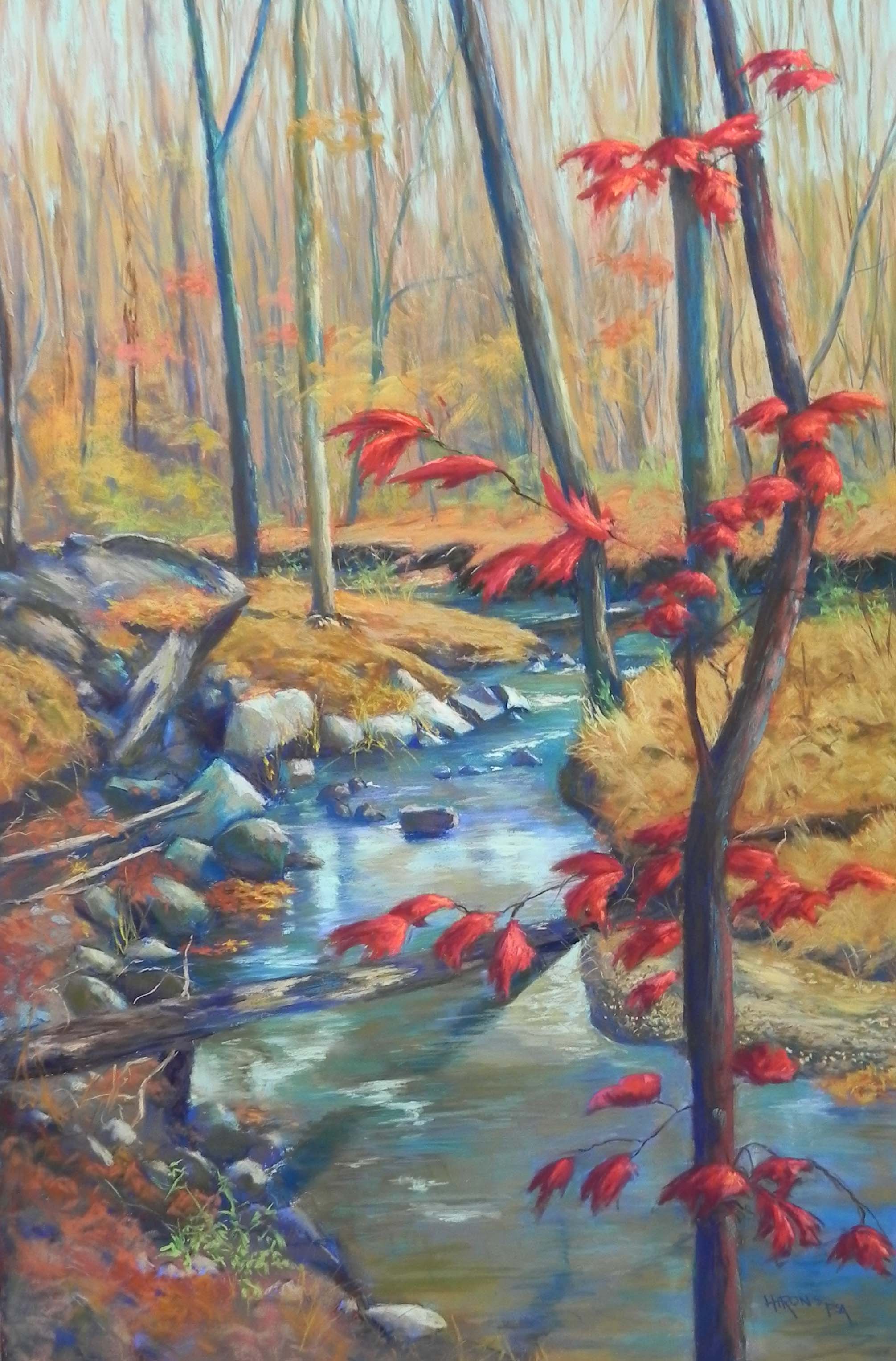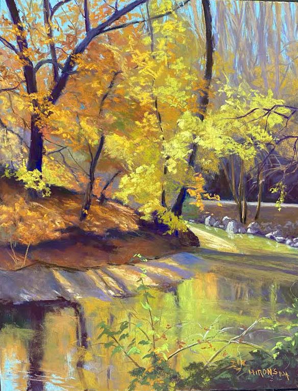
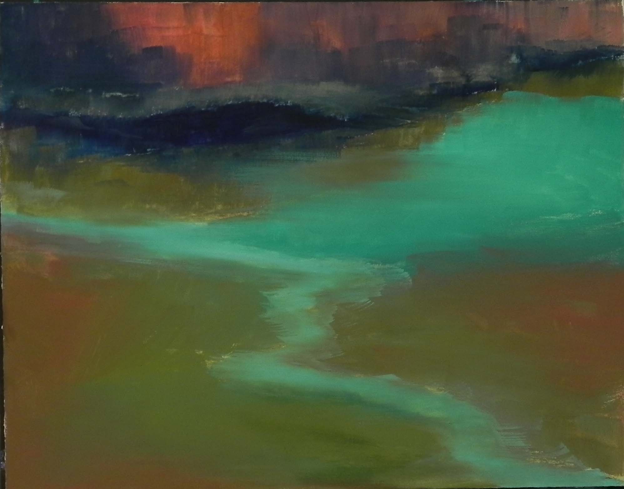
Shore Patterns, 11 x 14, UART 320
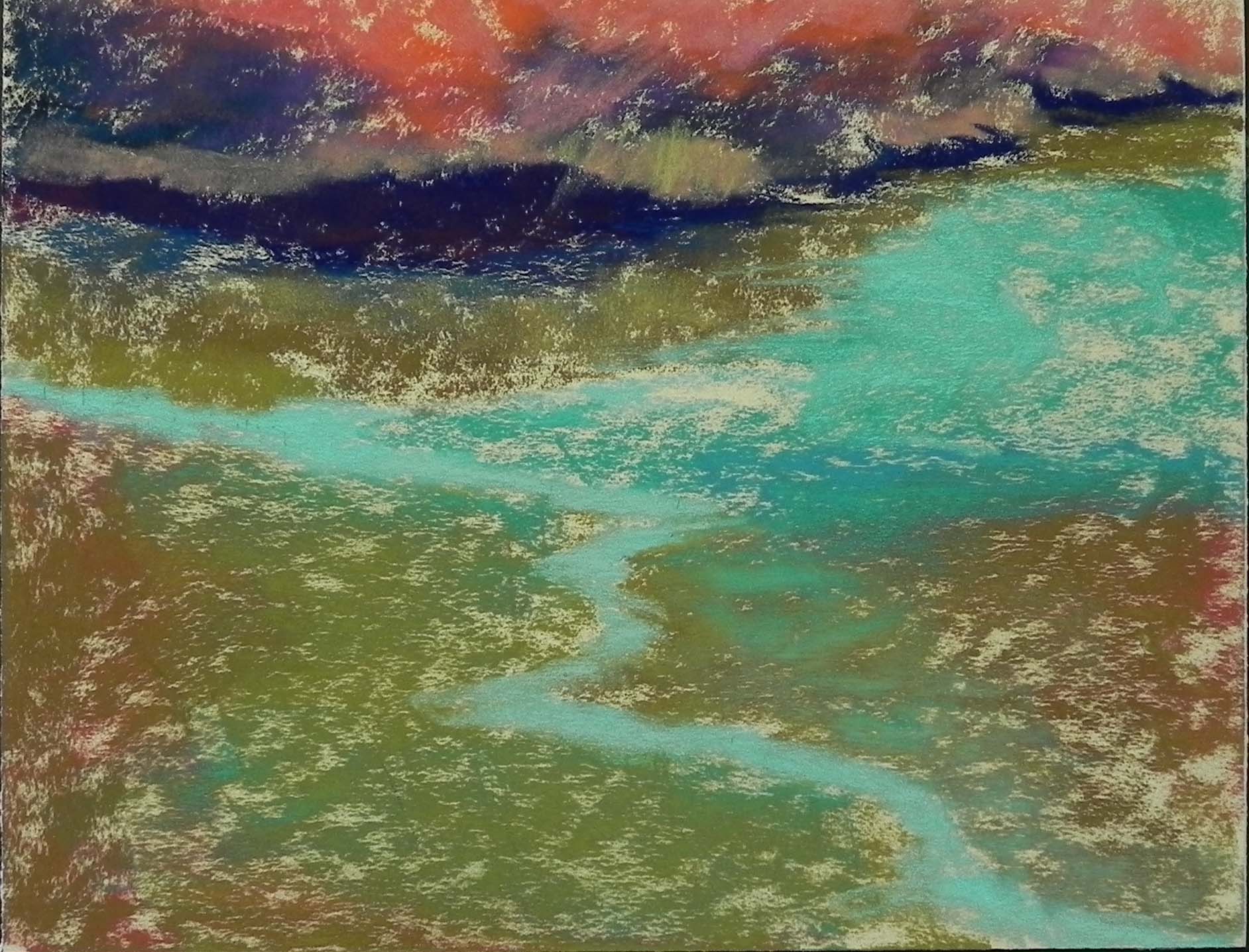
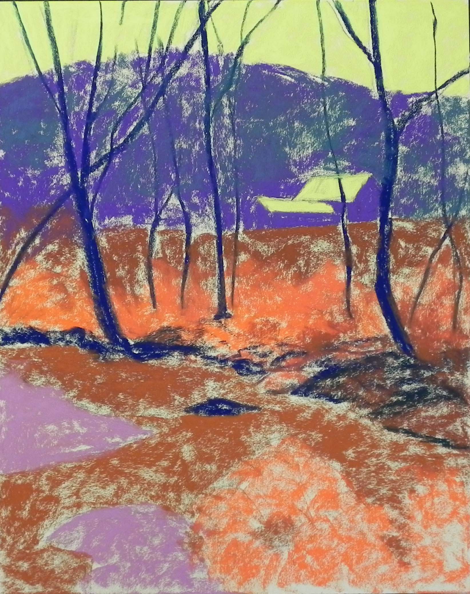
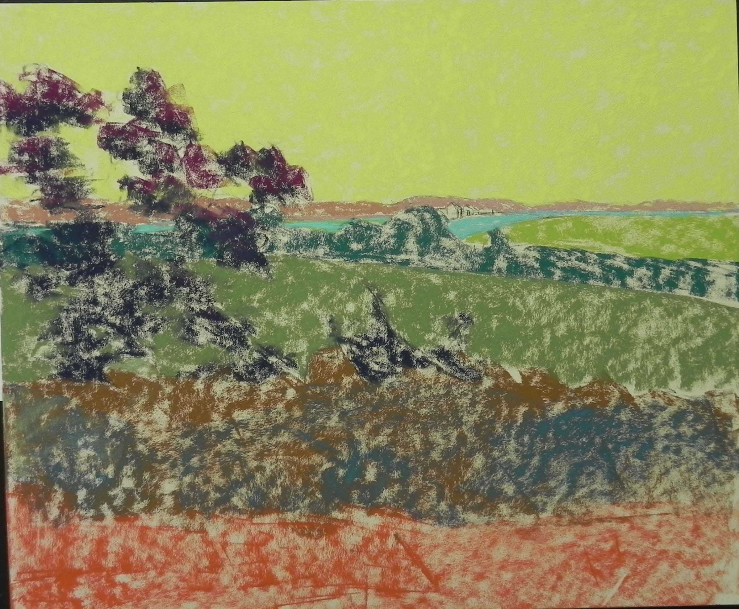
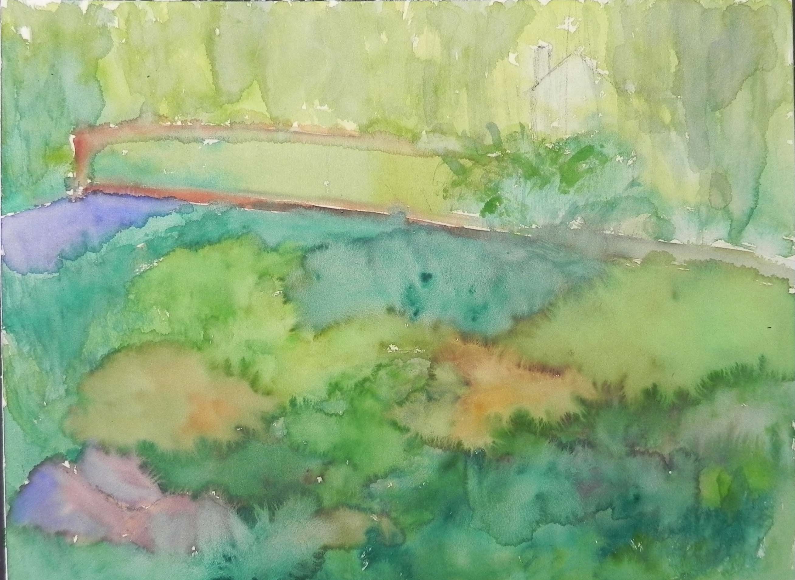
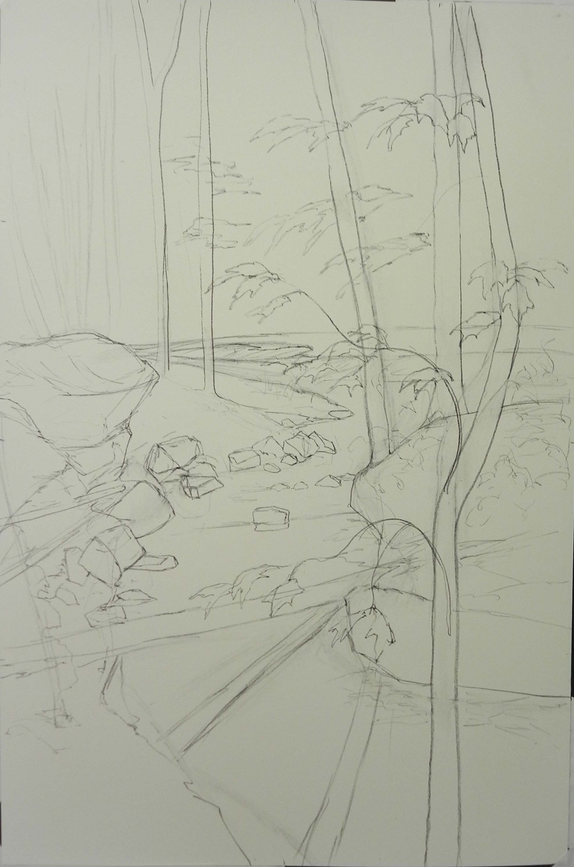
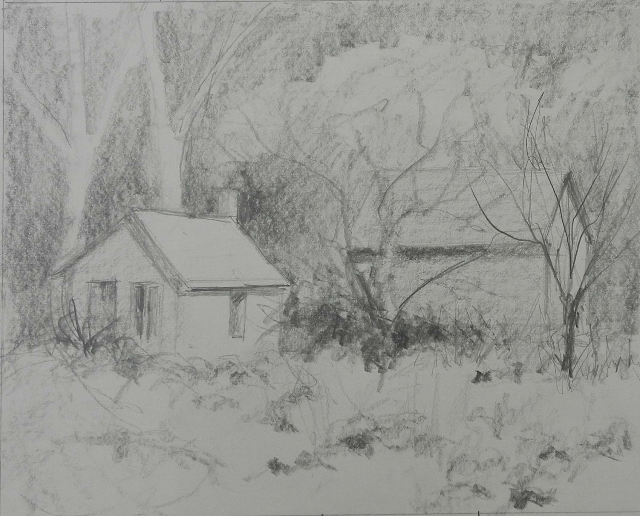
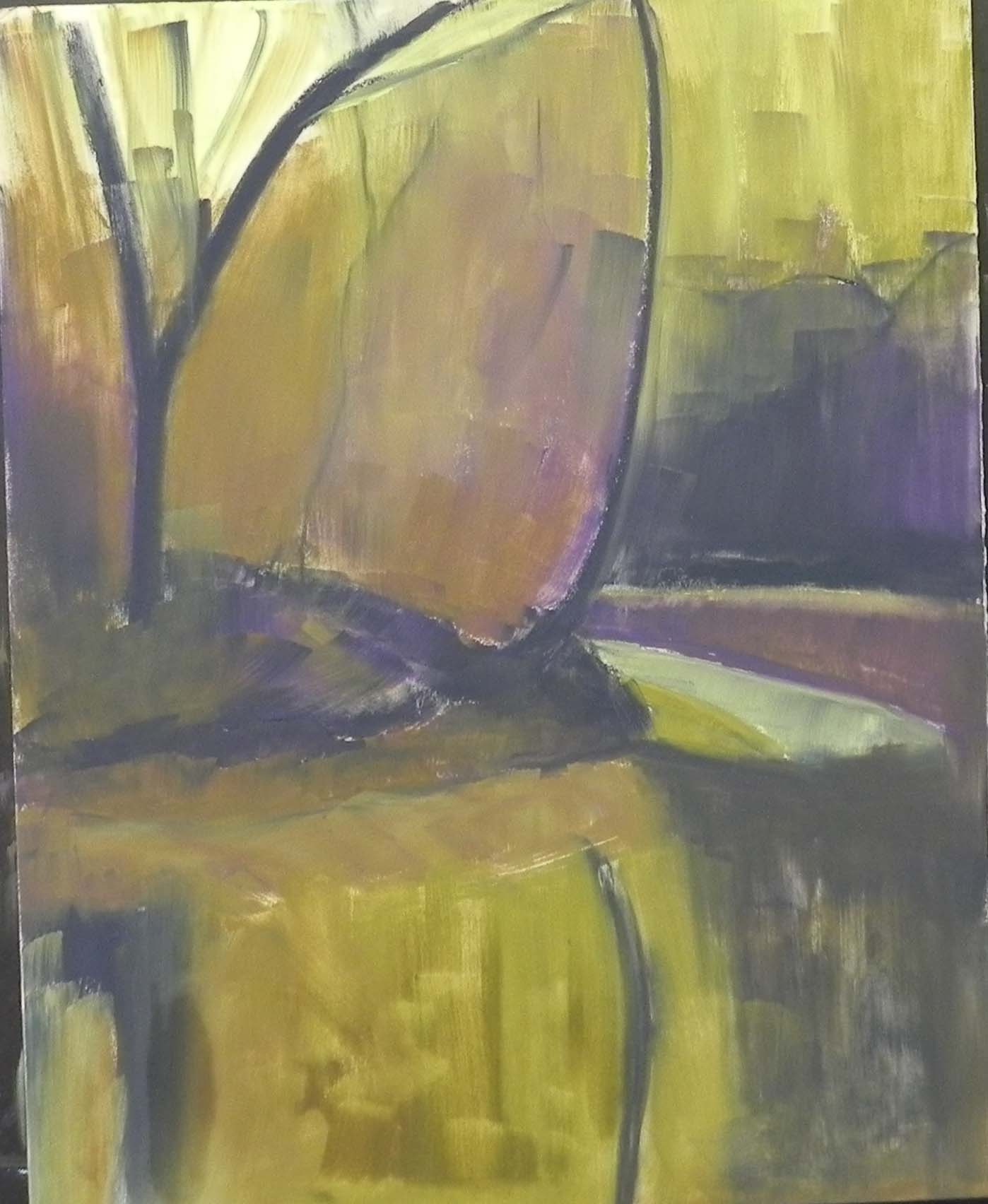
Underpainting, stage 1
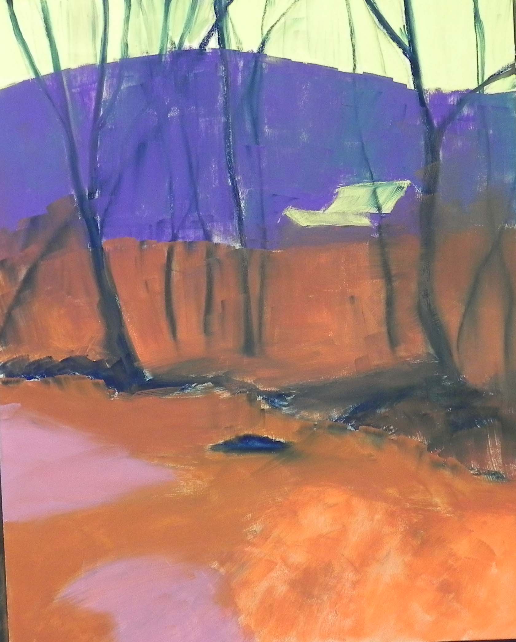
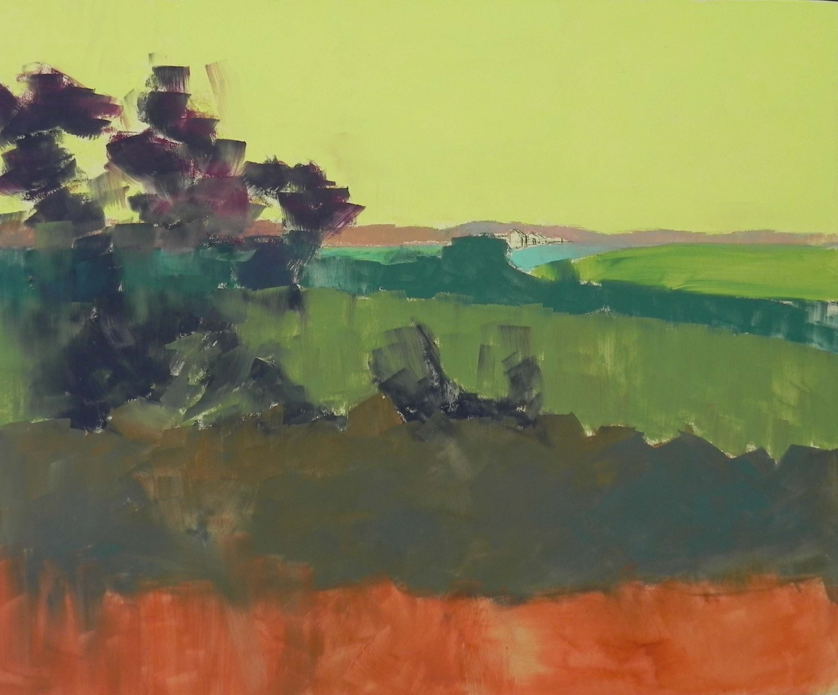
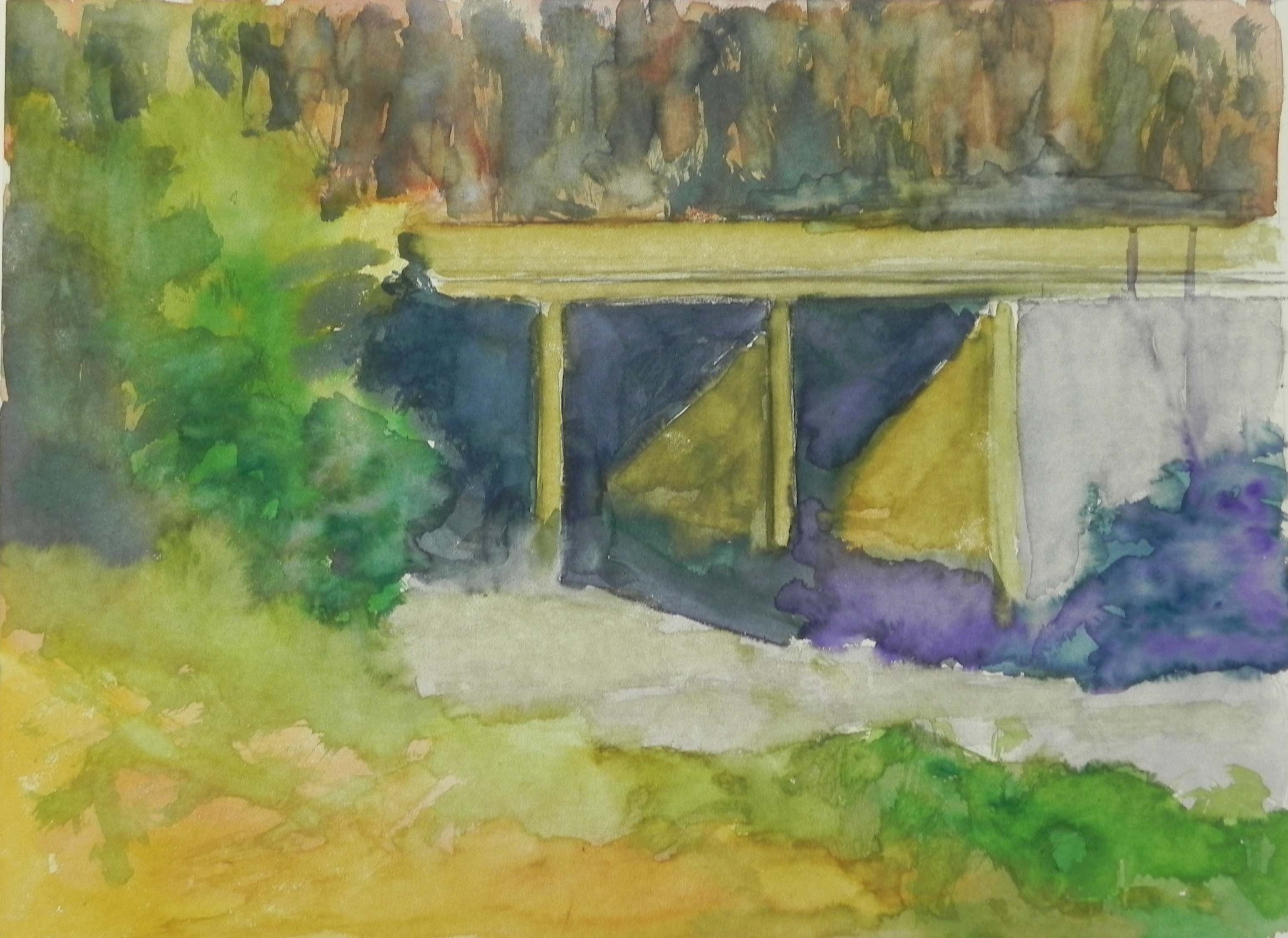
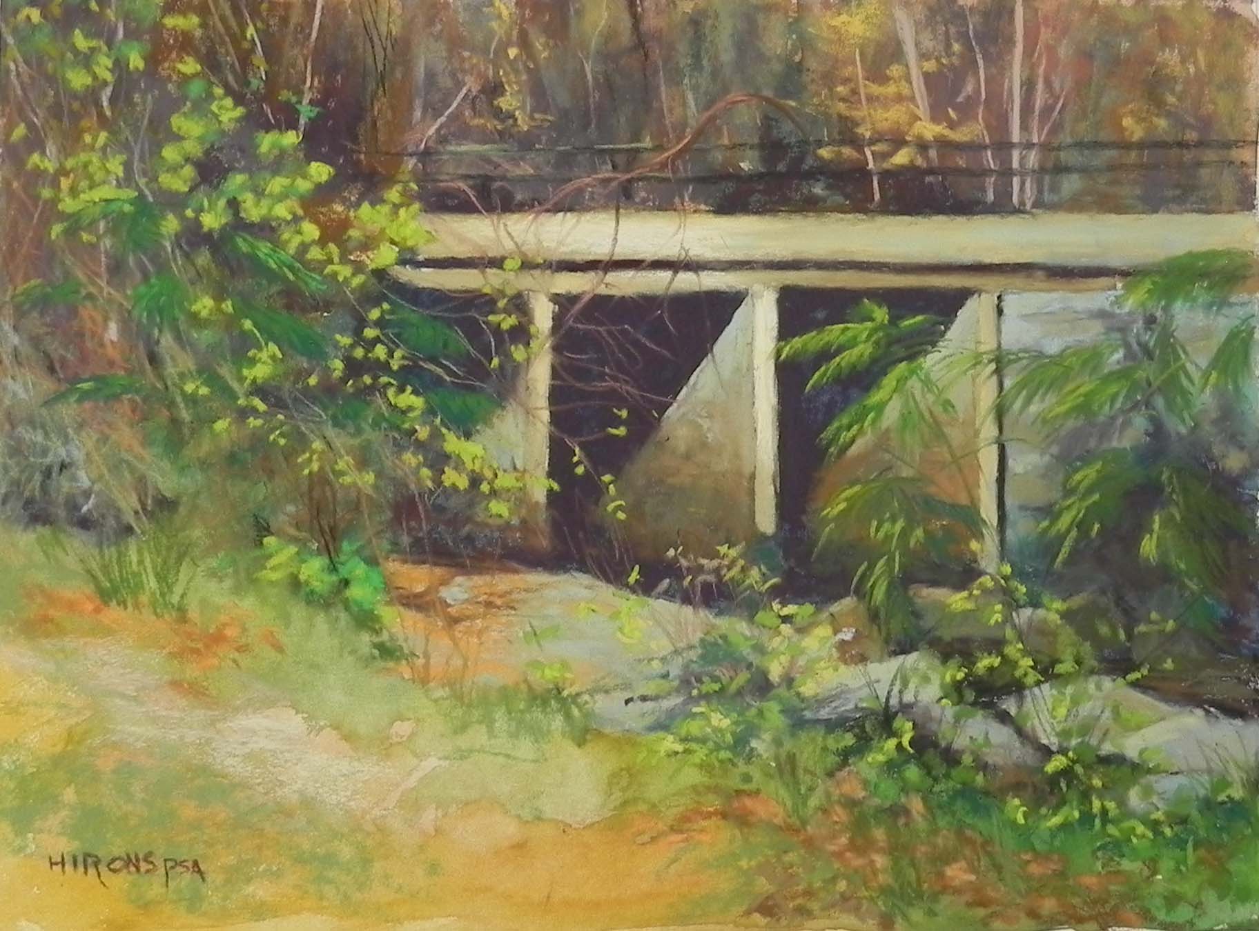
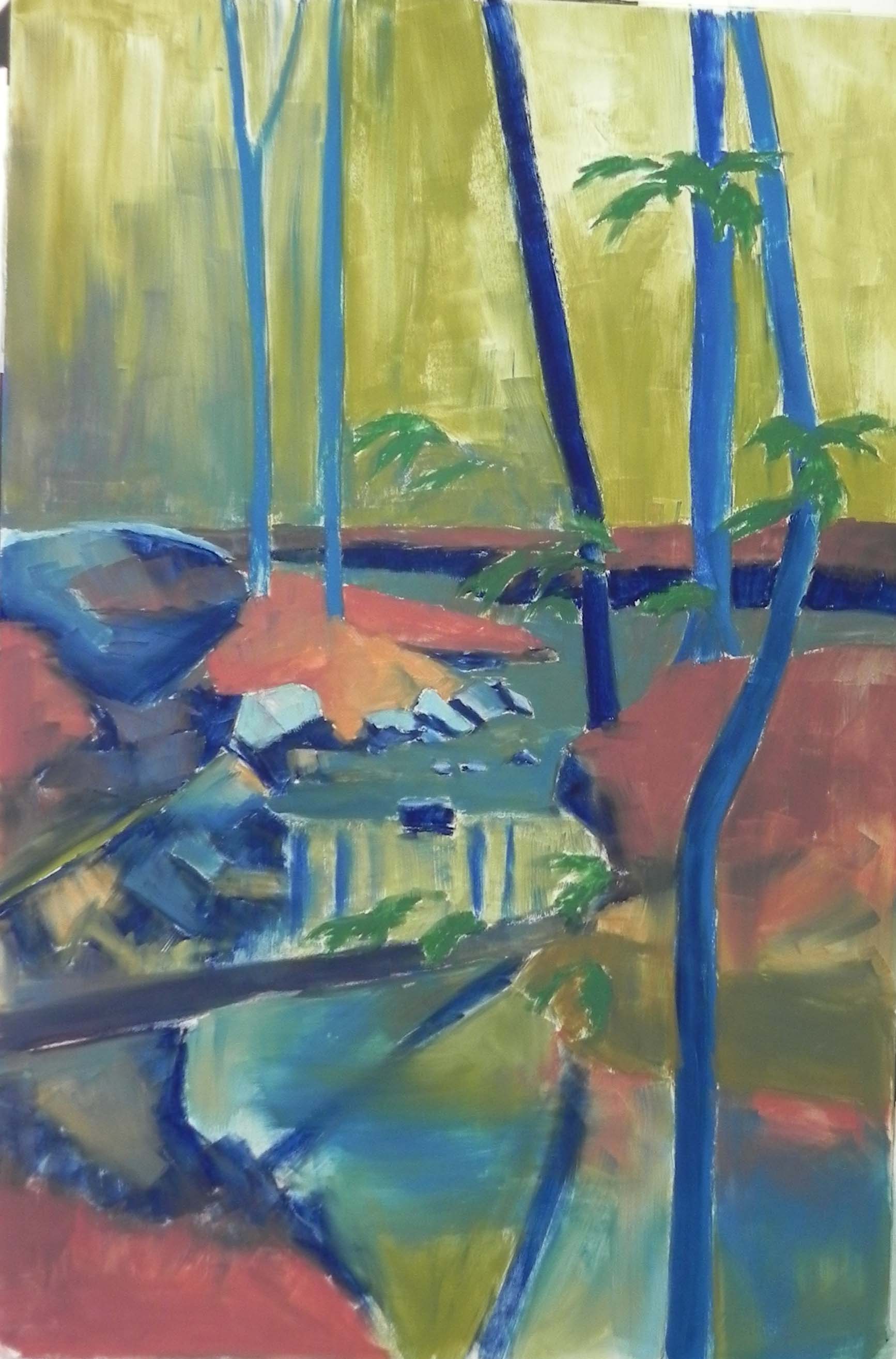
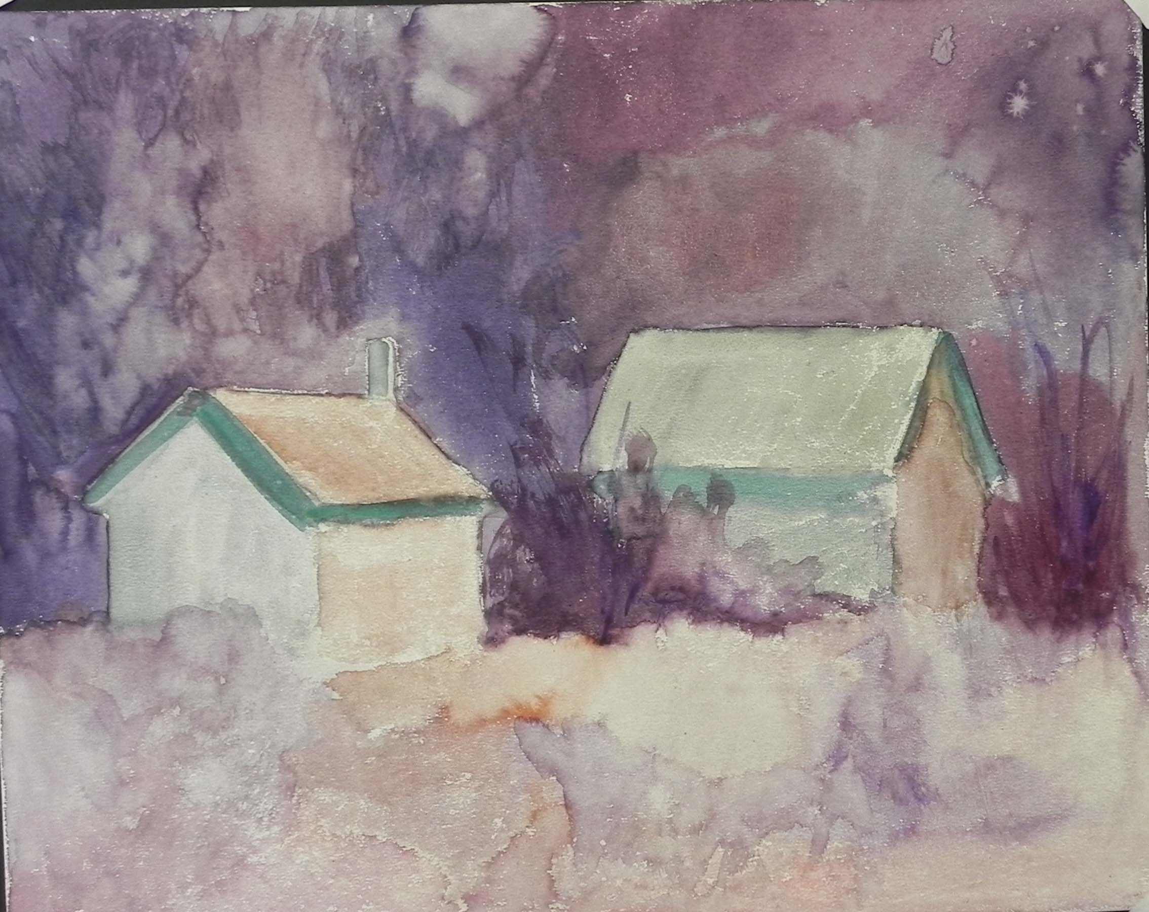
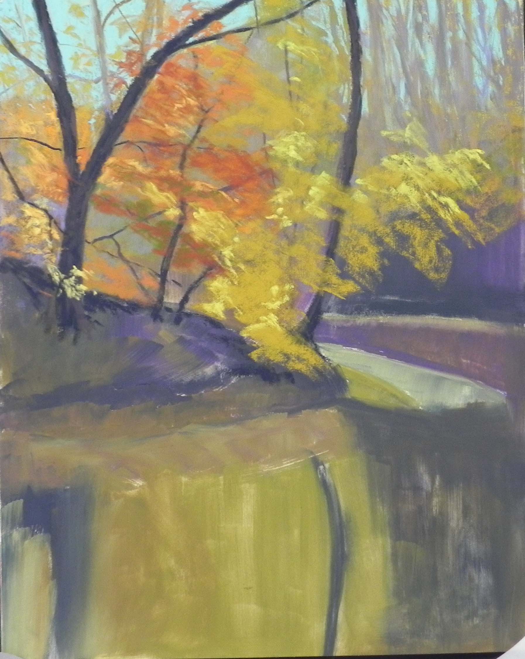
Underpainting with alcohol
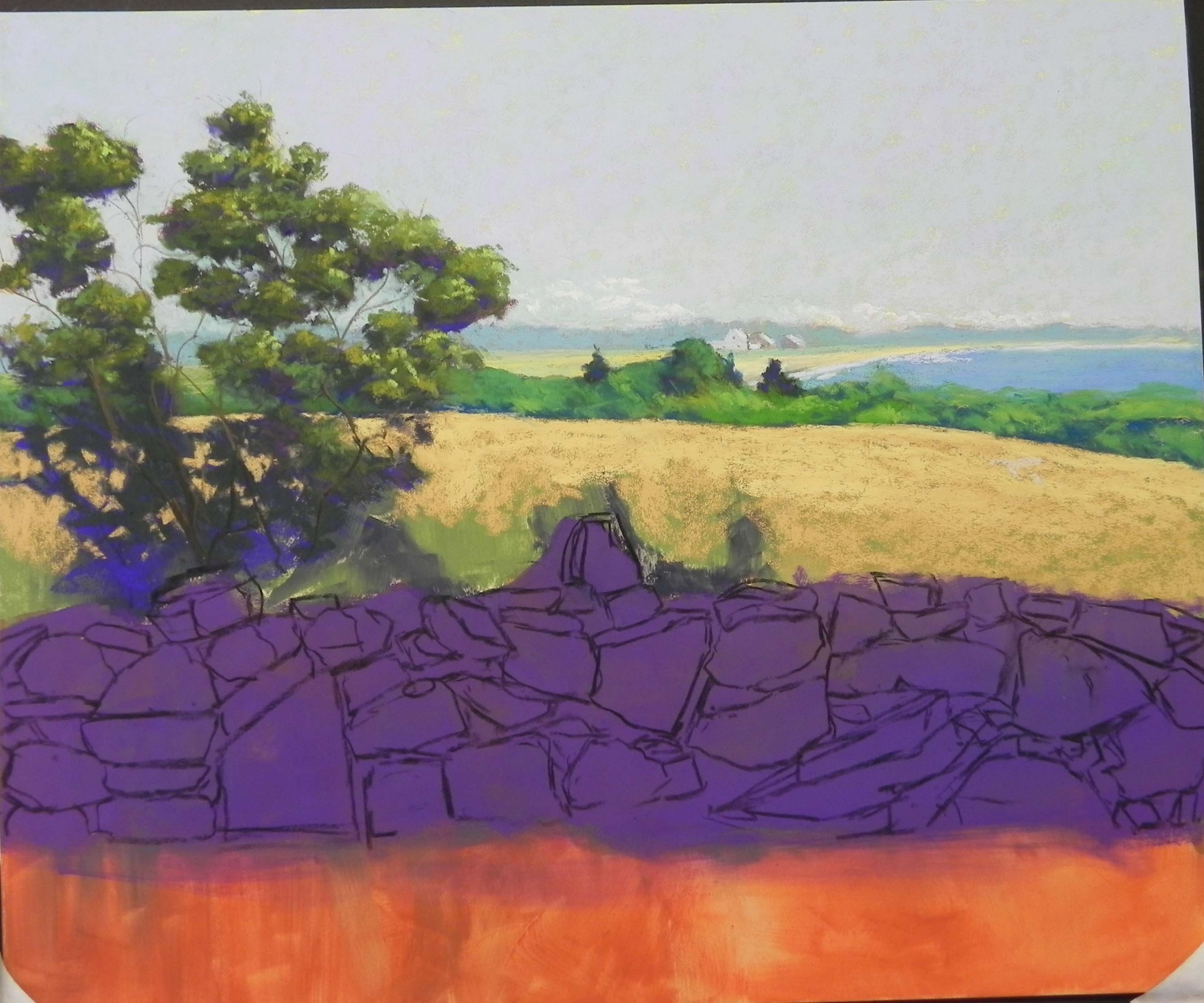
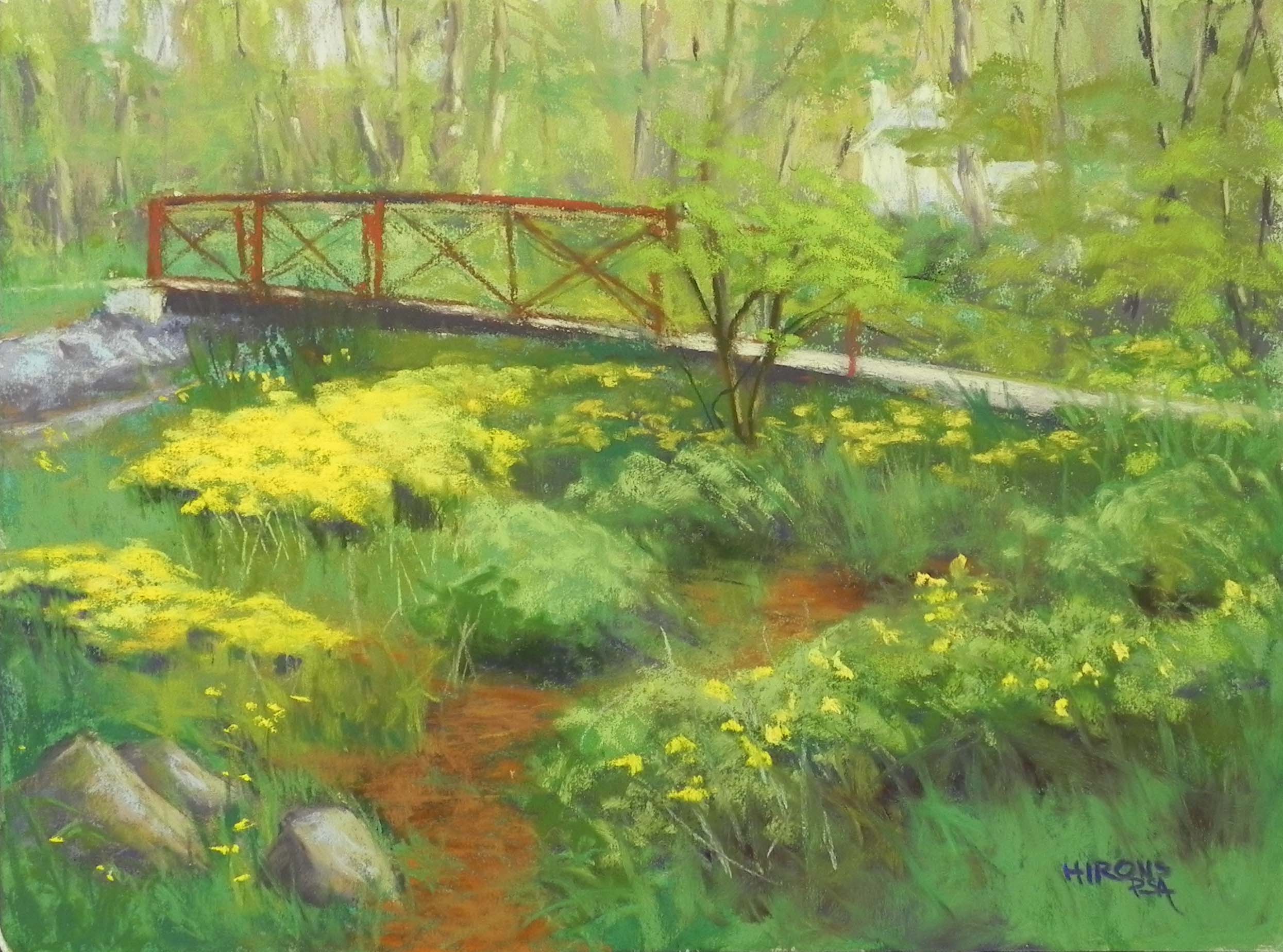
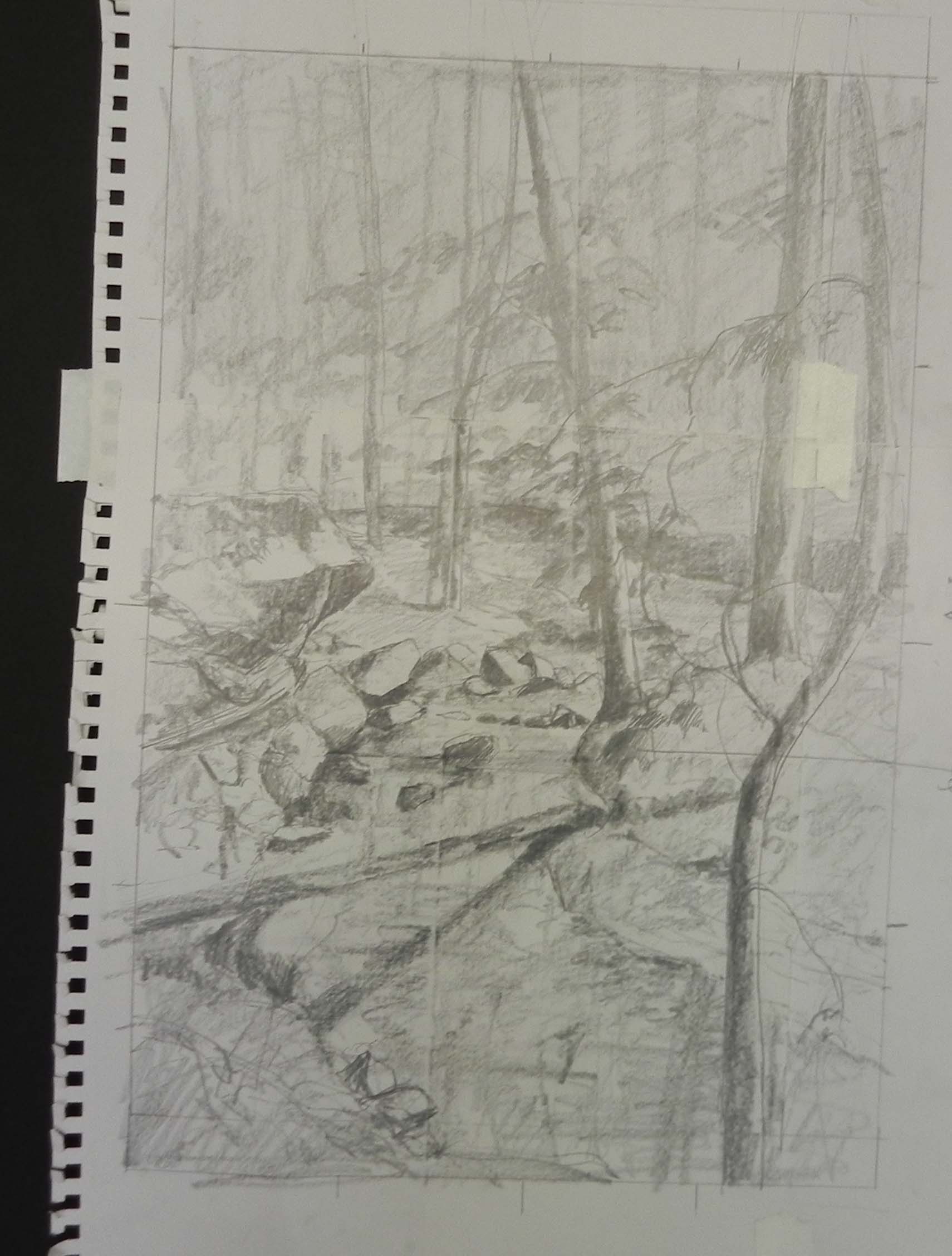
I’ve been tardy at posting! Actually, most of my painting lately has been demos for the Rock Workshop and I didn’t want to post them in the blog. I needed something for my email newsletter so on Saturday I worked on two paintings from our recent trip to Lewes, DE and Chestertown, MD. I began with an 11 x 14 of a close up picture of heron and an amazing pattern of water leading up to him.
I began with an underpainting with colors I really like. I think this could make a really interesting abstract painting! But, I went on to reality.
I have a lot of new Ludwig “eggplant’ sticks so I couldn’t resist using one for the darks under the reeds. I developed the middle greens then the lighter tops of the grasses in light with a variety of mainly grayed Giraults. After looking at it more, I realized it was too dark and outlined looking. So I brought more grayed greens over the dark in the far right and work at bringing both grayed greens and some of the lighter colors down. (I had a very hard time filming this picture due to the darks and lights.)
I tried to keep the foliage above the grass fairly loose and suggestive, but tweaked it a bit too much perhaps.
The reflections came out nicely, however with vertical strokes of warm Girauts and a blue green added on top.
For the water, I used primarily Ludwigs with a variety of blue violets and turquoises. I began the sand area with a brown Girault, then layered a grayed violet over it. I worked hard at trying to fuse the turquoise water with the more violet wet sand areas.
There were no grasses at the bottom in the photo but I decided it really needed them and used another photo as reference. This made a huge difference compositionally (my husband was happy!).
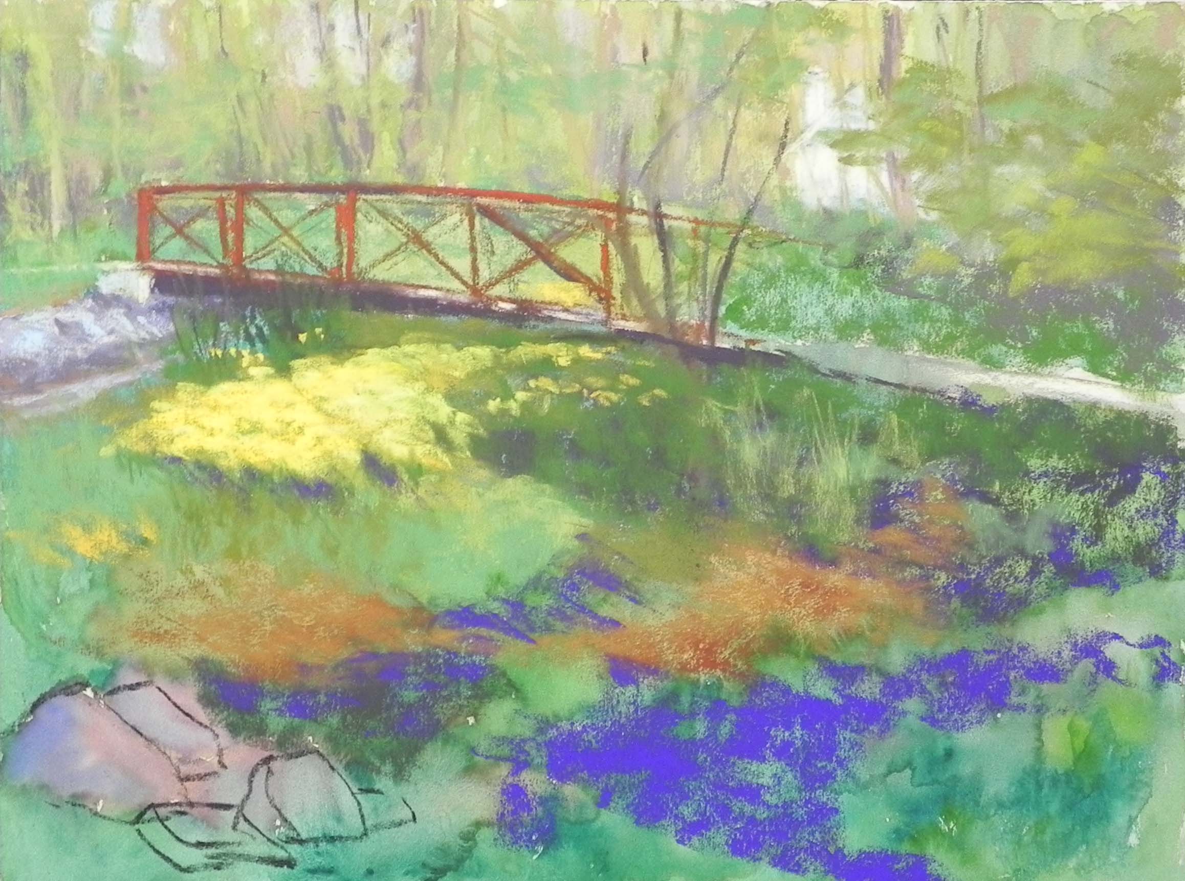
Finally, I added the heron. I had a number of shots of him. In the this photo, he was hunkered down and facing left, so I used another photo where he was standing up and facing right. I like the angle of the water leading to him and him going off in an angle to the right. I think it provides the needed balance.
This was a fun painting to do! Finding unusual things in nature can be fun but you don’t want to overdo it. It must look natural and believable!