
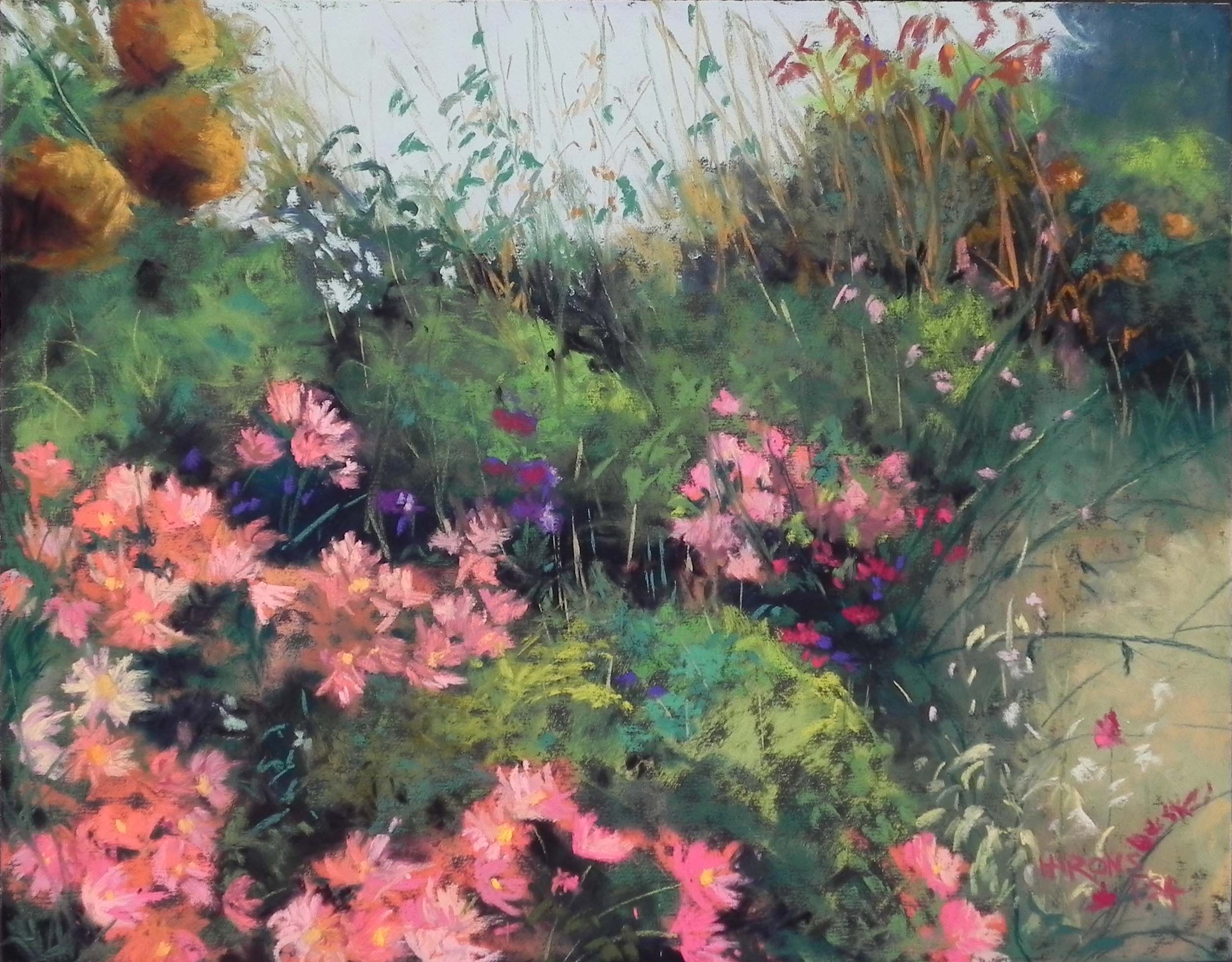
Profusion of Pink, 11 x 14, UART dark
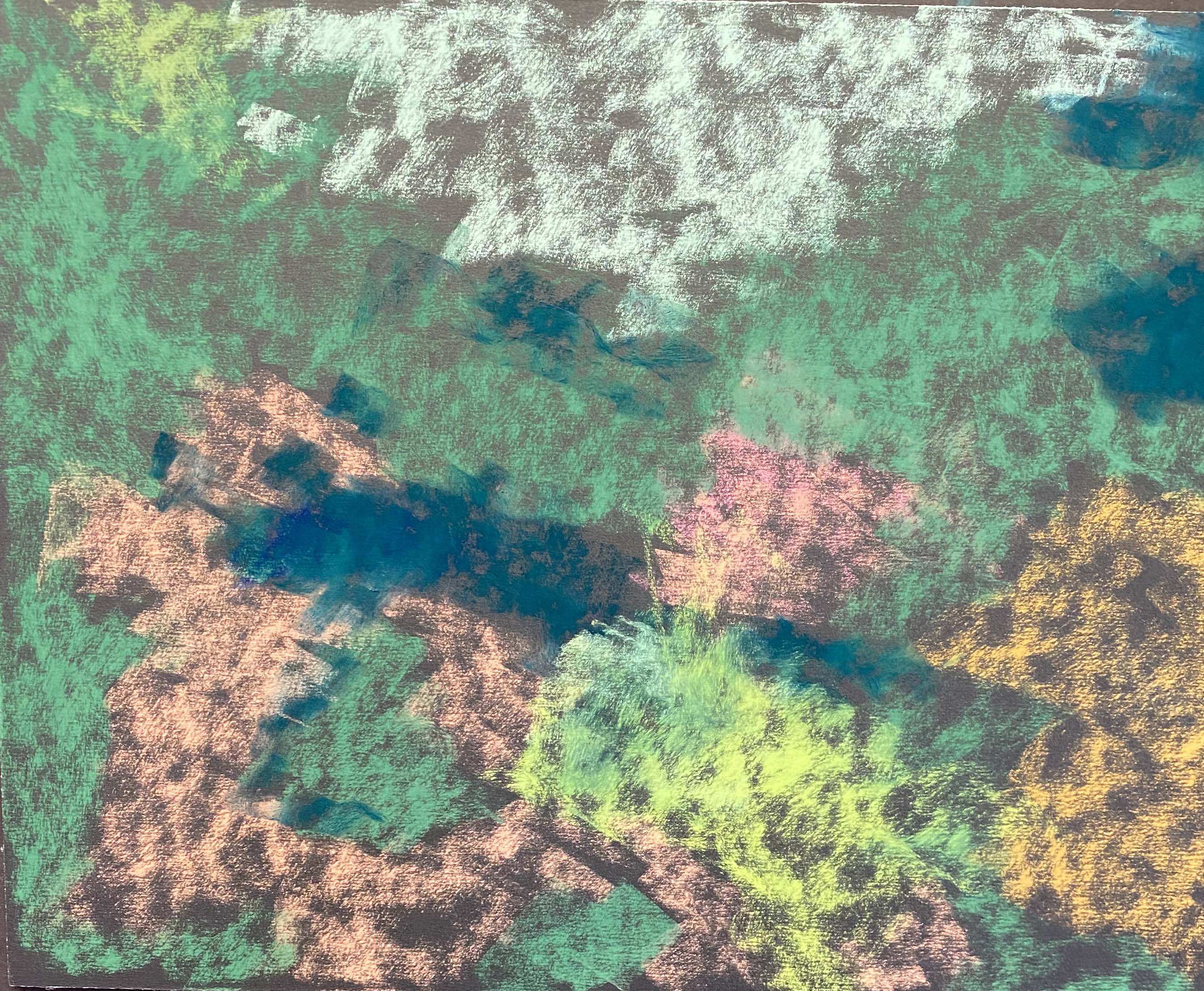
Stage 1
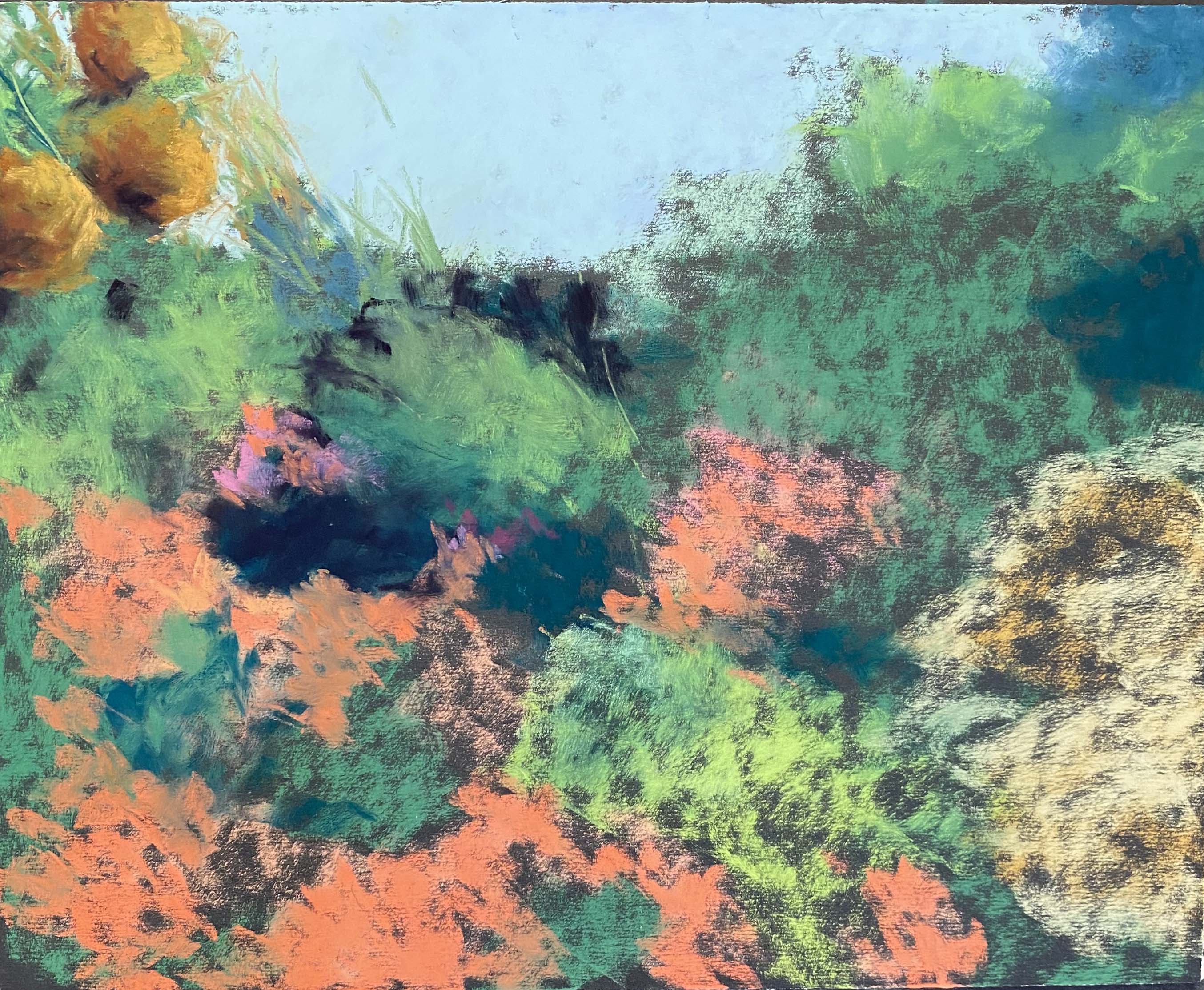
Stage 2
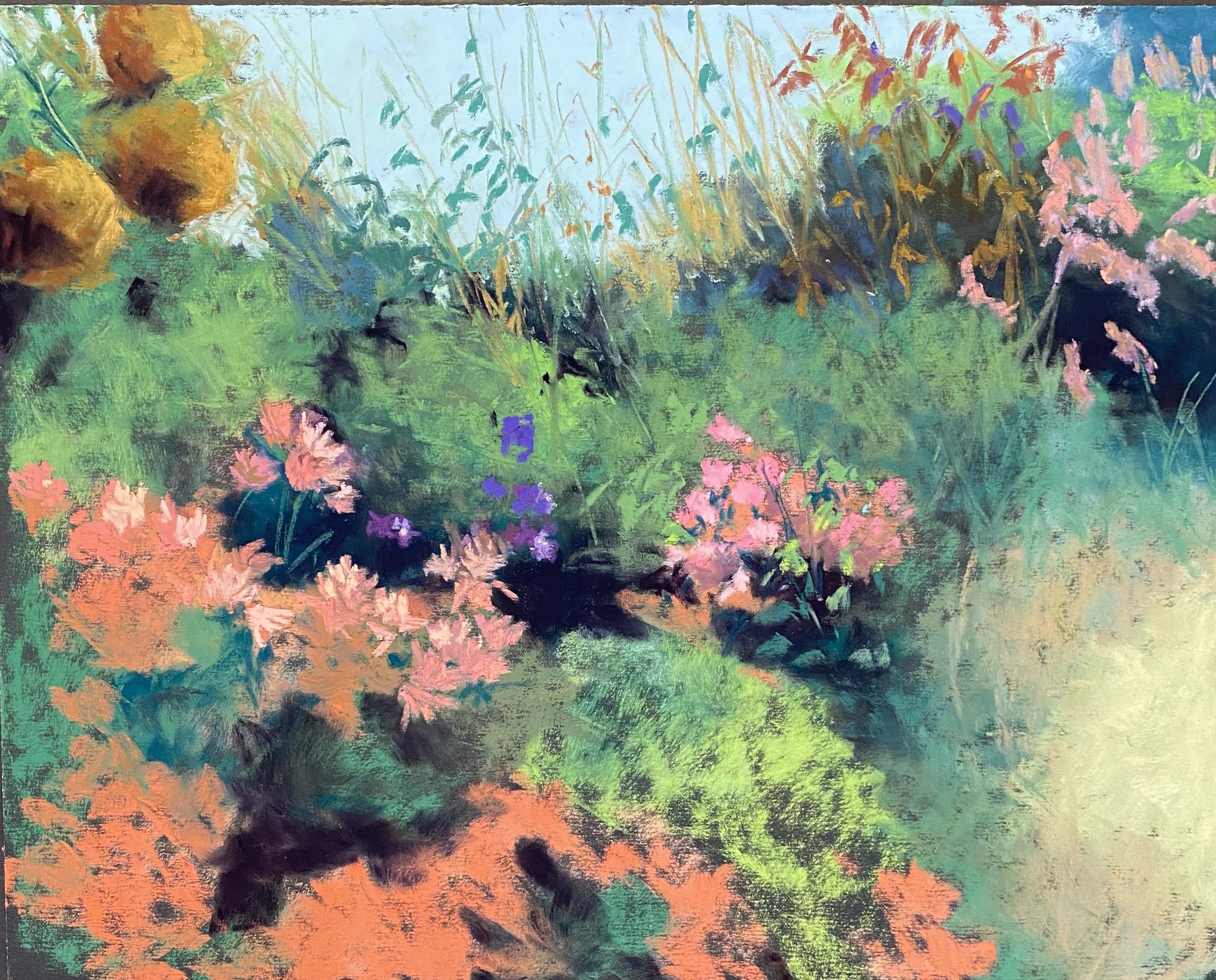
Stage 3
Stage 4
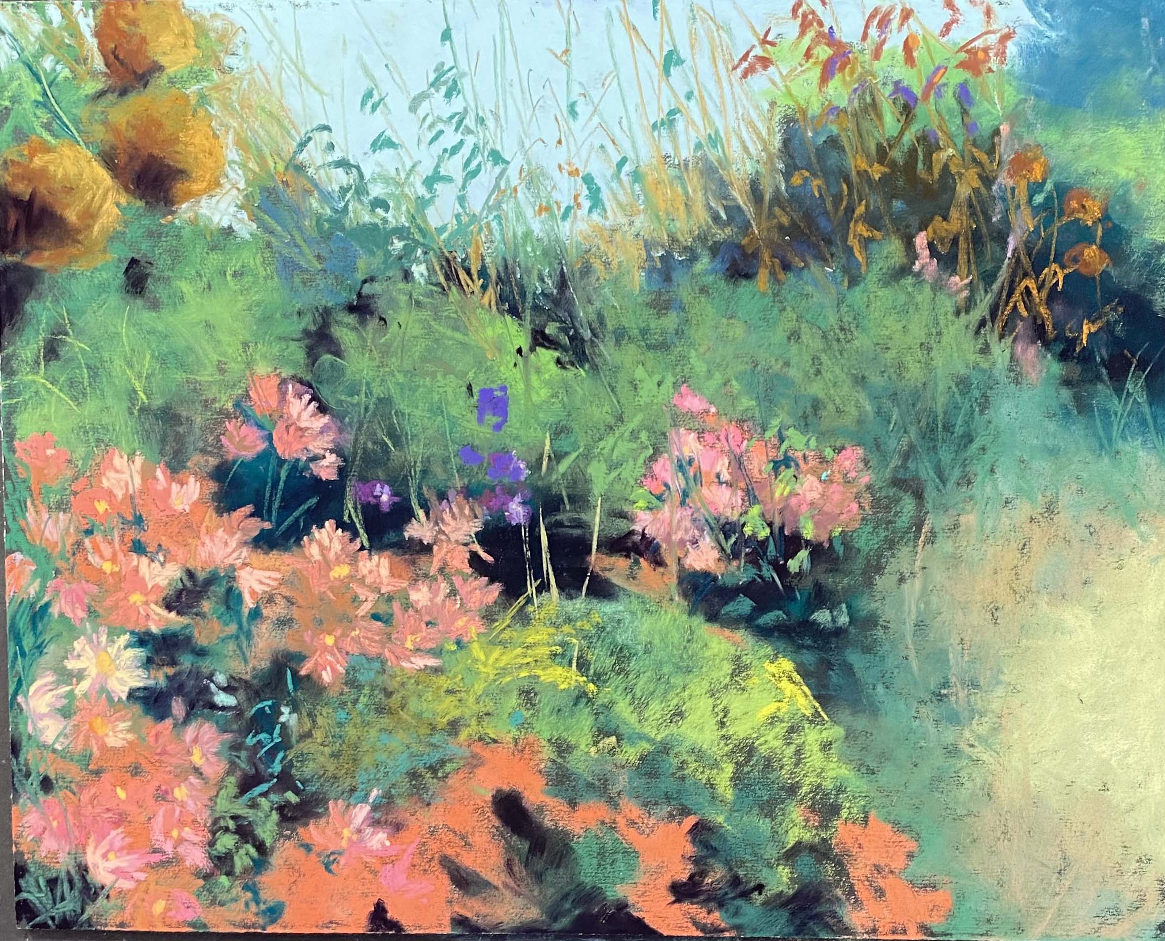
I’ve been working on a series of 11 x 14 florals on dark UART for a March show in Frederick, to go with Cactus Garden in Rain Country. This really is the perfect time of year to be doing these with the cold and gray weather we’ve had.
This is the first one that I started. I loved the photograph for its softness and profusion of color. I could just barely see a composition! This is NOT my comfort zone!
So I began with hard pastels, laying in the shape of the sky and the dirt area at right, then used greens, pinks, oranges, and dark blue green to very roughly establish the shapes of the flowers and bushes. This first stage looks like nothing! But it was enough.
In the photo, the asters in the foreground are kind of a coral color, with a mix of orange and pink that I really liked. So I used an orange as the basis of the color for them. In stage 2 I’ve added several soft Ludwigs (blue and turquoise) for the sky and I’ve painted the orange balls at left. I thought about leaving those out, but as soon as I did them, I loved them! In the photo the far right has tall spiky pink flowers. I put them in to begin with, then didn’t like them and decided to put more of the orange balls (dead hydrangeas, I assume) over there as well.
I loved painting the sandy right side of the painting. I used Blue Earth grayed “earth green” and grayed “turquoise” and these were a lovely combination. I waited till the end to add the little leaves and branches on top, but I really liked the negative space this created. I also used these two sets for most of the greens in teh picture, going back and forth between warm and cool.
Painting the asters was the biggest challenge. I just haven’t done a lot of this type of thing. I used a mix of pinks and oranges in different values, all soft. Once those were done, I did more work on the greens. In Stage 4 you’ll see a large dark area in the upper right. That was way too much, so I added more of the dull green on top and minimized the dark.
I was pleased with this painting, even though my husband says it’s very busy. I like the busyness of it, so long as there are the areas of calm to rest the eye. It’s about nature going all out in September when it knows that winter is just around the corner!