
Hello Friends,
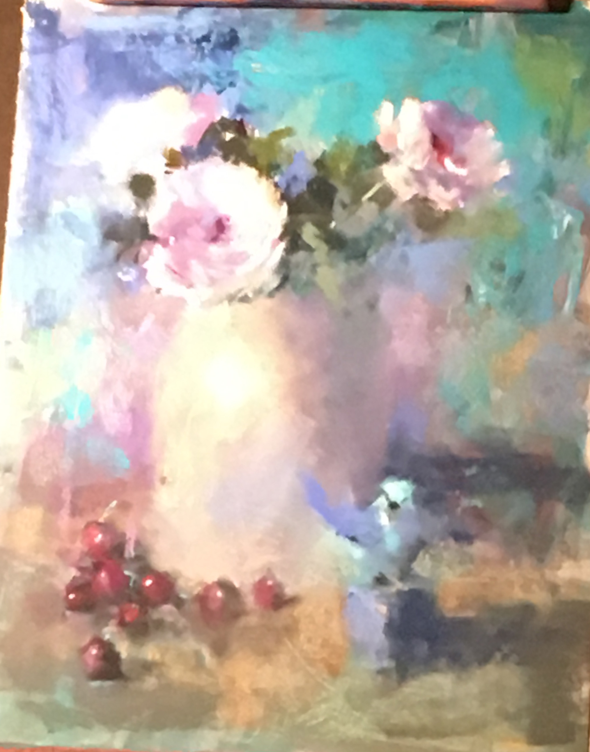
Still life by Mike Beeman, 20 x 16
I’m back from a trip to Albuquerque to the 2017 IAPS (International Association of Pastel Societies) Convention and a few extra days in Santa Fe. My good friend and fellow pastelist, Sunny Alsup, was there with me–her first time. I’ve been to every conference since 2003 (it’s biennial). I’m thinking this may be my last, so it was rather a bittersweet experience for me. I want to share with you my impressions of the 5 demos I attended and news of new products from the trade show–always a hightlight of the conference (I’ll add this in a separate post). I attended demos with: Mike Beeman (still life), Tony Allain (landscape), Casey Klahn (abstract), Colette Odya Smith (landscape) and Dawn Emerson (abstracted animals). 4 of the 5 were well worth being at. I was very disappointed with the Klahn demo and didn’t care for his attitude or demo. So be it! I loved the others!!! Mike Beeman is a friend and a wonderful artist who is a master at losing edges. His paintings are primarily still life and small birds. He noted that years ago he NEVER would have considered painting flowers, still life, or birds! Consider that he lives in Cheyenne, Wyoming and is a very western looking fellow! My main interest in the demo was to find out how he was so good at losing edges. He worked on gatorboard using inexpensive acrylic paints to create a very loose underpainting for a still life with a jug and flowers. He then covered that with clear Golden gel to give it texture. He worked over it with pastel, keeping the drawing at a minimum and developing the shapes more than the lines. I was very inspired by this! He also did a LOT of finger blending. Some with insulation pipe, others with his little finger, but it was a major tool for him in softening the pastel. (As someone who rarely blends, I found this quite interesting.)
My photo is poor, due to the lights and angle of the painting, but perhaps you can get the idea. The main subjects were the flower in middle and grapes at bottom, and the head of the small bird sculpture. I was quite intrigued with this, and I have acrylic paint, and I just might try this!
The next day I watched the Cornwall artist Tony Allain give a demo. I had met him at the previous IAPS, then again last summer in the Perigord, where he was the featured artist at the Pastels en Perigord Salon. His work is very bold and direct. He works on Colourfix toned with warm browns or grays and makes great use of the paper. In the two hour demo he did 4 large paintings! I only have a photo of one as the lights made it very difficult to film. In this painting you can see that he left the paper at the top and bottom and used minimal strokes to represent the boats. He says he has too little time left to get into detail! He began the painting using a large marker to put in the dark shapes that you see, including the people in the center. He then used single strokes of pastel to indicate the light and shadow. I thought his last painting was the most amazing, as he painted a lake in New Zealand with a background of rock and snow. The contrast of blue violet snow and gorgeous aqua/turquoise water and yellow snow was quite amazing. Alas, this is not who I am. But I do admire it!
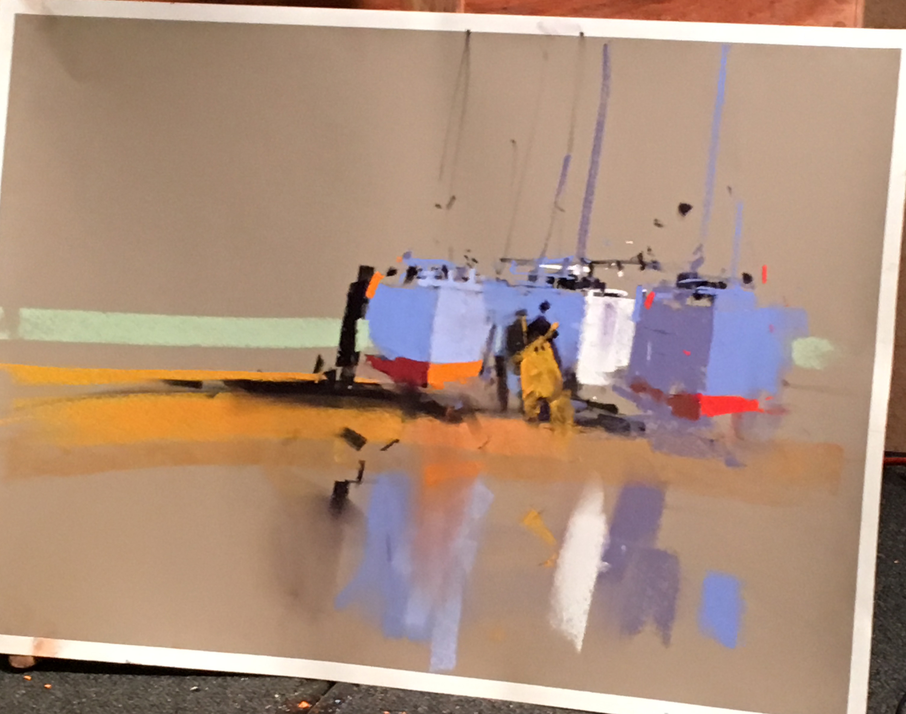
Painting of boats by Tony Allain
I took no pictures at the Klahn demo. He gave no thought to his composition and little to his color scheme and both Sunny and I thought it was rather a waste of time and money (I’m being very honest here!) If you like him, that’s fine.
Next there was Colette, a personal friend, and the artist most like me. Alas, my photos of her work don’t look like much. She is from Wisconsin and paints detailed paintings of close up views of streams. She showed us photos and how she cut them down, then presented a beautiful underpainting, very carefully done with watercolor. She works on museum board with Golden gel, adding the watercolor over the gel. This is a lovely surface and great if you want a thick, soft surface in whatever size you want. She spent 1.5 hours on the underpainting (prior to the conference) and I was quite impressed and understood why she didn’t try to do it in front of us. And she didn’t finish the painting either, but she shared so much. It was a lovely demo. I related to everything she said.
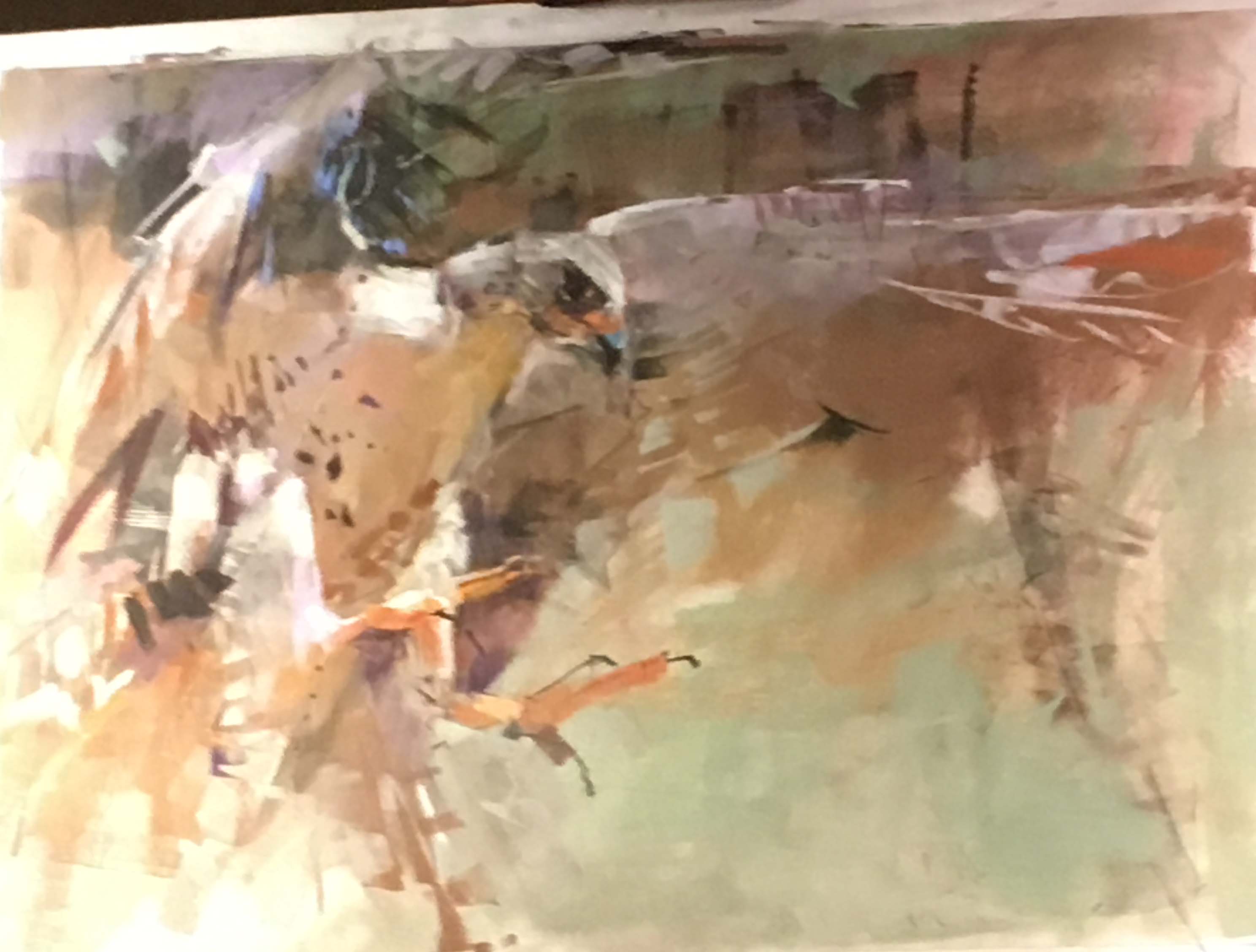
Painting of Swainson’s Hawk by Dawn Emerson
And finally, there was Dawn Emerson. I’ve seen her abstracted paintings for years but knew very little about her. Sunny and I were both there and at first we weren’t sure what to make of her. She is very much her own person and quite bold! She did two demos. She likes to use multiple types of media, not worrying much whether the result is a “pastel” or “multi-media” painting. She particularly likes brayers! She had two large tables full of materials, many of which she didn’t use. The first demo began with a black ink monoprint of ravens (she used to have 5 of them and you could tell how much she loved them.) She used pan pastel while dancing to music, putting on individual strokes with wide arm gestures. Then she did another demo of a hawk directly on white paper. My photo doesn’t do justice to it, but perhaps you can get the idea. She was working from a photo of a hawk sitting on someone’s arm with trees behind. (It was at a center in Bend, OR that I have visited as we have a friend who works there!) She focused on the basic gesture of the head and wings and used pastel with a wide “pastel smoother”, ink with a brayer, pan pastel, and all kinds of pastels to gesturally develop the painting, all the while dancing to music! It might have been kitchy, but it wasn’t. It was a very moving experience that we all felt and she sold the painting, not surprisingly. I had great respect for her. One of the most impressive parts is that she used no lines for the hawk, instead developing the shape of the wings by cutting in with the background colors. She really reduced the wing on right to just a gesture, as you can see, focusing on the face and eye and adding the talons in gestural strokes. I thought her painting was a very emotional reaction to the beauty of the hawk and I was greatly impressed with her ability to express it so freely. It was a great way to end the demos.
Loved your comments on the demos. I pretty much agree with all of them. I took a workshop with Tony Allain and really enjoyed it. He’s so personable and I love his work, but as you say, it’s not me. Mike Beeman achieves what I strive for: much looser paintings, fewer details, lost edges. Beautiful. Dawn Emerson’s hawk just blew me away! For me there’s no question that her work is pastel drawing. It’s definitely painting. Wish I could have been there. Maybe in 2 years I’ll actually get to IAPS. Thanks so much for sharing your views.
Dana
Thanks so much Dana! Glad to know that I’m not alone in my opinions! I DO respect integrity. Glad that you like Mike’s work. I think it’s terrific and I really like him as a person–completely natural! I hope that you do get to IAPS. It’s worth it. But it may be the end for me. Time to leave room for others.