
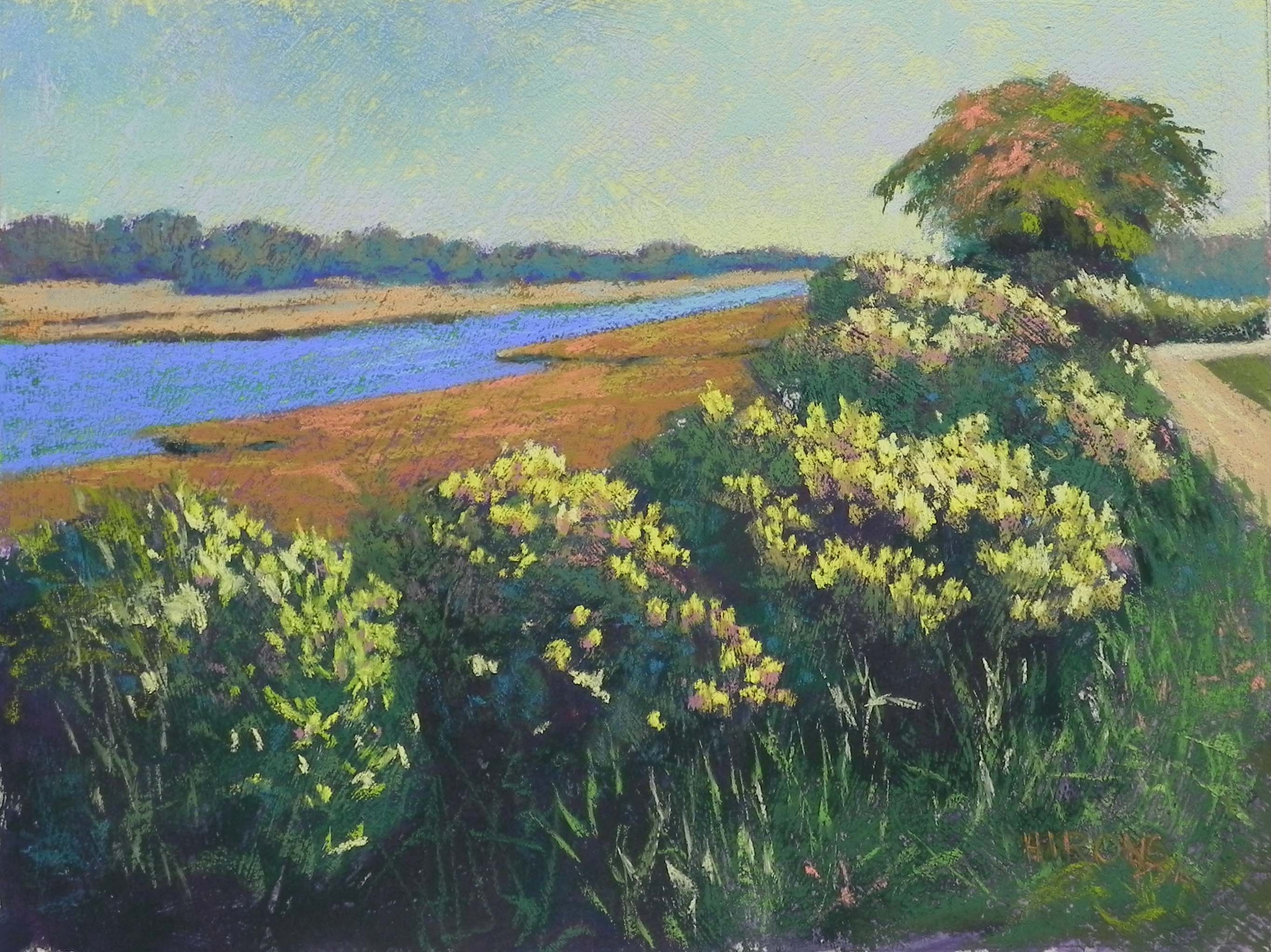
Sepowet Blooms, 12″ x 16″, Rives with Golden fine pumice gel
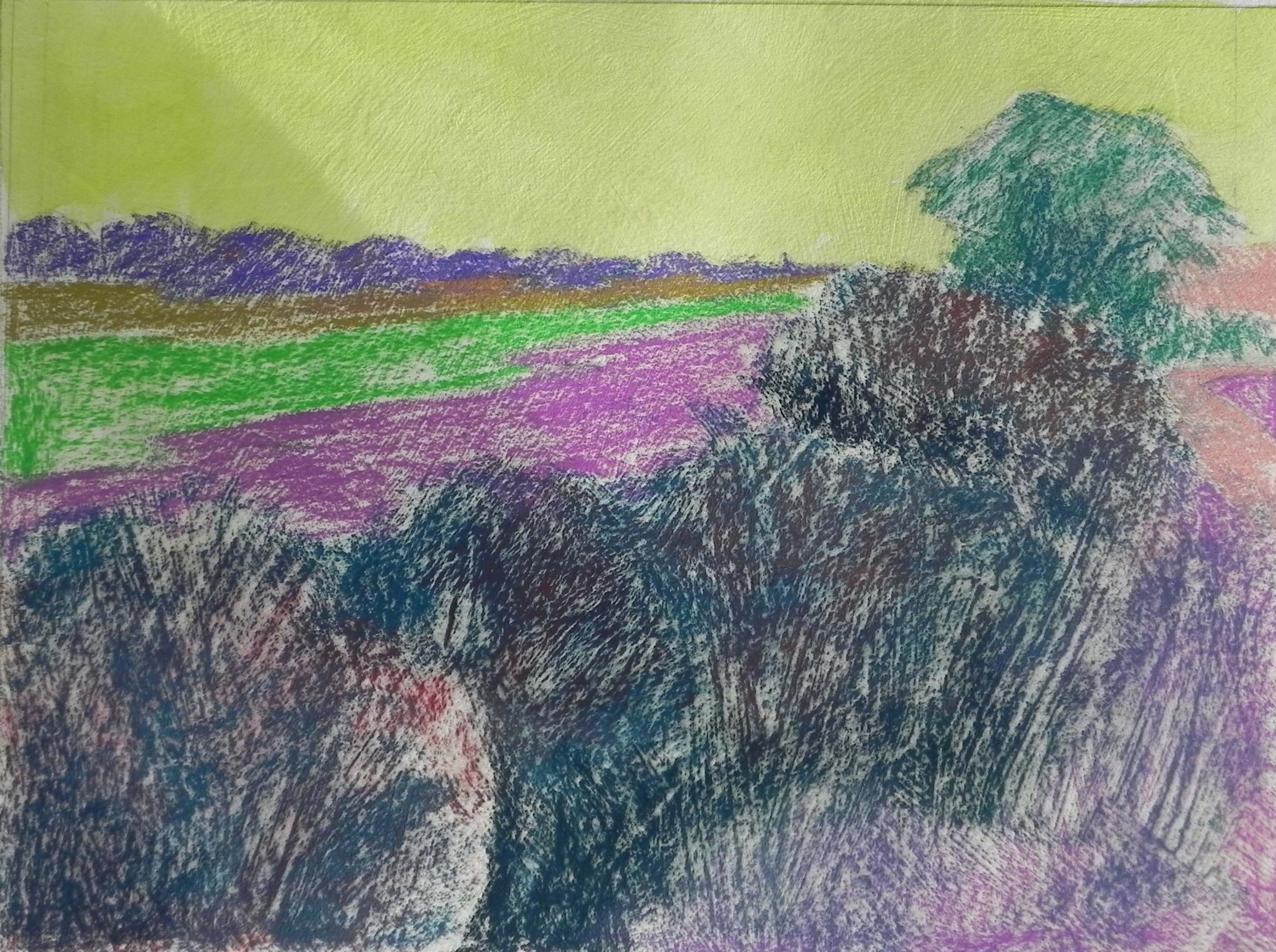
Underpainting stage 1
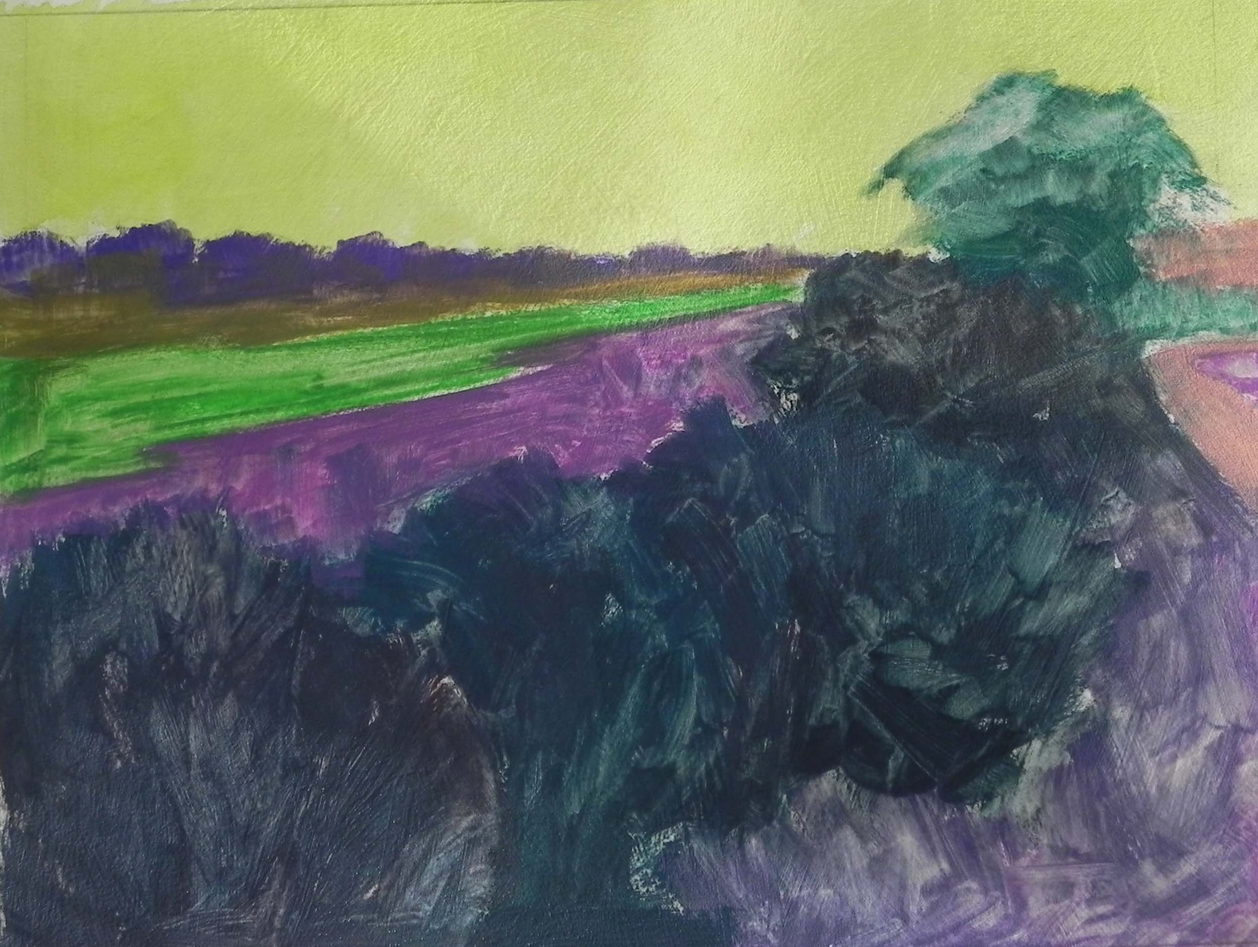
Underpainting stage 2
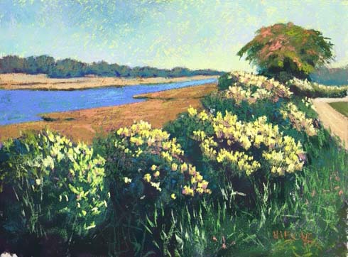
Iphone version for comparison
My second painting of the year, just finished this morning, is for an upcoming show called “Shorescapes: Maine to Chincoteague” which will be held at my church in Bethesda this April. I probably mentioned it when I posted the Adamsville painting. Anyway, I decided to try another 12 x 16. The photo was taken at Sepowet Marsh in Tiverton, RI, one of my favorite places to paint in New England. It was taken in October so the grasses by the river are brown. The flowers in the photo were white and there was no tree. Instead, the lovely progression of flowered bushes led the eye to — a telephone pole!!! I knew I had to do something with that.
I did an initial drawing playing with various possibilities. My first thought was a house roof appearing above the bushes. I tried this on the board and kept erasing. Then, I remembered this wonderful tree from Westport and decided this would make a much better addition.
Because of the large amount of textured bushes, I decided that I wanted to work on a more textured surface. I used Rives with Golden acrylic gel, untoned. I used watercolor to tone the sky but decided I had to use hard pastel to get a dark enough underpainting for the rest of it. This qualifies for one of the ugliest underpaintings I’ve ever done!!! No question. But it worked out OK.
The original photo was pretty cool–all blues and greens with white flowers and only the marsh in warm tones. I knew I wanted to warm it up. My first thought was to use oranges and pinks in the flowers, but with the orange grasses, that really wouldn’t have worked. So I used yellows instead. I decided to add some oranges and pinks to the tree and I made the road warm, so that it resembles more of a path. In the dark areas of the bushes, I mixed a dark green with a dark cool red. Then, I added some pieces of dark turquoise which was an intuitive addition that felt right.
I was pleased with my decision to use the more textured surface. It really enabled me to get more interest in the sky, as well as creating textured bushes. I used a yellow green pastel in the sky around the tree to create something of a glow that I could see in the B&W photo.
I’m including a photo that I took with my Iphone for comparison to the one taken with my Nikon Coolpix camera, which I use to photograph my paintings. When I took the picture with the camera this morning, I didn’t think that it picked up the colors as well. So I filmed it with the Iphone and felt that it looked identical to the original painting. The problem with the phone is that the photos all come out as 72 dpi. I can save them at maximum size, but still they are low resolution. Does anyone know if there is a way to get 300 dpi images with an Iphone?
My next painting will be on my remaining sheet of 18 x 24 Wallis. It will be a painting of Great Falls with ice and snow and many wonderful blues. I found it in a book of photos this morning and knew that the time had come to paint from it. However, between now and then, John and I will be going to Costa Rica and Panama!!! Very different from what’s in that cold, snowy picture, I must say. We leave next Wednesday but I hope to have the drawing done before I go so that I don’t decide to paint monkeys or birds or something of that ilk!!!