A New Blog–Maybe???

Hello Friends

It’s been a long time since I posted.  I had a terrible autumn and couldn’t paint for quite awhile due to broken bones.  I’ve been painting a lot recently, but I have a feeling that there’s little interest in my just discussing my latest paintings.  So, I’ve been thinking.

I contacted my website company, FASO, and I can’t transfer this blog to it.  But I could begin a new one there.  I’m thinking that it might be less frequent and based more on my teaching and personal explorations.  I’ve done a lot with classes in the past year: “Seeing Composition,” “Seeing Color”,  “Materials and Techniques”.  I’m thinking about developing a spring class/workshop? on “Seeing the Bones of a Picture”—value shapes, what’s underneath and behind, how to get started.  All of that.

For the first time, I have two distinct classes. On Mondays I’m teaching the Materials and Techniques class to a lot of first time people!  Most have experience in other media, so they aren’t beginners.  But they are new to pastel.  On Wednesdays, I’m doing  a critique class for the folks who’ve been with me for awhile.  All of these classes are on zoom.  I no longer have a place to teach in person, and it’s worked out really well, with people from other states joining in.

I”ll be traveling to three destinations this spring: North Carolina in April for a small show at Duke and vacation to Asheville; Paris and Normandy with Viking in May; and the American Library Association annual meeting in San Diego at the end of June!  I’ll be discussing my book, which was republished.  As a librarian who regularly went to ALA twice a year, I think it will be fun to go back as an author.  We hope to do some travelling when we are there and hope that the atmospheric rivers will be long gone!

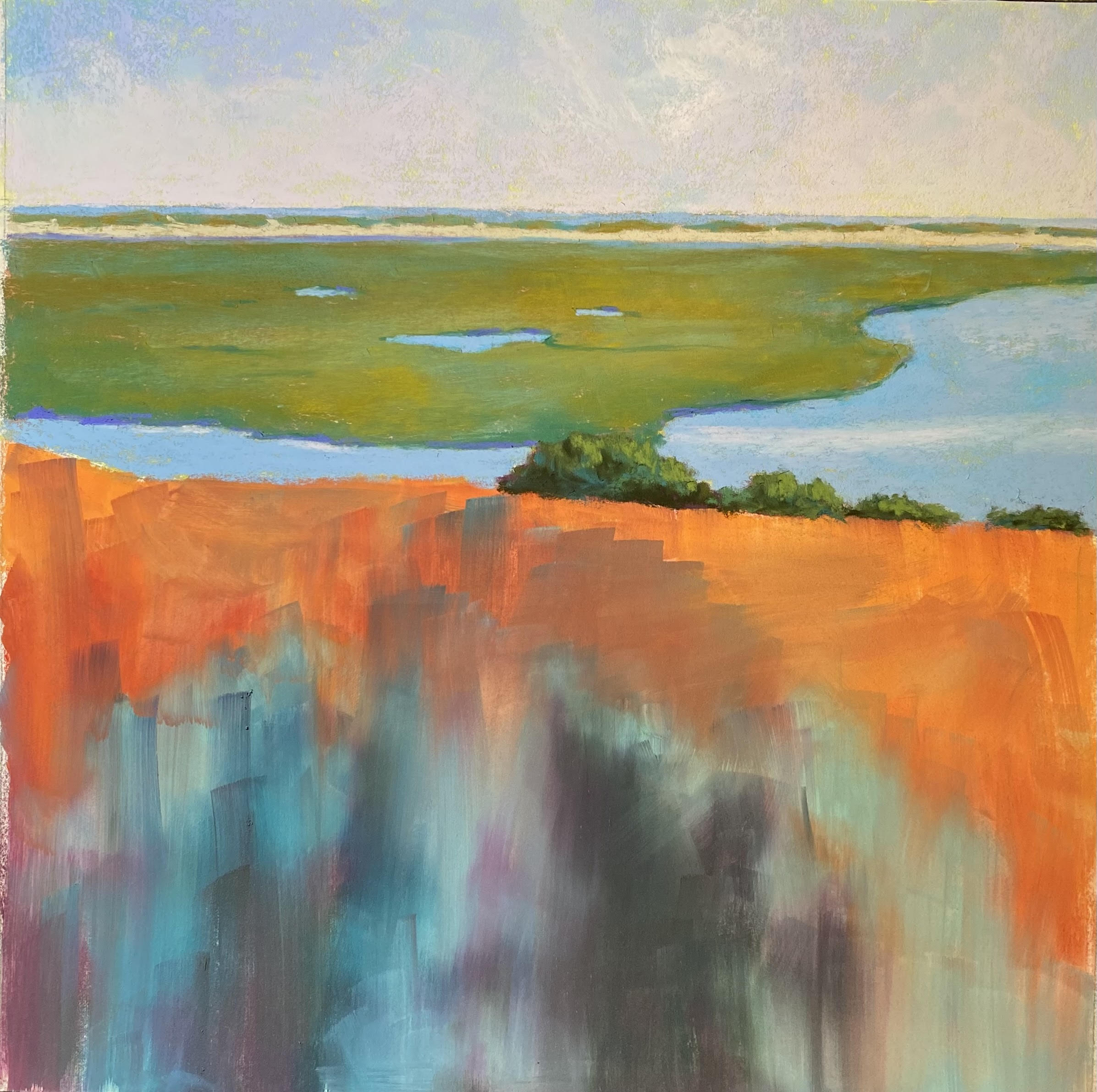
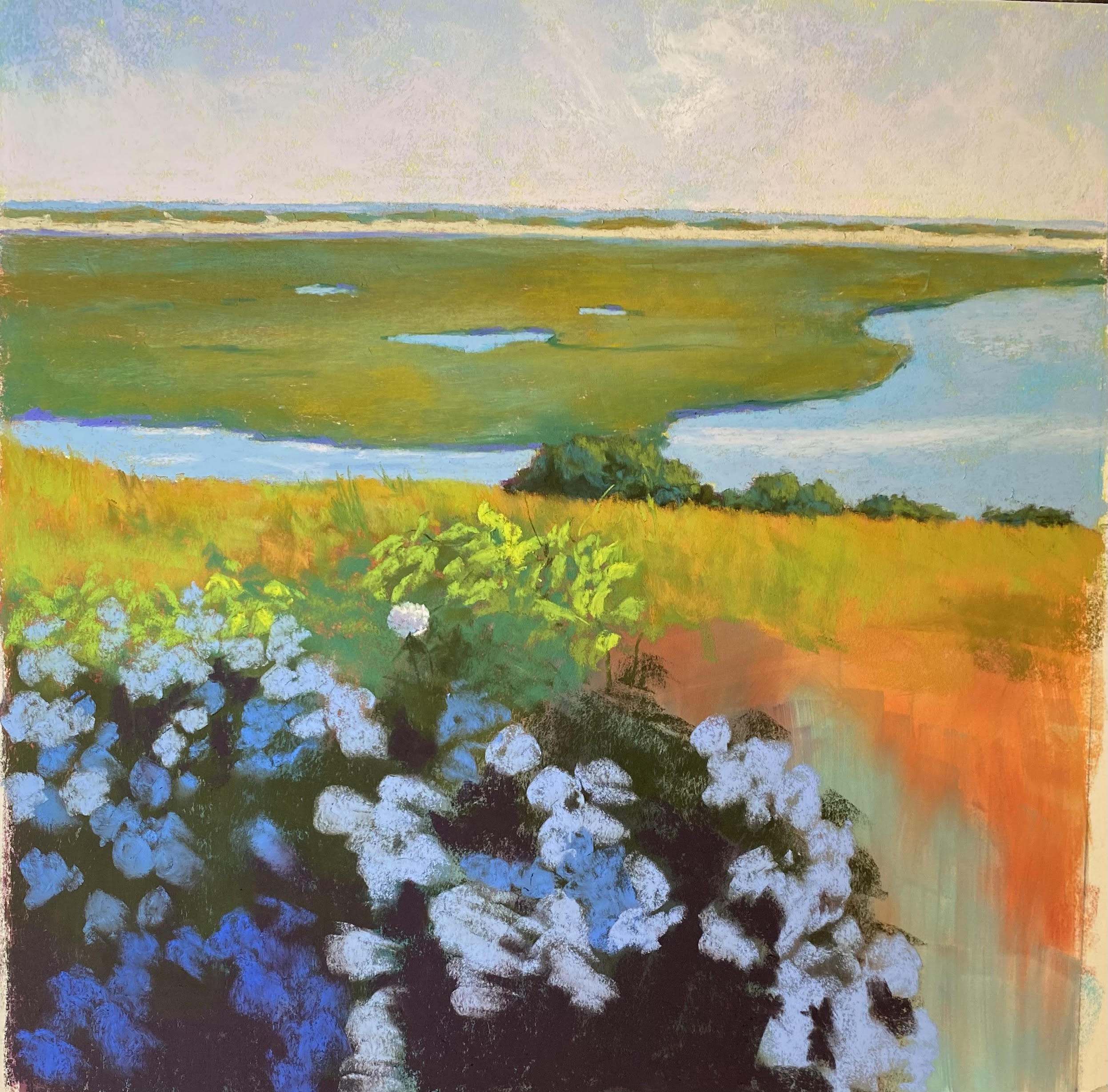
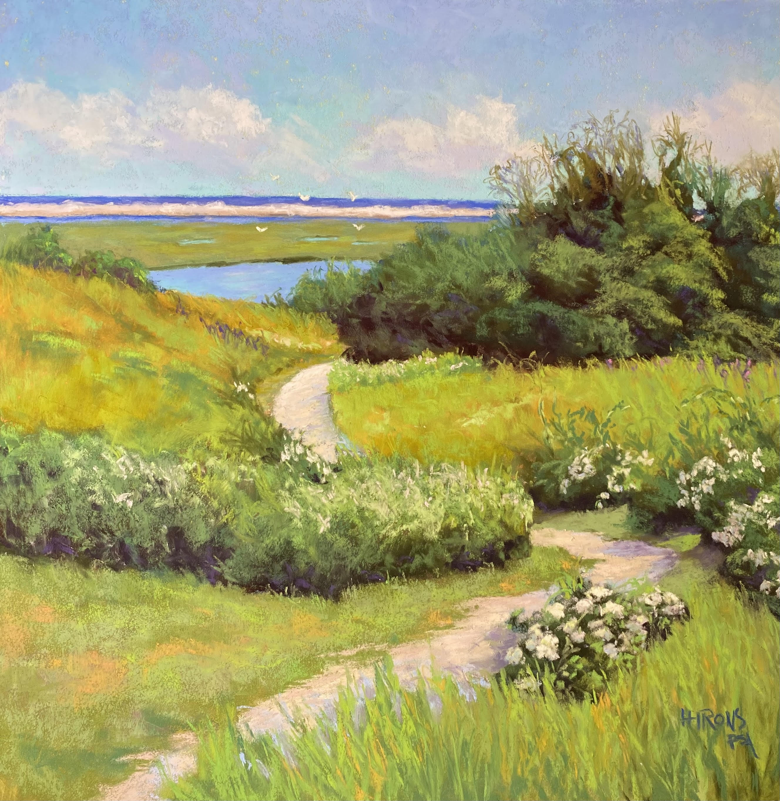
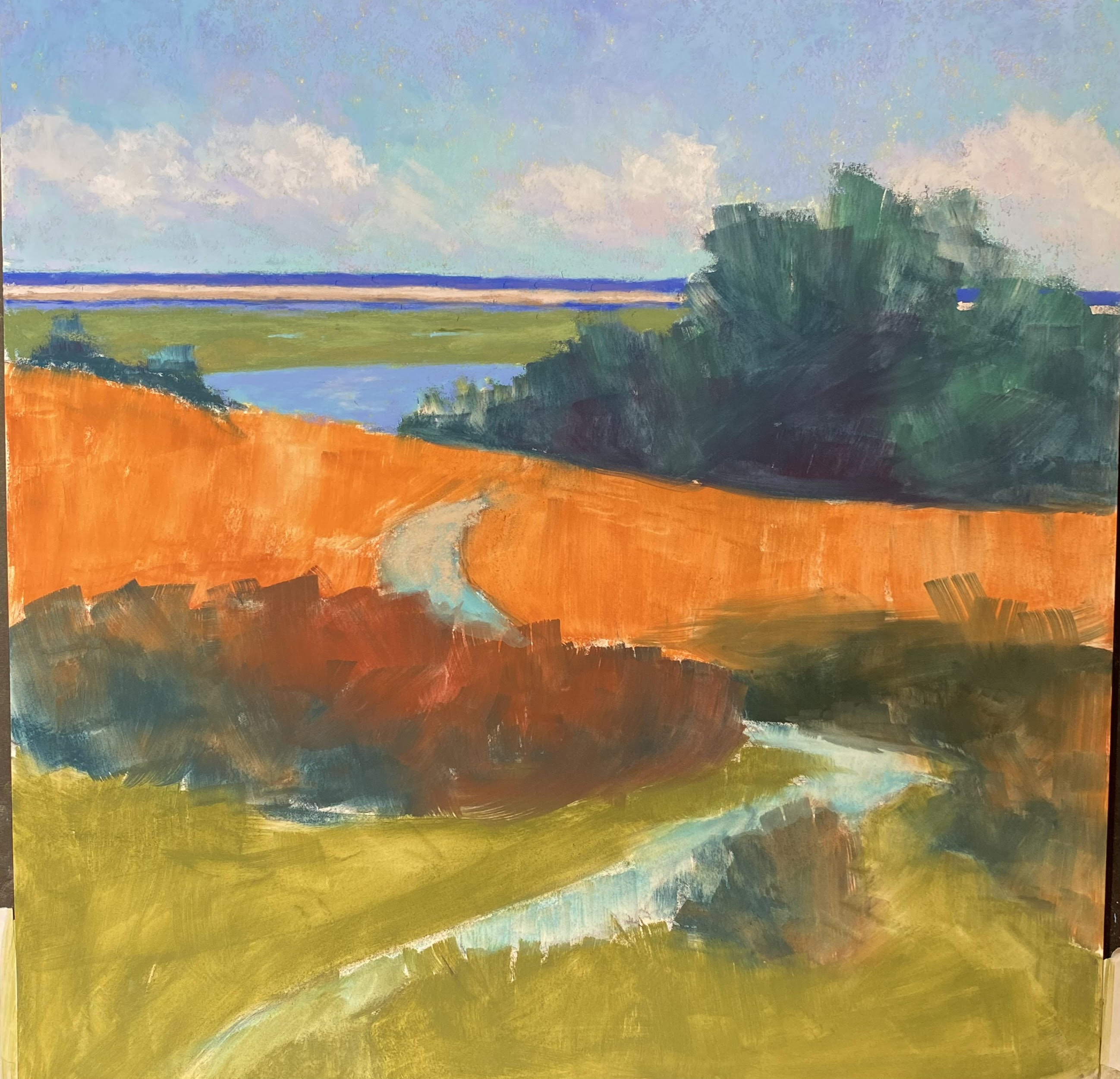
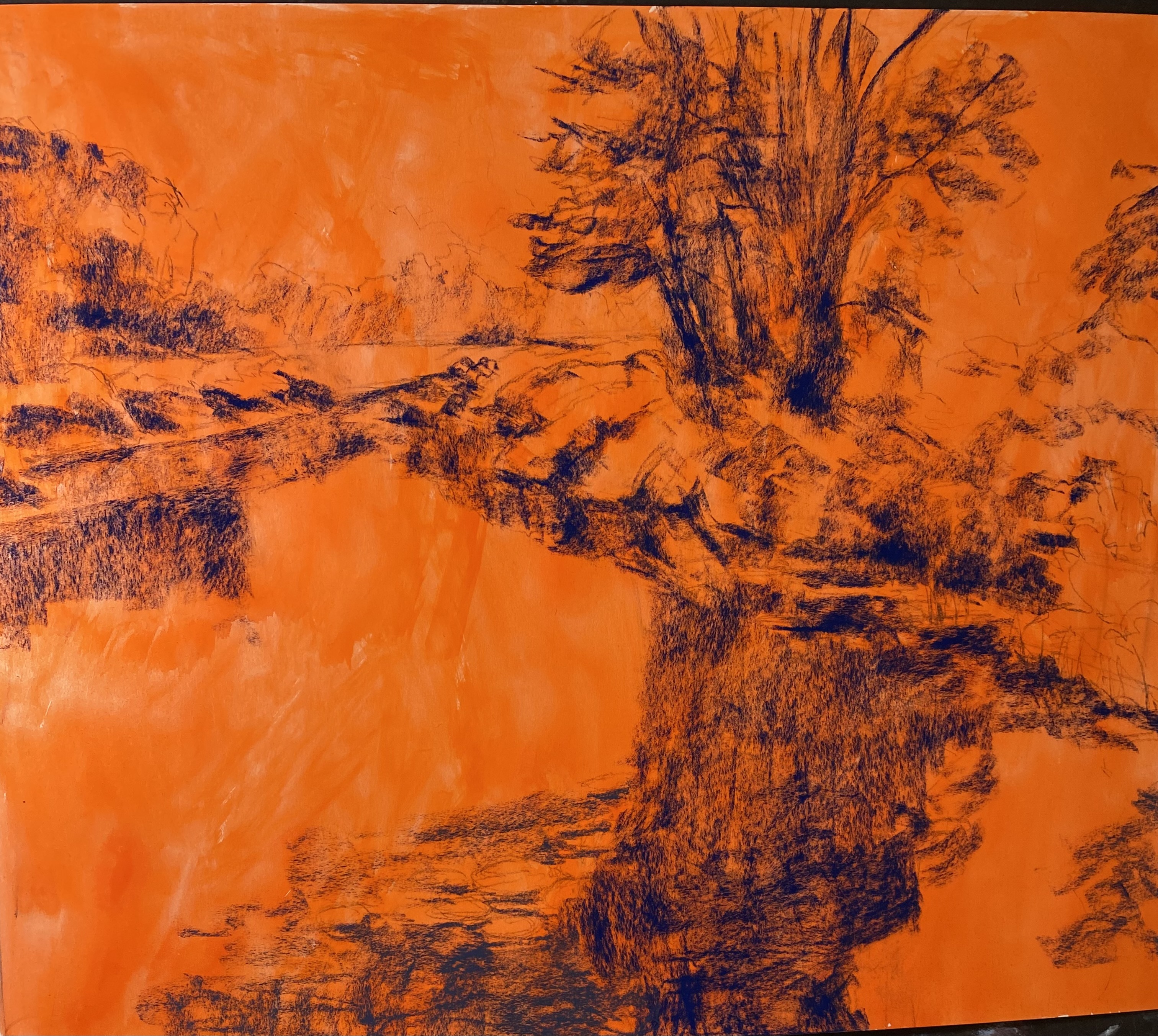
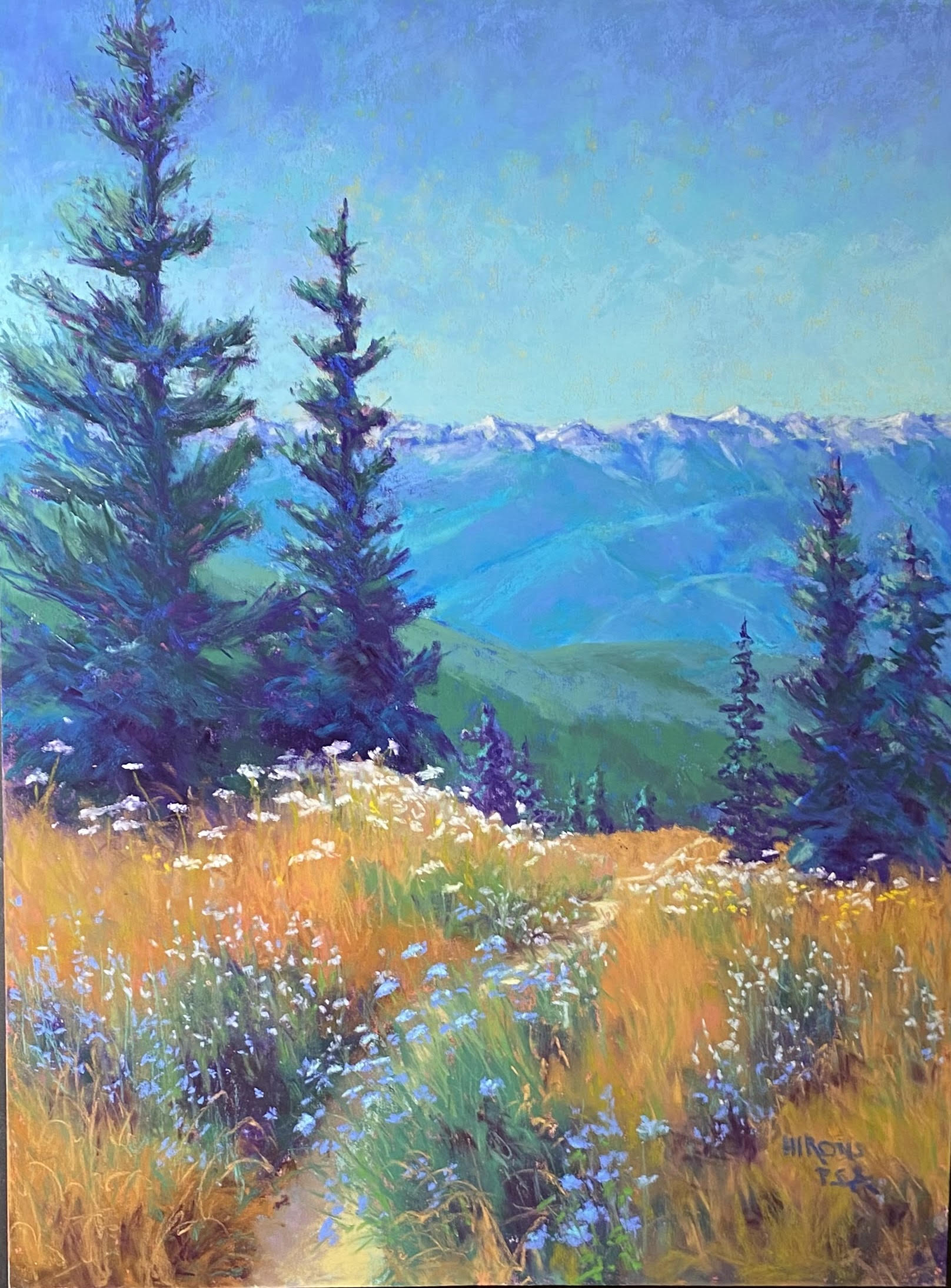
So, for this last post on this blog (I think), I’m going to share some recent paintings with you–just the finished product and a discussion of the challenges and joys.

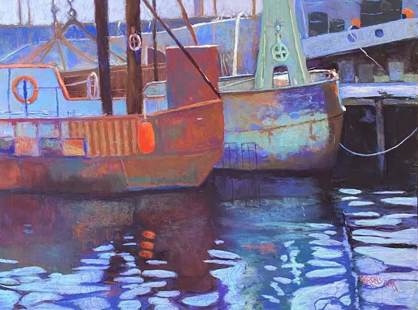
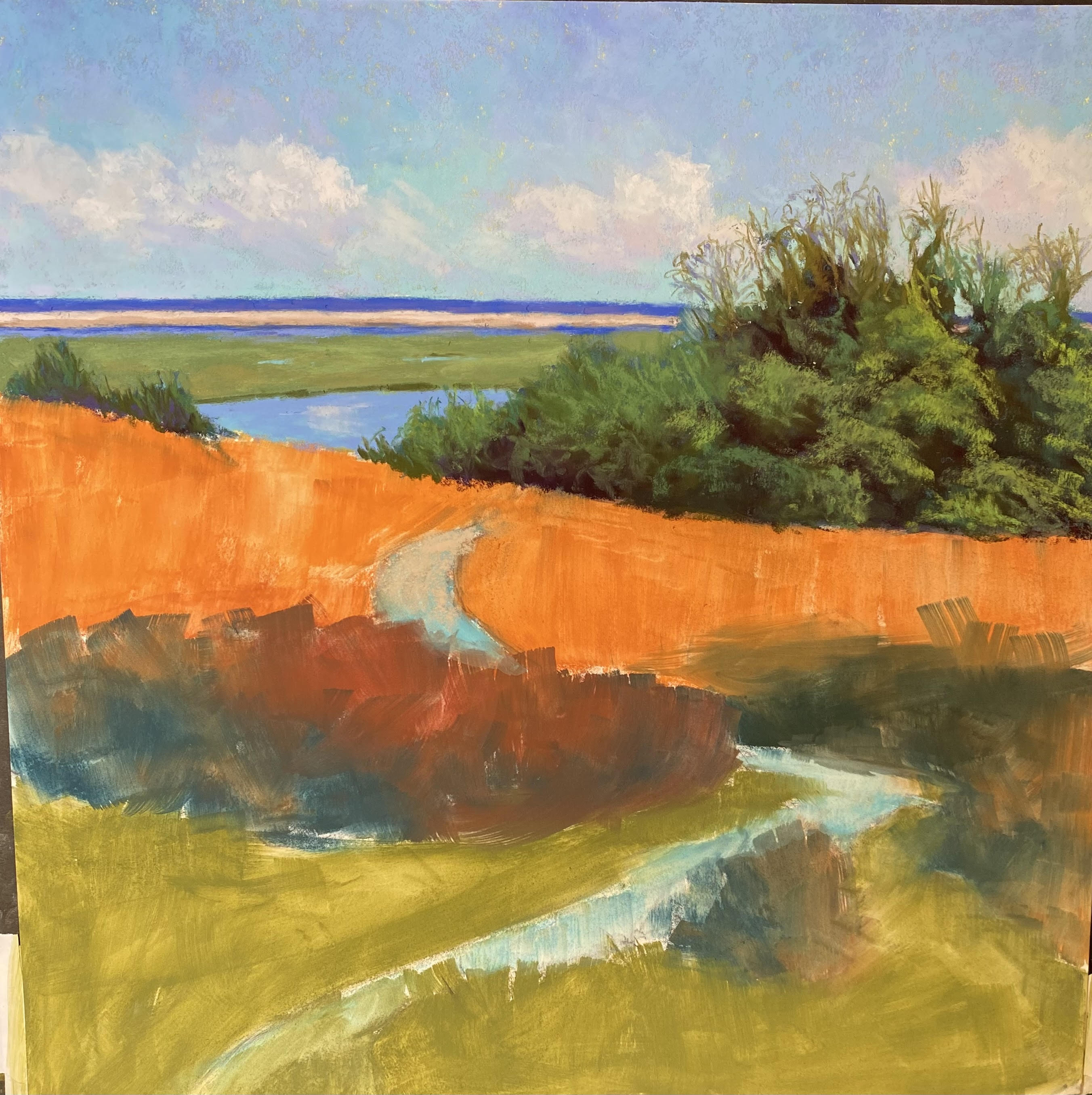
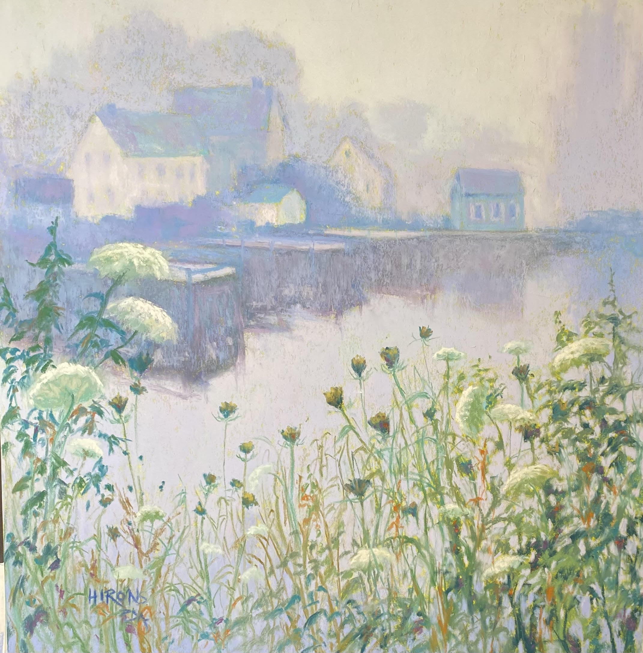
State Pier, New Bedford, 18 x 24, UART 320 board

State Pier, New Bedford. This was my first painting of 2024. I’d been looking forward to painting it since taking the picture last summer, but it turned out to be a real challenge!  There’s was so much stuff in addition to the boats and their reflections and I had to find a way to simplify it.  I finally opted for shapes of blue in the background and after a real struggle, it came together. I had originally thought I’d do three of these paintings but after one, I’d had enough.


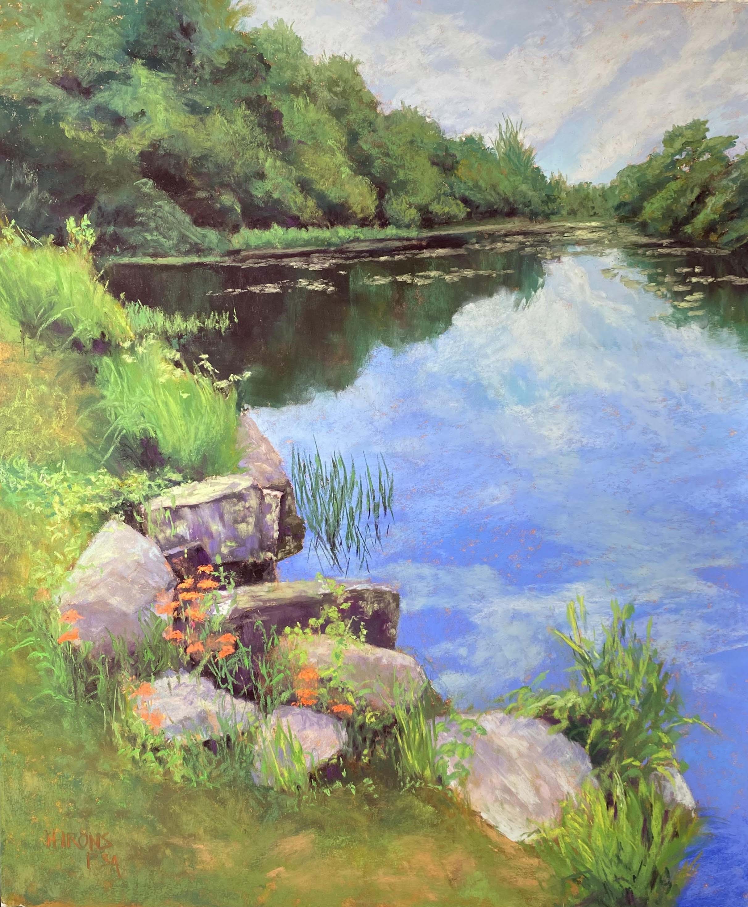
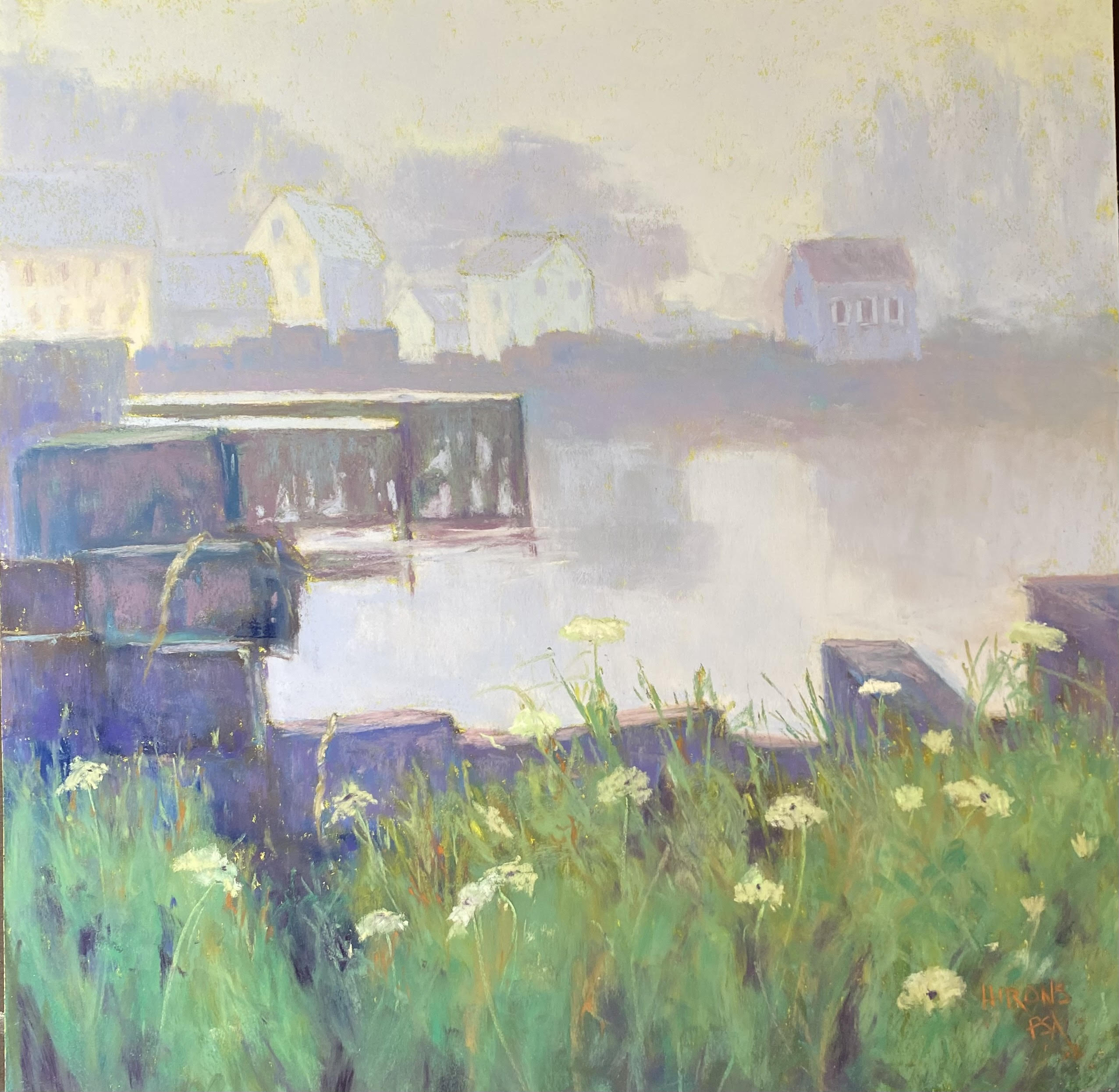
Lock House, Lock 8, 20 x 16, Lux Archival

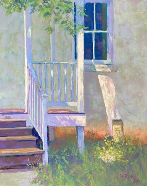
Lock House, Lock 8.  By comparison, this painting was a joy to do!  I was back to painting white buildings in light and shadow!  The house is on the C&O Canal, very near where I now live. We walk there frequently and I loved the play of light on the house and the texture of the building in this image.  After months of painting nothing but marshes (thinking I needed to have a theme for a future show), I was back to what I love to paint!  So this painting said a lot and meant a lot to me.  I then went looking for white things to paint!


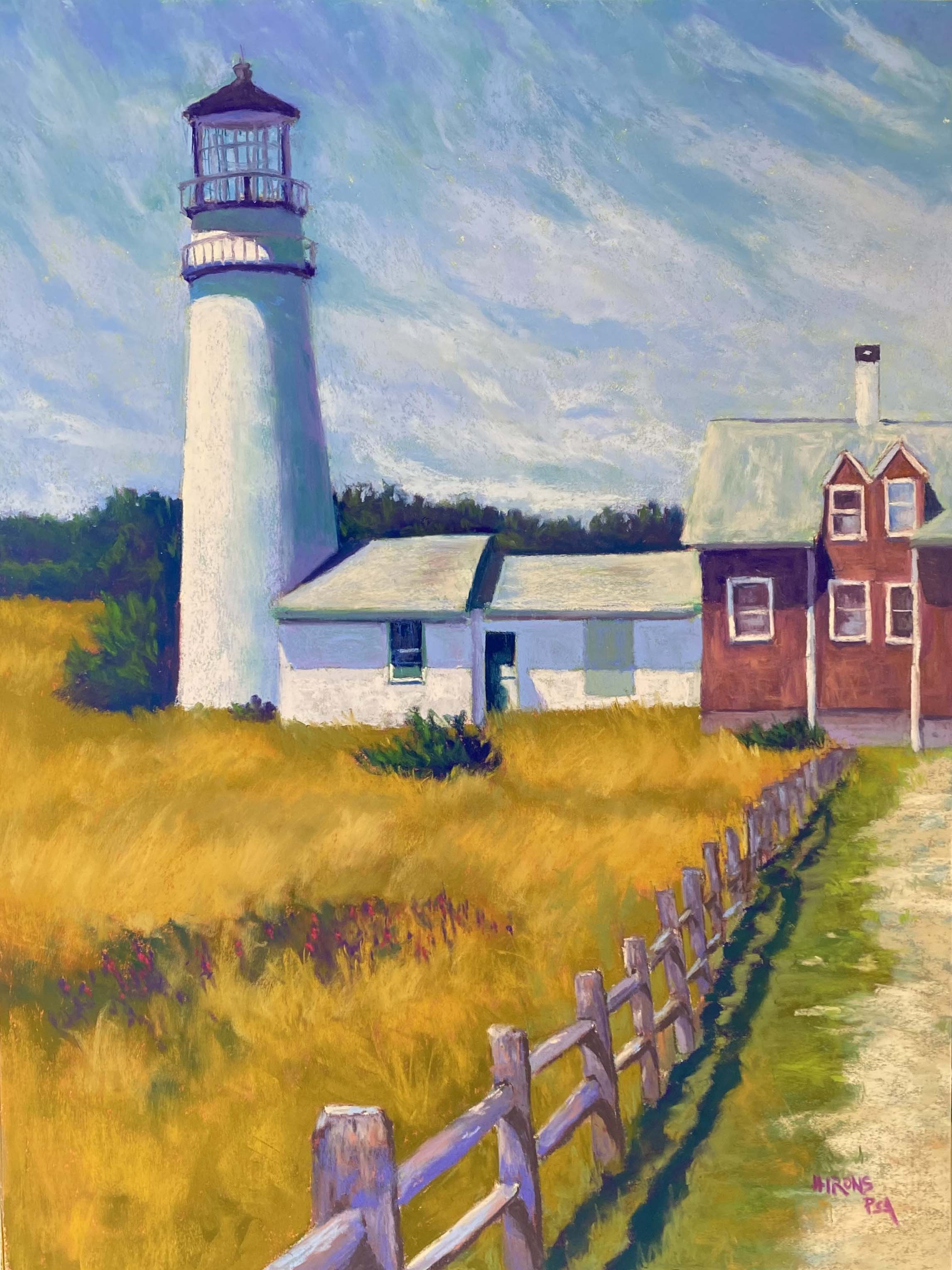
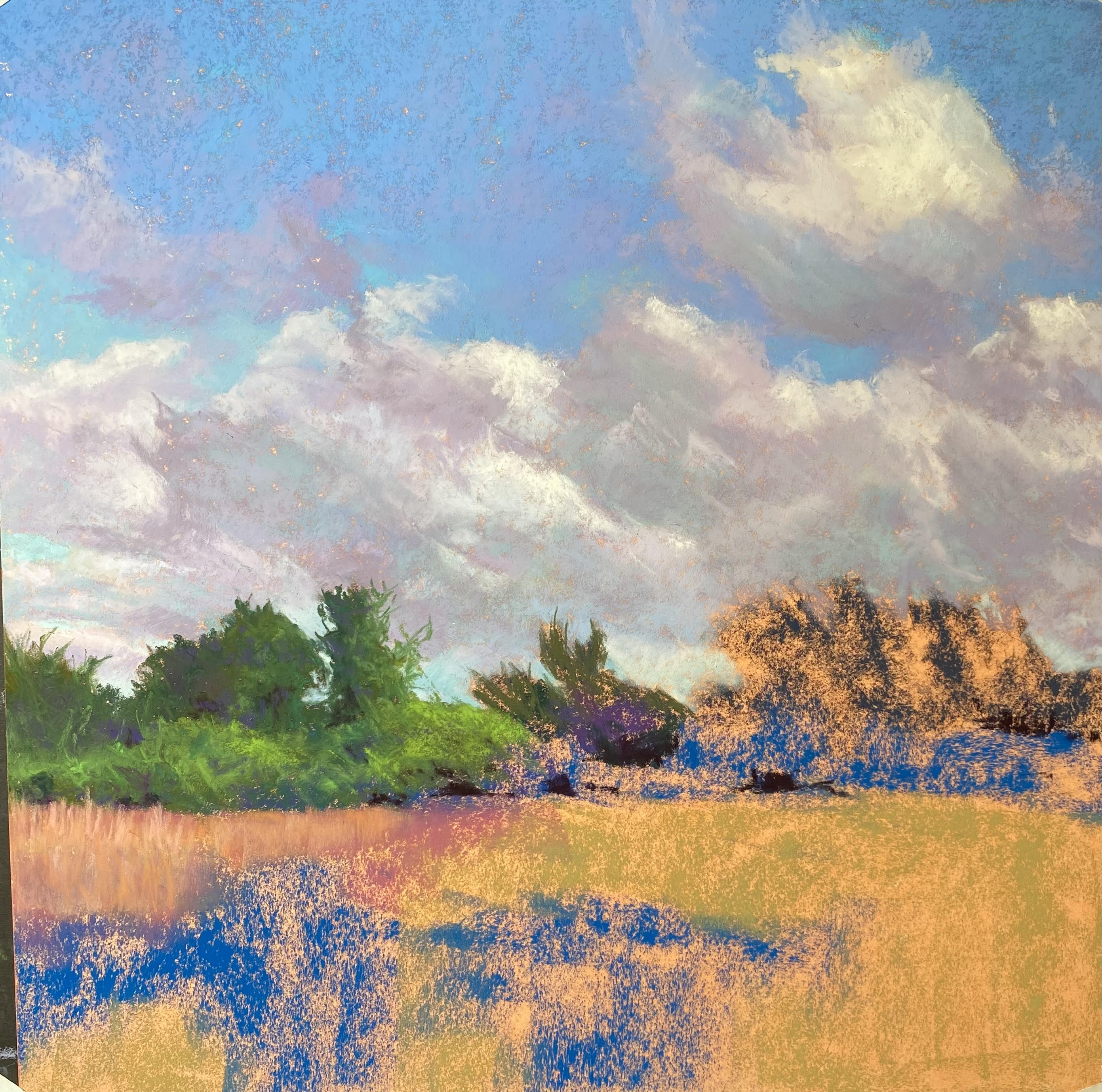
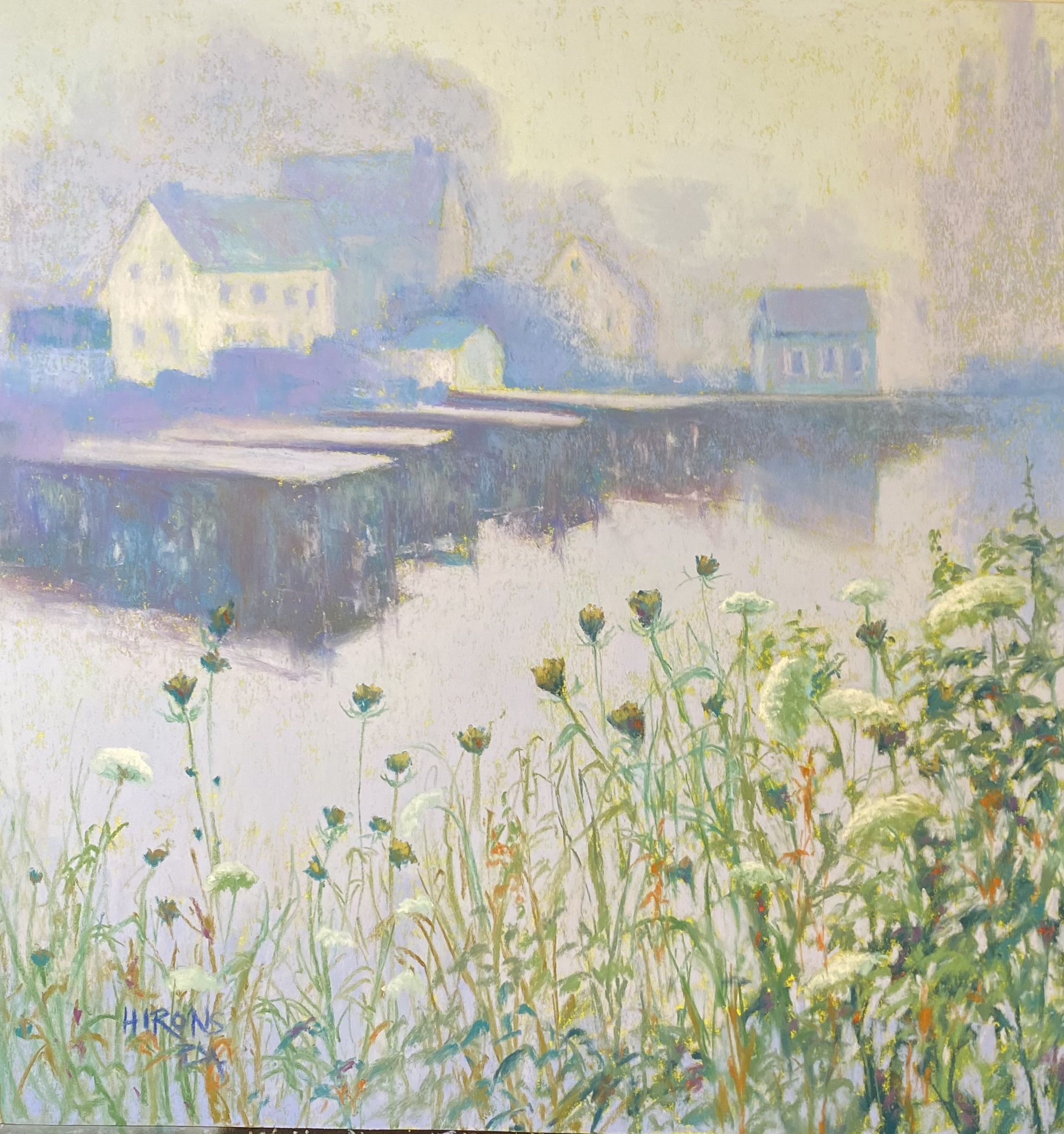
Highland Light, Truro, 24 x 18, Lux Archival

Highland Light, Truro.  Back to Cape Cod!  White lighthouse, white buildings in light and shadow.  The lighthouse that Hopper painted!  I loved doing this.  I particularly liked the way the movement in the sky and grasses contrasts with the stillness of the buildings.  The primary challenge was the fence but it worked. My last addition was a patch of flowers in the foreground to pick up the reds from the building. That was really satisfying!


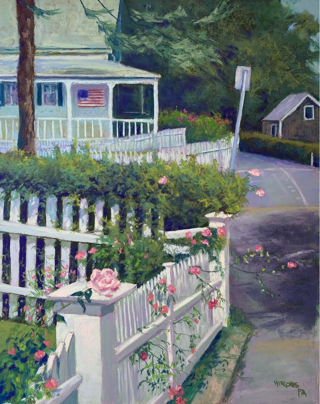
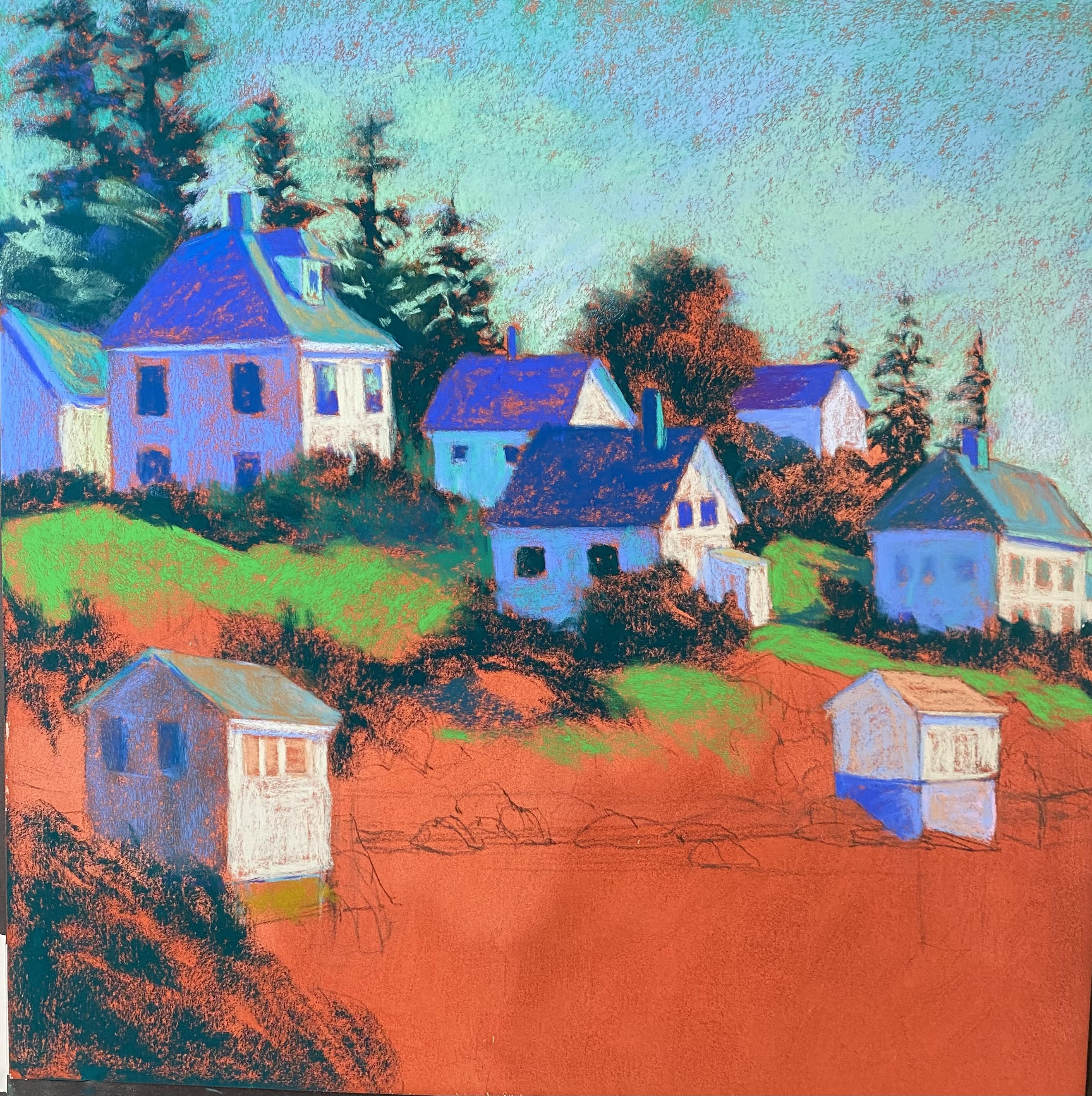
Chatham Roses, 20 x 16, Lux Archvial

Chatham Roses. Speaking of challenging fences!  I took the photo in September of 2022 and knew I wanted to paint it.  I loved the angle of the fence and the lines of the distant road, and, of course, the house with flag.  I did a lot of drawing for this one and used my new J. Luda Romanian pastels for the greenery!  (An award from the PSA). This was also a real joy to paint.  I used a variety of off whites for the fence in foreground and played with the colors in the roof, street, and distant building.  I was in my happy place for sure!


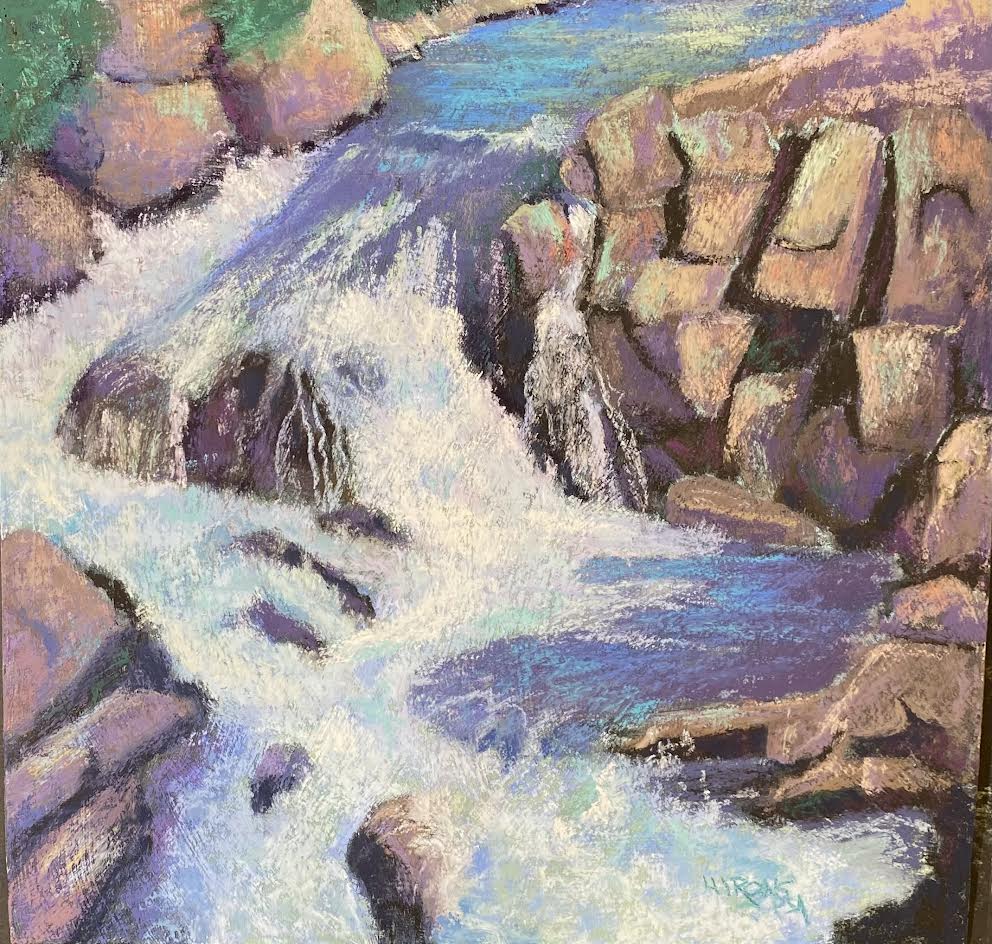
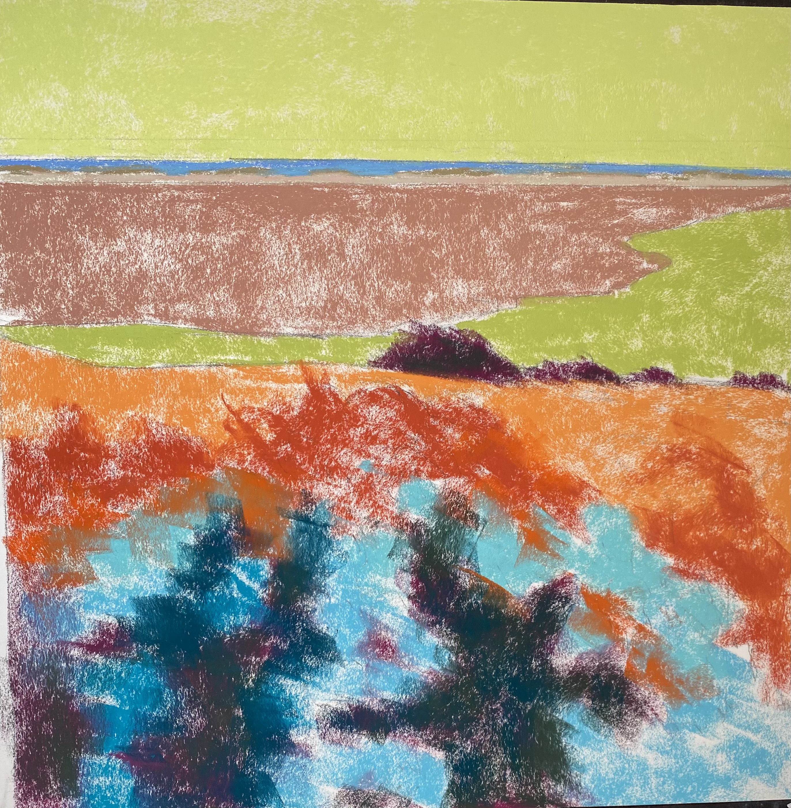
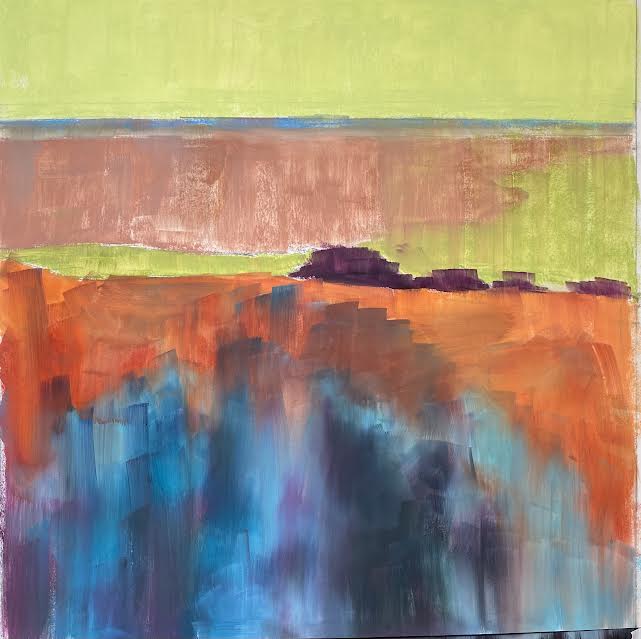
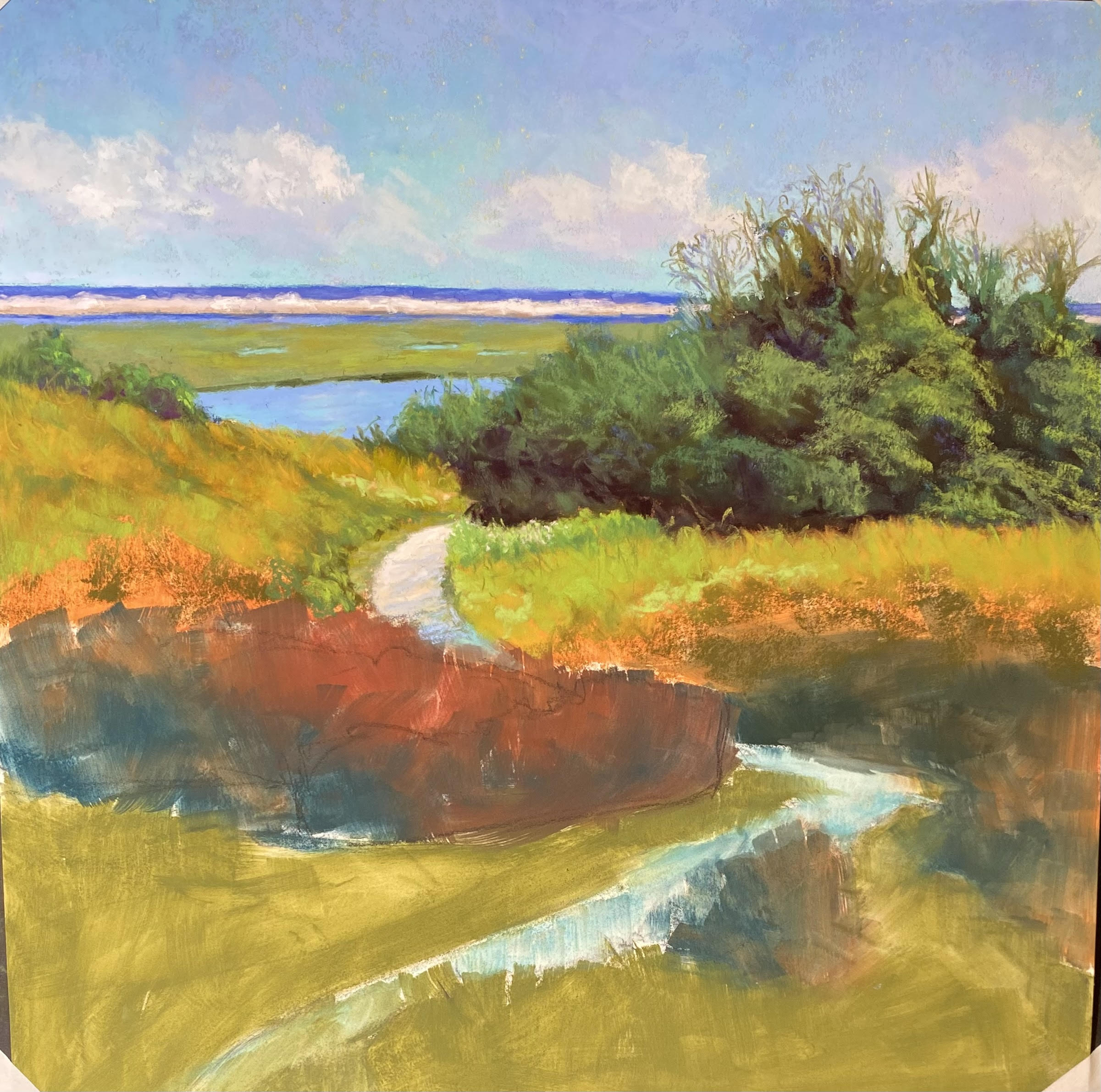
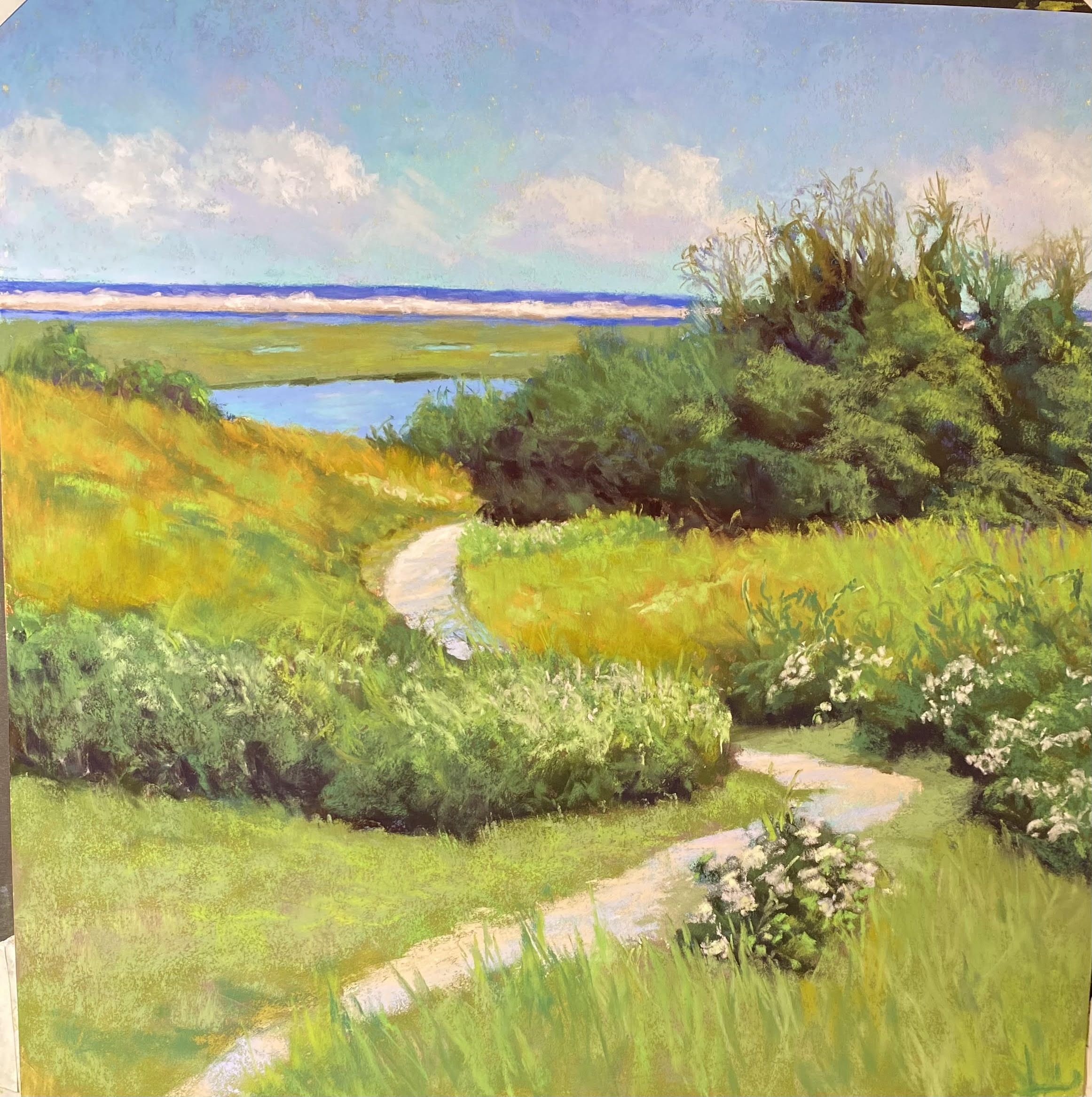
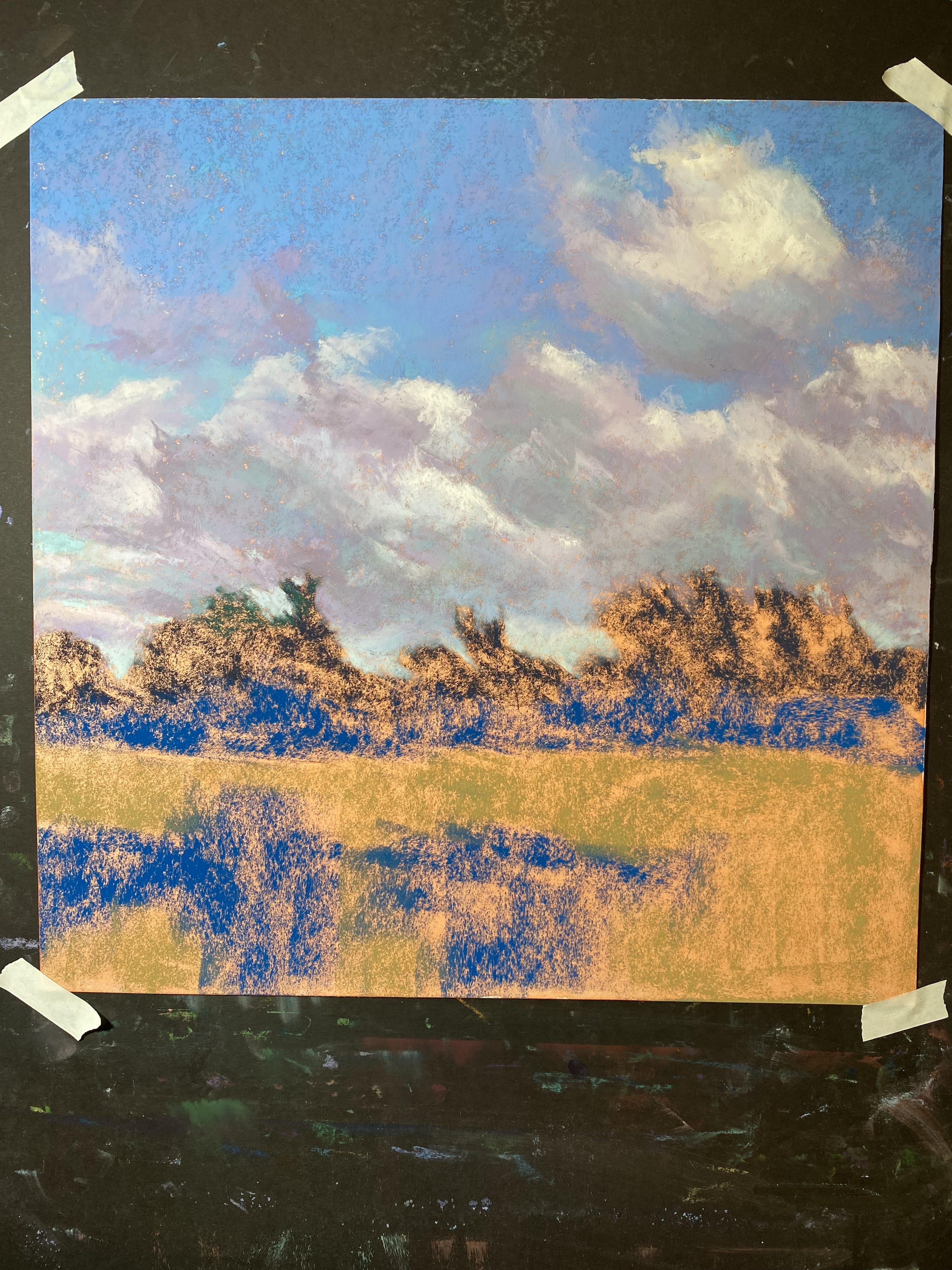
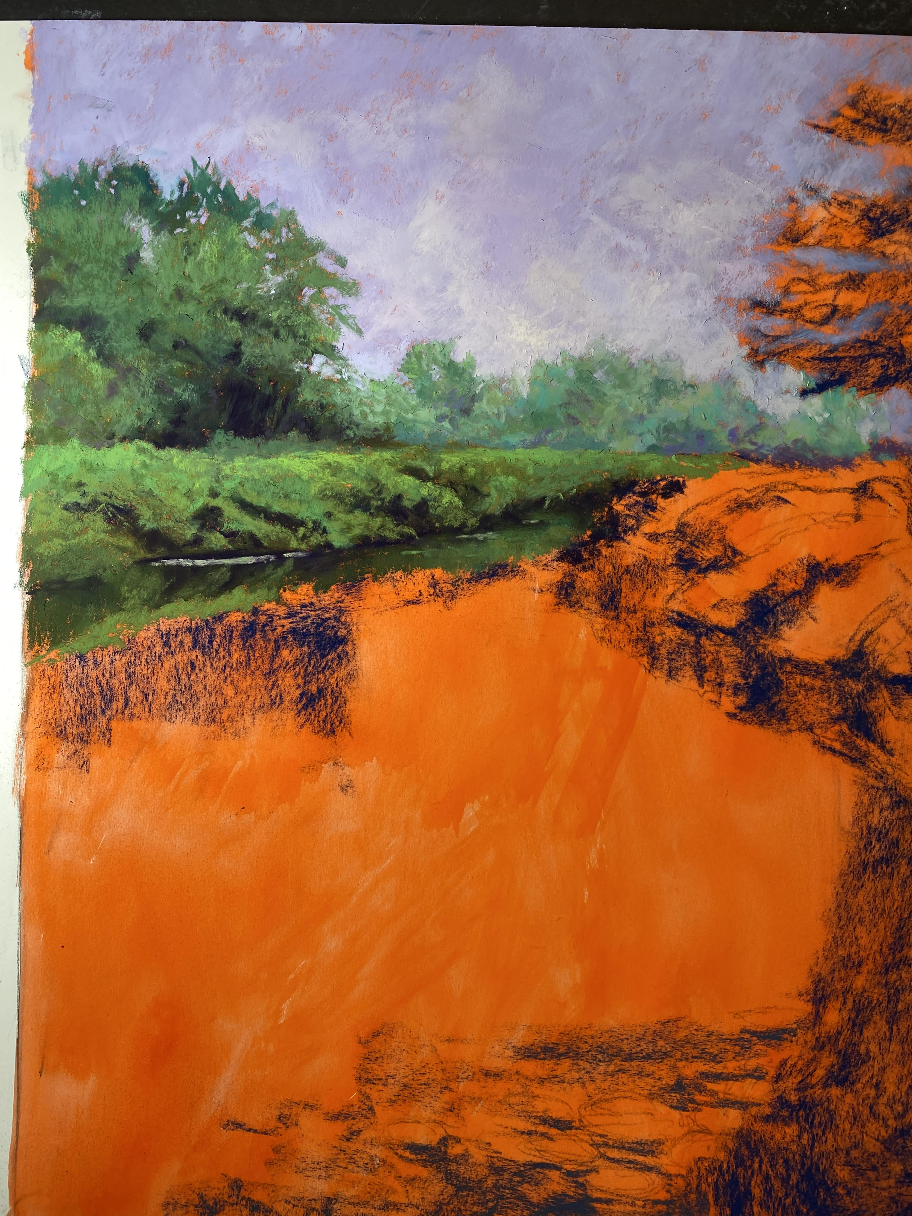
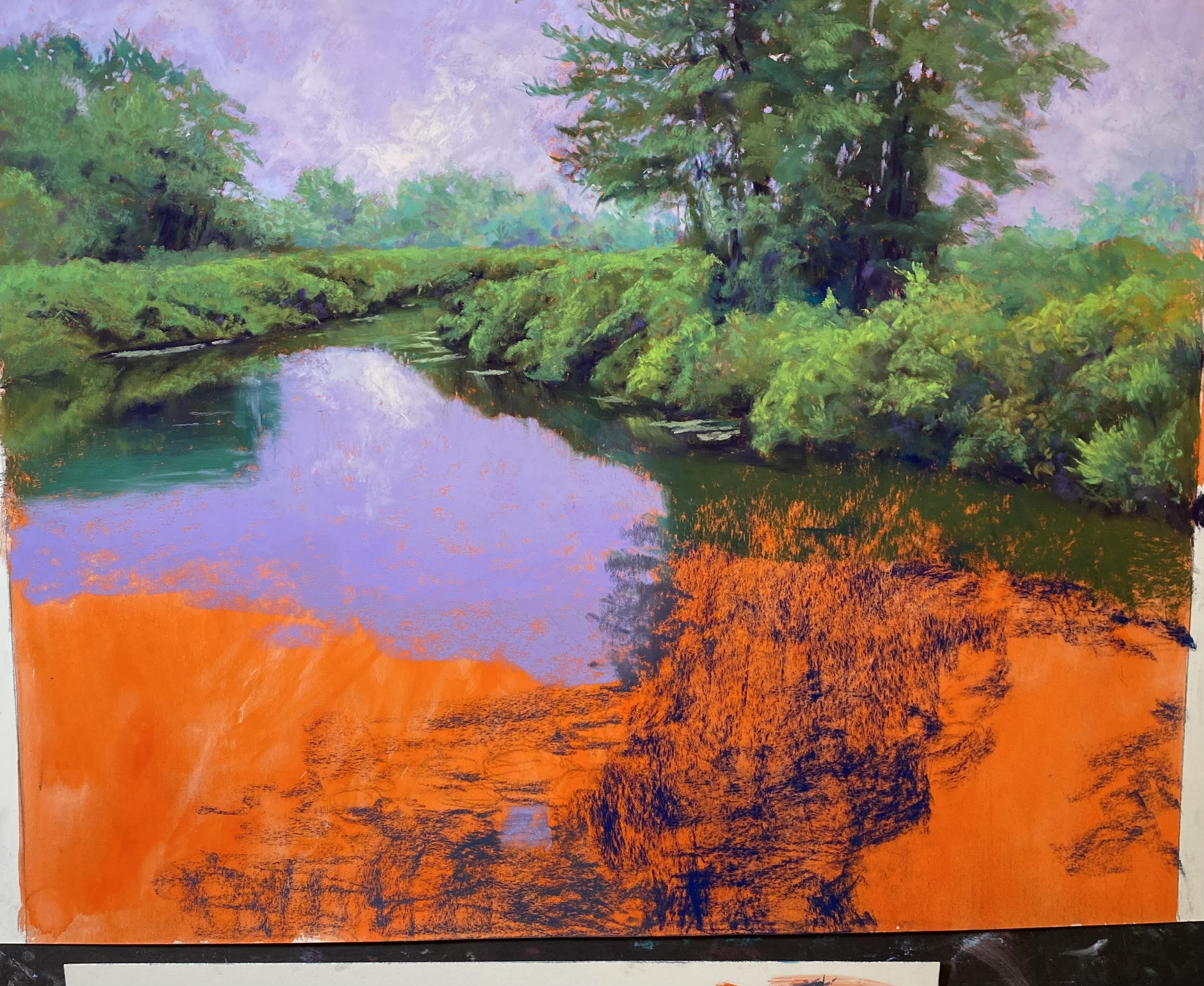
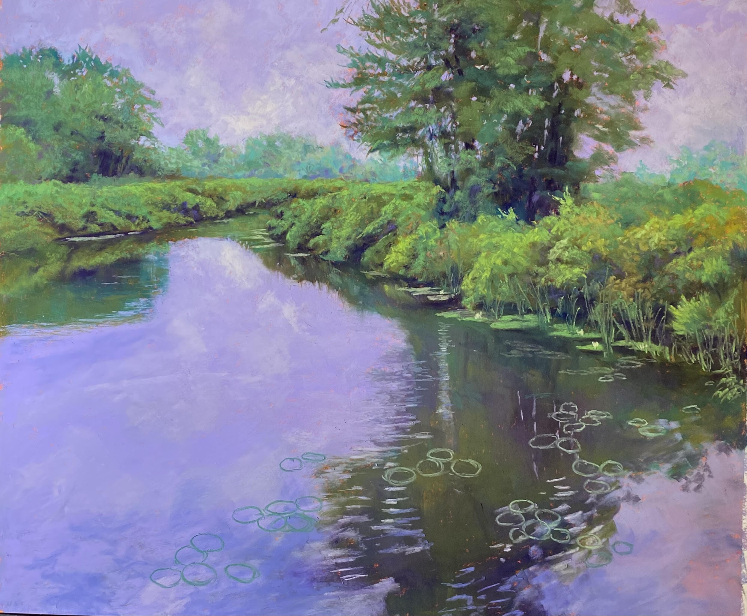
White Water, Great Falls, 14 x 14, illustration board with Golden fine pumice gel

White Water, Great Falls. I’ve been wanting to experiment with different substrates for hand-made surfaces and purchased some illustration board.  I cropped an old photo into a square and applied one coat of the gel (untoned) to the board.  It bent up but a short time under books flattened nicely.  (My previous uses of Rives printmaking paper were unsatisfactory because the paper always buckled once on the easel, even after an entire night under books!) I added a simple underpainting with alcohol and added another coat of gel and put it under the books again.  For the painting, I used nothing but the softest of pastels as the surface was pretty hard.  Blue Earth were the majority of what I used.

I did this as a study, thinking I’d do a larger one. I may, but might look for a different image and view.  I found the illustration board easy to use and satisfactory, although I would have liked a little more give.  Sigh!  You can’t have it all!!!


That’s it for now. Don’t know what I’ll be painting next or what I’ll do with the blog. I’d appreciate comments, thoughts, suggestions.  Be well.

Jean

jeanhirons48@gmail.com

Finding Your Style in Pastel

I wanted you all to know that my book, Finding Your Style in Pastel, is now in the process of being republished and it is available on Amazon in both paper and hard cover for a lot less!!!  The prices are: hardback: $33.99 and paperback: $23.99.  I am working with Ewings Publishing, which is going to do a marketing campaign which they hope will lead to finding a permanent publisher.  MANY companies have wanted me to do this over the years and I’ve fought them off!  I was so afraid of the picture quality.  But I have copies of the books and, aside from the cover not being quite as bright, they look great.

So, if you know artists who are just getting started in pastel and don’t yet have the book, this is a great time to introduce it to them.  It’s available on Amazon and Barnes and Noble websites.  And all of the original comments are there.  I just read some of the recent ones and was truly humbled!

Wild Roses (Nauset Marsh, #3)

Wild Roses (Nauset Marsh, #3), 18″ x 18″, Lux Archival

Underpainting with hard pastel, stage 1

Underpainting, stage 2

Sky, marsh and trees painted

Roses blocked in

I’ve just completed my third painting from Nauset Marsh and I have 2 more I want to do.  Hoping to be able to do them before we leave for Europe on Sept. 5.  This is one I was really looking forward to because of the roses and the ability to play with colors.  The composition is a little odd, with the marsh and land masses joined by the distant tops of trees peaking over the hill.  But I liked it because it was different and provided some interesting shapes.

I decided that I didn’t want a bright blue sky in this one.  So I added a little blue, then brushed a light pink over most of the rest of it to give the sense of fog or light clouds.  I liked the softness of it and the fact that the pink relates to the flowers.  I added water, distant sand bar, a tiny bit more water, and then the marsh.  I played with various shapes of the water holes in the marsh, and softened the dunes, then added the water.

What looks like bushes are the tops of trees as this is a hill overlooking the marsh.  They are kind of odd and I overdid trying to capture the one in the middle with too many colors. Finally settled for a warm green, cool green, dark green and a little violet.  For the grasses, I used a combination of warm greens, yellow greens, a little pinky orange. I wanted to keep this part fairly simple, given the complexity of the foreground.

For the flowers, I started with three values of blue/blue violet and made shapes.  I began working on the left side with pinks and a little light blue.  The warmest color on the left is one of the really light violets from Blue Earth.  When I got to the flowers in shade, they began with reddish violets, then I added blue violet on over.  I loved the colors!  BUT, these are white flowers surrounded by green!  So I needed to add more of a sense of green. I used turquoises:  a light one for the left side of the blooms in sun, and darker ones in the shadowed areas.  Finally I added a very light yellow green, followed by the Ludwig yellow white on the blooms in sun on the right.  It made a difference.

What I loved about the photo was the branch coming up on the right.  I didn’t have to make this up!  The flowers lead the eay to the bottom, but the branch leads it back into the picture plane (at least I hope it does!).  My final touches were a few yellow orange grasses in the foreground and some real light yellow in the leaves, to make them stand out more from the grasses.

As I look at this, the horizon seems to be unstraight, but I think that might be the photo.  Will take another look before it’s framed!

Nauset Marsh #2

Nauset Marsh, #2, 18″ x 18″, Lux Archival

Underpainting with sky and marsh painted

Trees painted

Marsh revised, midground started

Foreground added but not done

Reference Photo

I have been having such a great summer painting!  To date, I have done 10 paintings and I learn more with each one.  I’m working more and more slowly and carefully and trying to react to the painting and not the photograph.  I haven’t done blogs on all of them, but I’ll include some at the end of this entry.

This is the second painting from Nauset Marsh on Cape Cod.  It’s the Fort Hill area and is one of my favorite places in the world. I was so fortunate to have a beautiful day when we were there!  It rained a lot of the rest of the time.  I’ve included the photo so you can see what I was working from, and how different the painting is!

I began with a sketch for a square and immediately knew I wanted to see more of the water and marsh.  It’s the path that makes this image worth working from and it’s not the first time I’ve done it.  As you can see, I made a number of major changes, some as I went along to meet the needs of the painting.

I decided to do an underpainting, after working on toned surfaces for the past month or so.  I was afraid that the hard pastel underpainting would fill up too much tooth. But after working on the Pastel Premiere medium grit white, I can honestly say that the Lux Archival has enough tooth to deal with an underpainting.  It’s a matter of using a light touch.

One of the first decisions was that the sky was too boring and I wanted clouds–lovely, sunny day clouds whose bottoms disappear into the sky.  I added the distant ocean, sand bank,  and marsh.  In the photo, it’s a lot of little lines that are hard to decipher.

I next worked on the trees to the right. My intention had been to make them into leafy oaky-maple-type trees, but I realized that that’s not what’s there.  So I followed the photo more carefully here.  At first I had a solid line of field in front of them, but when I began working on the field, I started seeing more of the planes in the trees and brought some of them foreword, which I like much better.

I came back a second day wanting to soften the background water/marsh, etc.  I decided to add a hint of waves and raise the level of the light color in places and softened the dark blue of the distant ocean. I liked this a lot better.

I began the mid ground with some yellow oranges and greens, mainly Giraults.  At one point I added purple lupines on the right and decided they were too much. I lightly brushed them out, added greens over, but had little pieces of purple left, which I really liked.  I eventually added a bit more and some lighter pinky purple highlights.  You have to look carefully to see them. I also added purples on the back left of the field where the path disappears.

The foreground was more of a problem as it consisted of a large expanse of mowed grass. And the path is a series of steps broadly separated.  I didn’t really want this.  So I added another wild rose bush and tall grasses at bottom right, which help cover the path.   The large bushes on left foreground were a challege. I started with the roses on the left side (as in the photo) and realized they were too much of a distraction.  So I created something more general, with a hint of pink flowers at top (which are also on the small area of bushes to the lower left of the trees).

I worked more on the path, breaking it up, adding more lights and shadows. For the wild rose bushes, I began all of the flowers with one pinkish Blue Earth.  To finish, I added blues and pinks to those in shadow (light is coming from the right) and light Ludwig yellow to those in full sun, primarily the bush in front, which isn’t in the photo.

And finally, I added the seagulls!  I’m happy with this painting and the flow that it creates.  It has the feel of how I think of Nauset Marsh, much more than the boring photo!

Here are the three paintings I did since my last blog post.  As you can see, I’m really getting into detail and loving it!  I hope to do two more 18 x 18 Nauset Marsh paintings before we leave for three weeks in Sept.  When we come back it will be fall and I won’t want to paint these summer paintings.  Enjoy the rest of the summer.

Woodland Pond, #2, 24″ x 20″, Pastel Premiere, medium grit, white

Sepowet Marsh, #2 24 x 20, Pastel Premiere medium grit white

Woodland Pond, #1, 24″ x 20″ Pastel Premiere Medium Grit white

Sepowet Marsh #1

Sepowet Marsh #1, 18″ x 18″, Lux Archival

Clouds completed

Begining greens and field

I completed another painting today.  It’s hot and this is all I really want to do (along with playing the piano).  And I really want to capture these paintings soon after being there and before other trips and changes of season make them less appealing.  And besides–i”m having a really good time!

This is based on two of the many cloud pictures I took at Sepowet Marsh in Tiverton, RI on the first Sunday of our trip.  The rain cleared out leaving sunny skies and wonderful clouds.  I expect to do one or two more.  The best thing about rain is that when it clears up the clouds are fanstastic!

I did this painting on Lux Archival and it was a joy to do, particularly compared with the last one!  It’s almost all Blue Earth and Girault, like the others, with a few Ludwigs in the sky.  I started using primarily violets in the clouds and it looked two one-dimensional.  I added greens and blues to them and it was so much better.

The greenery was painted in a way similar to the Bantam River picture and it worked nicely. I put a lot of Blue Earth violet into it and a small pieces of Eggplant.

For the grasses, I began with a magenta, then an orange, then a lighter orange and pink.  The photo looks too orange.  The painting has more of the violety magenta which ties it to the violets in the clouds.

The foreground came from a different photo.  I felt it needed something more and I’m happy with it.  I’m not sure it’s completely done (the turquoise piece in the sky at left is bothering me!)  But it’s close.


Purple Flag

Purple Flag, 20′ x 16″, Pastel Premiere white

Top done

Laying in left side with soft pastel

Darkened bottom; right side was daunting!

Painted in but not done

I completed a second painting from Litchfield, CT today.  I decided that a vertical 16 x 20 would be best and I had some mounted Pastel Premiere white medium grit in that size.  It’s the same paper I just worked on, only the other was not mounted.  What a difference–it was awful!!!  I toned it orange and that was a mistake.  It didn’t take the pastel the same way at all.  So it was really a struggle.  As you can see from the hard pastel that I applied, it left pock marks in between. It didn’t go on smoothly at all like it did in the last painting.

But I loved the composition and knew I wanted to do it from the minute I took the picture.  The pattern of the water leading tothe background really excited me.  Doing complex grasses like this when they are all green, however, means having to find or create patterns in them.   I did that with the lighter yellow greens.  I used a combination of rounded strokes for “rounded” bushes and vertical strokes for grasses.  Fortunately, you can make up a certain amount of it!

For the top, I used a grayed violet for the sky and various Girault and Blue Earth violets for the clouds.  I wanted it to look like the overcast, rainy day that it was.  I used a combination of greens and violets in the distant trees and liked the effect, so I continued it below, using pieces of various violets in the shadowed areas of the grasses.  The first four pictures were done using the photo.  Today when I went to finish it I didn’t look at the photo at all.  Instead, I decided to focus on what I thought was needed.  I added some lighter color to the area of water around the grass reflections and that made a huge difference.  I removed the dark shadows in the water from the lower left side as they didn’t read well.  And I worked at getting a pattern of yellow greens going to give structure to the painting.

I knew I wanted to add the lovely purple flag iris, that I found in other areas.  It’s barely visible but you can see it on the right side by the water.  I also could not resist adding in a little red winged blackbird to the grass in upper right. They were all over there, so I really didn’t need to make him up!

I’m really happy with this painting now, but I wasn’t happy with the experience of painting it!  I’m going back to the unmounted paper in 20×24, and I have one sheet of Lux Archival left for an 18 x 18.

On another note, I’m in the process of having my book republished!  It’s going to be available in soft and hard cover and I’m hoping that a publisher will pick it up.  I’ve had so many complements on it over the years.  So I finally decided to do it.  I hope it works!!! I’ll let you know.

Bantam River

Bantam River,, 20″ x 24″, Pastel Premiere med. grit white

Compositional lay -in with dark blue NuPastel

Background trees, sky, and left side

Right bushes and tree done

Water lillies drawn in

I haven’t posted in awhile.  I went to New England at the end of June and got a lot of wonderful shots of marshes and wetlands, both on sunny days and rainy.  I’ve complete 4 paintings, but the most recent has been a game changer for me!  I’m back to working on 20 x 24, my favorite size. And instead of working quickly on rough surfaces without the benefit of photos, I’ve done the exact opposite.  I’m working on Pastel Premier white medium grit (which doesn’t have as much grit as I thought).  But I decided to work very slowly and more thoughtfully, with the help of a photo and some compositional changes.  And I love what I’m doing!

I thought I’d show you some of the progression of pictures that I took.  I really loved the photo, for the most part, except for the large area of water on the left side.  I was trying to figure out how to make it more interesting and realized that I could extend the water lillies over the the left, to help lead the eye into the picture and up into the bushes and tree.  When I did the initial lay-in with hard pastel, I indicated some of this.

I started with the background trees, rather than the sky.  I wanted to do this to try to get the values right.  I used soft pastels in cool greens and a medium value violet.  Then I put in the sky with a Girault violet.  I loved the way it went on so smoothly and flat.  I used my soft Blue Earth pastels for the clouds.  As a matter of fact, this painting is done almost exclusively with Blue Earth and Girault.  But there’s a lot of Ludwig Eggplant as well!  I was really worried about the lack of tooth in the paper, but it worked really nicely, as long as I began with the Giraults.

When I started working, I realized that I wanted to take my time with this painting and enjoy it.  For the greenery I started with the soft, then used dark warm and cool green Giraults to moosh it around.  This was really fun and very sensual!  I LOVED doing this and decided that this is how I want to keep working.

So I completed the left side, then moved to the right and the trees and then lay in the reflections of the trees.  Creating the dark reflections and light water ripples overlaying them was a challenge, but I used the Giraults for this.  Then I drew in the lillies so I’d know where I wanted them.  I added a few flowers but didn’t want to over do it with that.  It’s not about them.

The most exciting part was putting the light clouds into the sky and adding some of it to the water.  I added more as I went a long and tried not to over do it.  The very last thing I did was to add some dark red violet into the greens in small pieces and it looks really nice.

(Note that the photo doesn’t do this painting justice.  It’s not quite as deep violet as it appears.  Friends saw both the original and photo and agreed with me. But it’s the best I can do at the moment.)

This painting is of the Bantam River in Litchfield, CT, in the northwest corner of the state. It rained off and on the entire time we were there and we were very lucky that we got walks in without getting wet.  I think it had started to rain when I took this picture!

I’ve decided to work with the themes of marshes, wetlands, clouds, and water for some time.  This makes me happy and these places are SO beautiful, in sun and rain!

I realize that we are fortunate here in MD not to be having the extreme heat of the southwest or the floods of the north.  July and August are a good time to stay in an paint!  Expect to see more.

Morning Sun, Stonington

Morning Light, Stonington, 18 x 18, Lux Archival

Reference photo 1

Reference photo 2

Drawing

Partial lay in of hard pastel showing red ink surface

My most recent painting was begun some time ago.  I decided to use two different photos of Stonington, Me harbor as I wasn’t completely happy with either.  I wanted the lower building from photo 1 and some of the houses from photo 2.  I worked on a drawing, picking and choosing houses and simplifying them as well.   I used red earth ink to tone the paper and liked the effect of it.  I did a drawing then started with hard pastels to lay in the basic colors. I decided to use primarily blues and greens.

I made a number of changes, including adding tall evergreens behind the houses and removing the one really tall tree from photo 1.  I left out the rock in the water and, as mentioned, I simplified the houses.  I wanted the yellow house at the top of the hill to be the center of interest and tried to keep the others a little cooler with less sharp lines.

I also decided that I wanted to add lupines to the painting as they were all over Stonington when I was there (June).  You can see them in front of the yellow house and a few other locations.  I didn’t want them to be too obvious, but I wanted to at least hint at them.

I was happy witht the way the painting came out and I’m feeling more confidant in making major changes or even working without a reference.  I took a lot of photos and am using them as a PowerPoint demo for my zoom class.


Fog paintings for Maine Gallery

After I finished the commission, I decided to do some 18 x 18s for Jud Hartmann’s gallery in Blue Hill, Maine.  I sold four paintings in 2021 and havent’ sent him anything new in some time.  I decided to stick with my recent 18 x 18 format but use Lux Archival and not the prepared surfaces.  I was reminded of my 12 x 12 Port Clyde fog paintings that I did in 2012 and decided to revisit them.

Port Clyde in Fog, #1

The first one is a picture with lots of lobster crates.  I’ve made them into more of a solid shape.  I struggled with the values in both this and the subsequent painting, not having done fog in some time.  I ended up making this painting much lighter than the original 2012 painting.  And I added trees behind the houses at left that weren’t there.  This painting involved input from some of the members here at Fox Hill!  It was interesting sharing my process with them.  My goal was to have the eye travel around the foreground to the left and over to the little building at right.  This is a painting with a defining shape around which everything is organized–the water.  I liked having that.

Port Clyde in Fog, #2 before flowers added

Port Clyde in Fog, #2, 18 x 18, Lux Archival

Then I began the second one which didn’t have any lobster crates and instead had flowers against the water.  I decided to focus on the right side with the flowers and have the buildings in the upper left.  But when I thought I was finished, I realized that I had two separate paintings with no connection!  It was terrible!  So, I brought flowers up on the left to over lap the buildings, lightened the piers, and now I think I have a unified painting.  (I’m currently teaching a zoom class on composition so it was fun sharing this stuggle with them.)

Now I have to get them to Maine!  Fortunately my framer found beautiful 18 x 18 gold plein air frames from Omega that look really wonderful on them.  The paintings are predominantly blues and violets (not so obvious from these photos) and the gold is stunning with them.

For both paintings, I began by toning the paper with a yellow green irredescent acrylic ink, which warmed them up and you can see this in the photos.  Very little shows through but it was just enough.  The pictures look kind of weak in the photos, I have to say, but they look really wonderful in the frames!

One more for Maine in a separate post.


Commissioned painting: Olympic Firs

Olympic Firs, 24 x 18, UART 320

Olympic Firs, Underpainting

Drawing

I’ve been very remiss in posting my blog as of late.  It’s been a very busy spring.  In April, I gave up my studio and moved everything here. Fortunately, I have a lovely space to paint in.  In addition to that, I got rid of my bathtub and now have the pastel cabinet in there. And the guest bathroom doubles as my retail shop for cards and such!!!  Just made a sale and have someone coming next week.  So, you never know!

My first painting done in the lovely art room downstairs was a commissioned piece for my piano teacher and his wife–mainly his wife. She is from Seattle and wanted something with tall evergreens.  I found 4 x 6 color photos from our trip to the Olympic Penninsula in the 90’s.  I had a picture of the distant mountains, one of trees, and another of wildflowers. But none had a composition.  So I did a drawing and put it all together.  I’m getting to be pretty good at that!  I delivered it yesterday and they were delighted.   Here are the drawing, underpainting and finished painting.

The most difficult part was the distant hillsides just below the peaks of the mountains.  Getting the color and value right was a challenge and also making the hills different enough and not all the same.  Fortunately, pastel is very forgiving and I finally got it to my satisfaction.

My original intent (as you can see from underpainting) was for a solid band of white topped flowers running to the right of the large tree.  But I really disliked it and broke it into singlular flowers, such as Queen Anne’s lace.  I was much happier.  The foreground of chickory and path came from a photo from Revelstoke , BC taken during another trip.  But I really liked putting in the blue chickory to bring the blue of the sky into the foreground.

They were delighted with the painting and now Leander wants one from New England!  I have a few of those!!!


Olympic Firs, 24 x 18, UART 320