
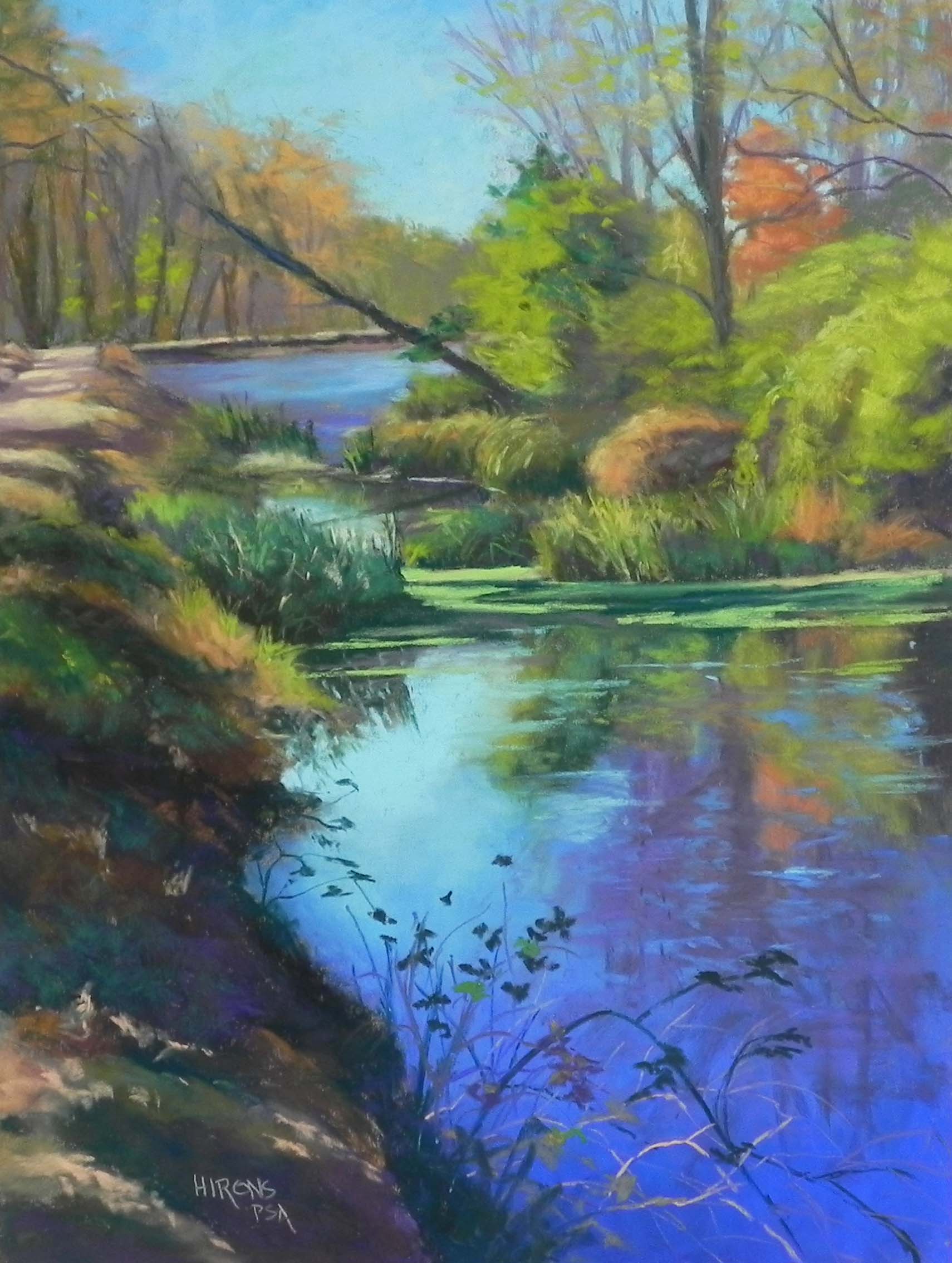
Autumn Light C&O Canal, 24″ x 18″, Pastel Premiere, Italian clay
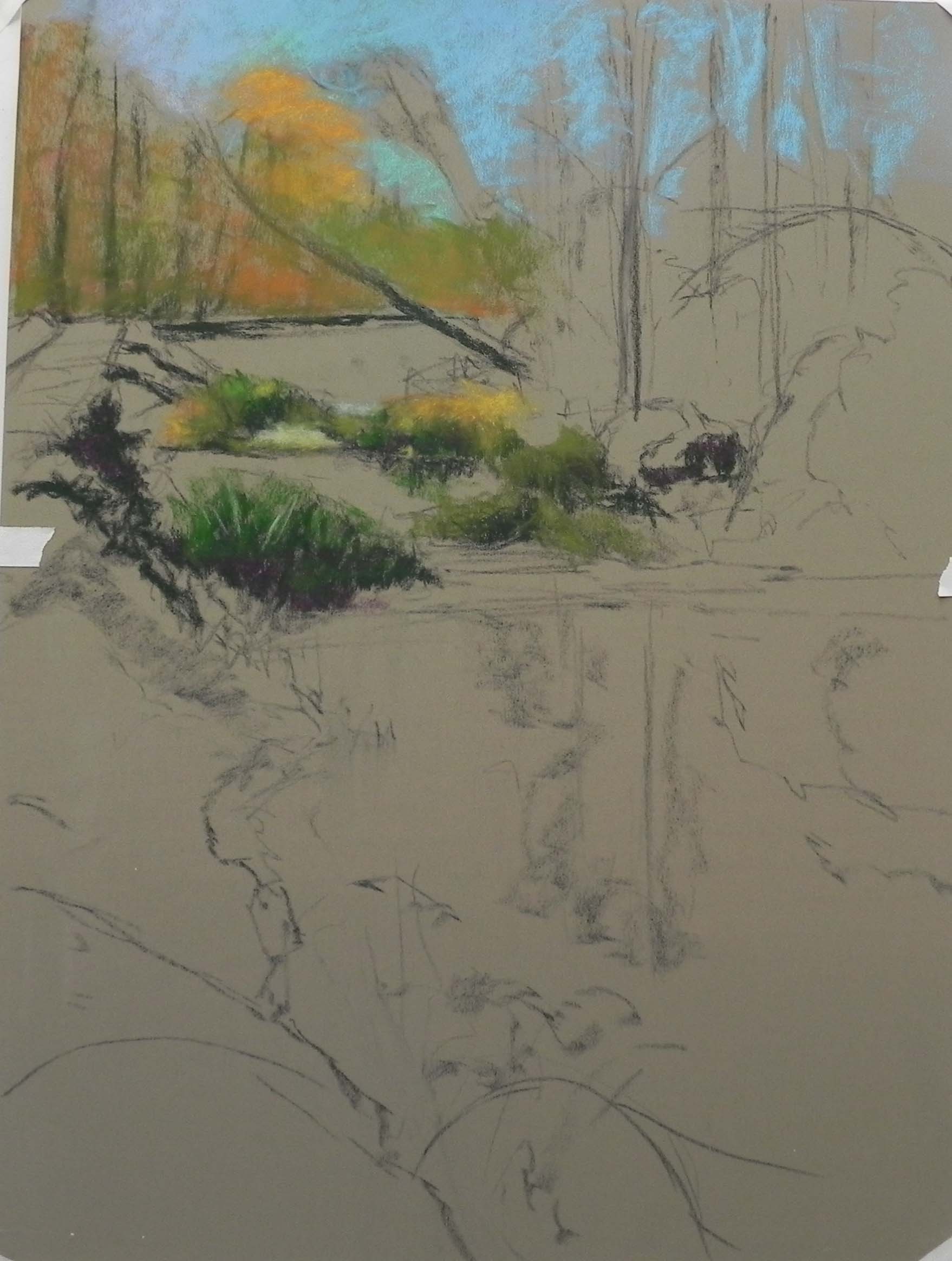
Stage 1
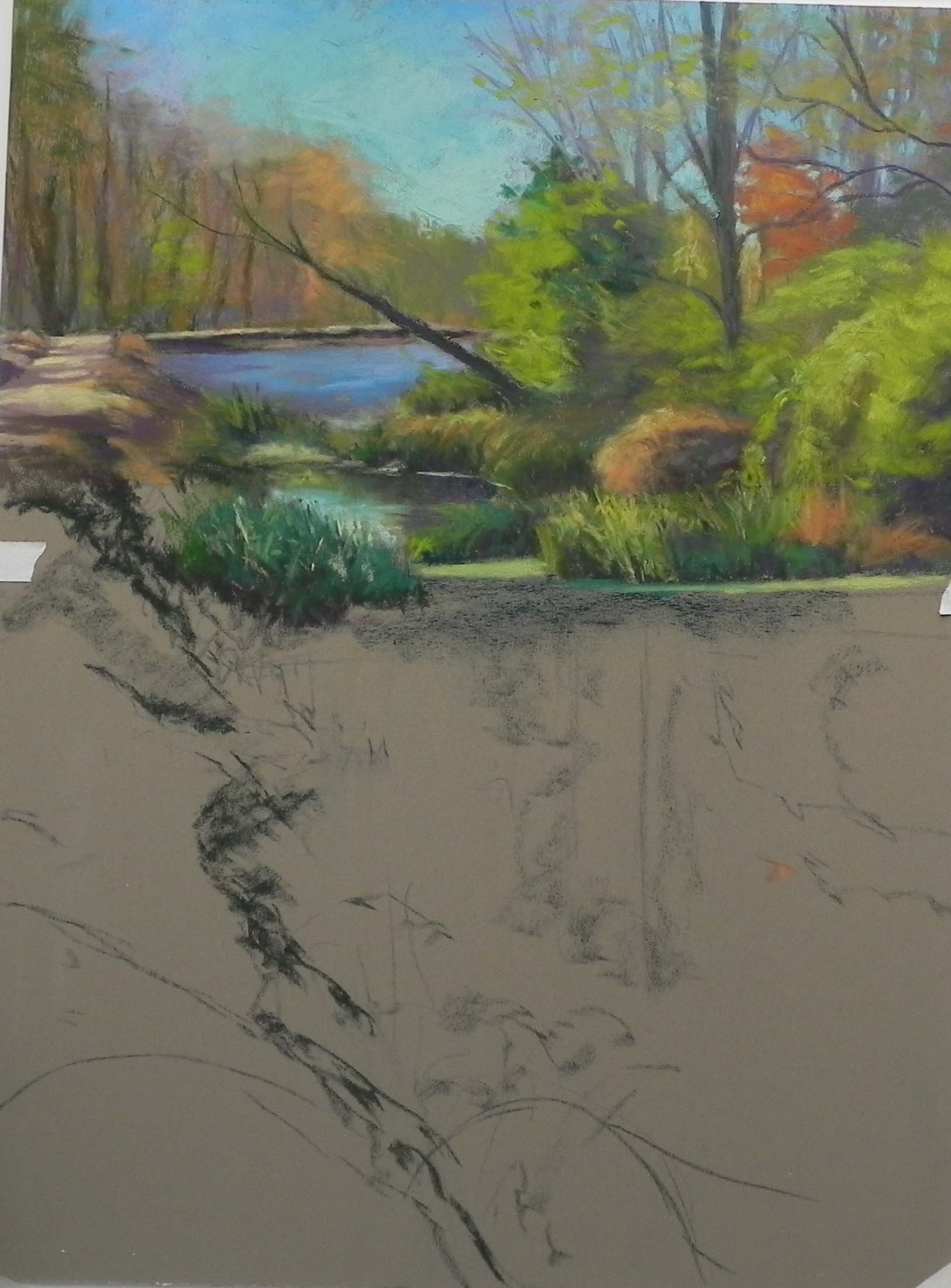
Stage 2, top part mostly done
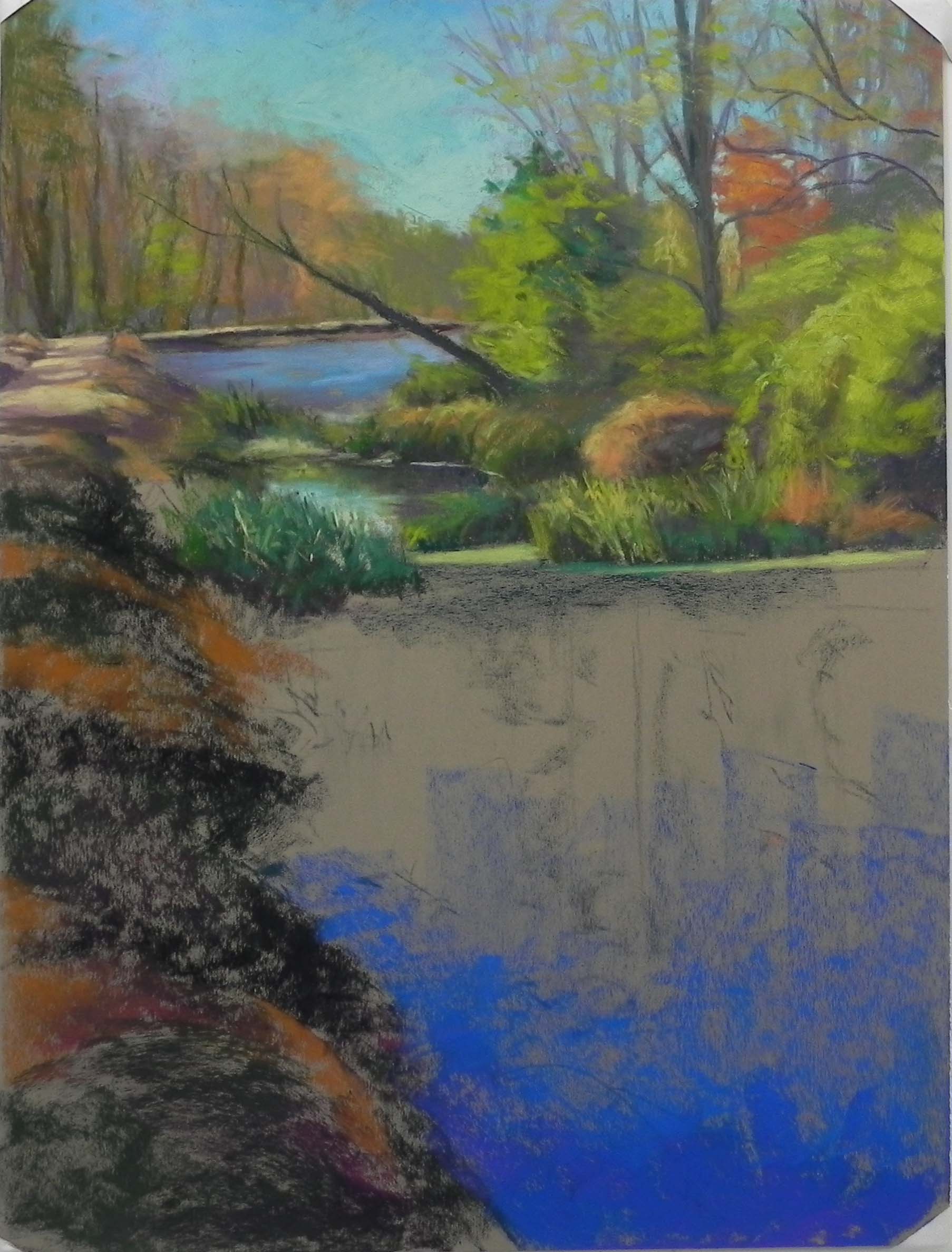
Stage 3, roughing in the side and water
Just finished my third canal painting. This one was not a demo. I really liked the possibilities of the photo and decided that it warrented a larger format: 24″ x 18″. I found a mounted board of the Pastel Premiere Italian Clay and decided to work on that. So I didn’t do an underpainting, which posed its difficulties for me. But it was kind of fun to just do a drawing, then begin at the top and work my way down. I started with hard pastels and used them in the painting a lot more than I normally do. I used a dark NuPastel “bottle green” to do much of the initial laying-in of the darks. I tried to keep to the hard pastels, but fairly quickly switched to the Giraults. But I left the hard pastels in my corn meal box and continued to use them.
I had a challenge with the orangey hay bale-looking bush in the middle. I started it out to big and prominent and after reworking it several times, decided to add more of the green bush on the right over it. There are three areas of water here with narrow paths between the grasses that link them. I added a little more light in the middle pool to make it clear that it was water.
Once I was happy enough with the top, I used hard pastels to rough in the bank on the left and then some of the water. For the water, I started first with some of the reflections at the top, then decided I really needed to just get the blues in there. I loved the progression from the deep blue violet at the bottom to the warm aqua above. I used a number of soft pastels to accomplish this. Then went back to the reflections. There were little ripples in the water so I used a number of small horizontal lines to try to indicate this.
The last step was the bank and leaves and stems going over the water. I used greens, browns, and violets in the shadowed areas to try to give them more interest and dimension.
I loved painting this! It’s one of those happy paintings that you just love to do. The line of the bank leading up to the light on the water was such a great composition. I wanted to take my time with it and enjoy doing it, which I did. But I know that I really prefer to start with an underpainting. I thought of doing a partial underpainting, but I it can be more difficult to work with, when some areas are covered and others are the color of the paper. This approach worked well.
I LOVE this one, Jean. You did a spectacular job on it. I will read your description carefully. Cheers! Susan
I LOVE this one, Jean! I will read your description carefully. All the best, Susan
Thanks so much Susan. I really appreciate it! I really loved doing it as well.