
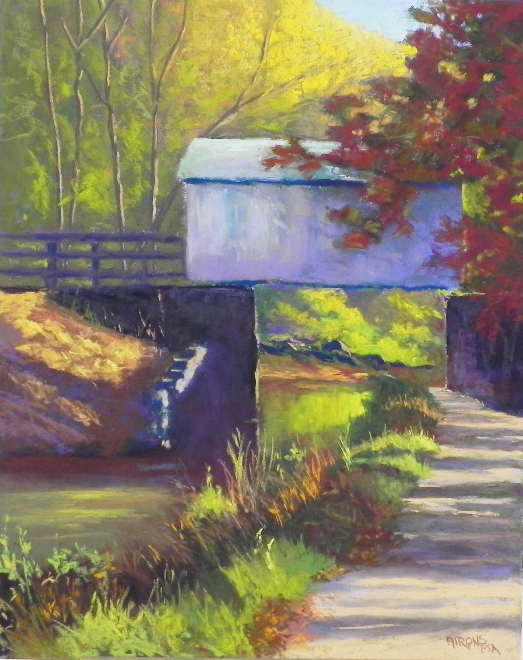
Light and Shadow, Great Falls, 20″ x 16″, UART 320
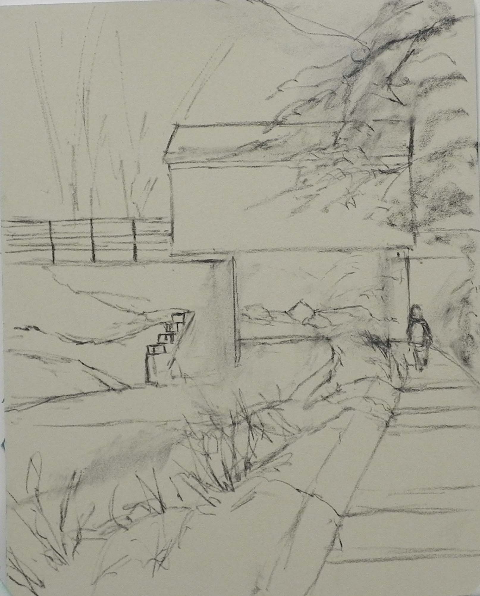
Drawing on pastel surface
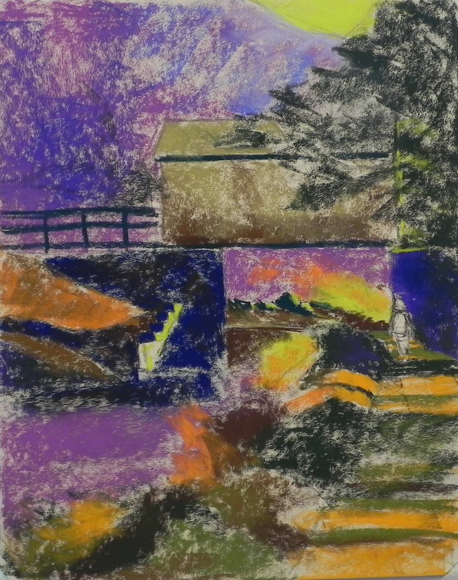
Underpainting, stage 1
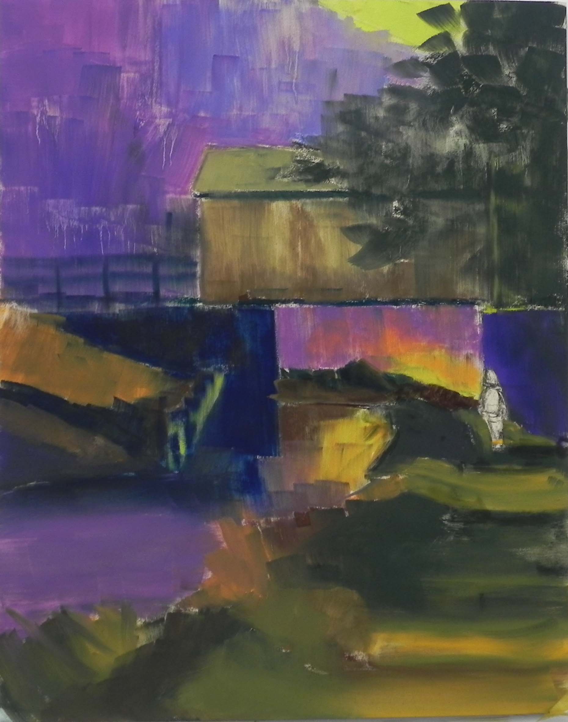
Underpainting, stage 2
Today I did my second demo of the week for my Wednesday class. It wasn’t easy! But my class gave my many helpful suggestions and I was pretty happy by the time I finished it off to go home. This picture has less light and sky than the first one and there is the odd covered bridge-like structure — which isn’t a bridge at all because it doesn’t go anywhere! It seems to be a storage shed. But anyone who had walked the towpath from Great Falls to Wide Water has seen it. What I really liked was the overall flow of the composition and the lovely warm color reflecting in the water under the “bridge”.
Looking at the initial drawing, you’ll see that I had a figure in there. I left her in for a time, but decided to take her out. We weren’t sure if the proportions looked right and there was enough else going on.
The biggest challenge was what to do with the “bridge”, which in the photo was almost completely uncovered by trees. There was a a tree to the right but not as large as what I created. My initial thought was to try to add more cast shadows. The light is coming from the right (west). But when I enlarged the tree to cover up more of the bridge, it looked much larger, and thus, much closer, and so–no cast shadows. But I liked it nonetheless. That was the one major compositional change that I made.
Underpainting colors–the biggest question I get. I knew I was going to be using yellows in the trees at top and that I’d be putting violets and blues on the “bridge”, so I went with violets under the background trees. I brought this color down into the background as well and used it for the color of the water in the foreground. For the bridge, I used a warm “almond” color with browns, using a warm-under-cool approach. But for everything else, I used warm under warm and cool under cool. My reasoning is that the bridge is a large, flat structure, over which it is easy to apply the colors. But everything else is much more complicated! Thus, by using warms under warms and cools under cools, I can see where the warm areas of the composition will be after the alcohol is applied. In all, I used various violets, browns, greens and some orange.
There were a number of struggles in the painting. Going too bright immediately in the background was a problem. The “stepped” wall in the mid section was also a challenge as the light areas seem to jump out too much. I finally used a darker neutral to make it work. The walls under the bridge were begun with “eggplant”, over which I applied majenta, warm brown, green, and finally dark grayed blue. The final grayed color was a little lighter and set it back where it belonged! (Thank you Katherine!) I used reds and reddish browns in the large tree at right, then added several greens into it.
The final work was down on the towpath and the grasses in the lower left. For the towpath, I started with two colors of light and dark to just place the shadows. Then I used various violets and browns over them to break them up and soften. I added some clumps of leaves along the edge and various lights and darks. For the grasses, I used a mix of pastels, including going back to the hard pastels, which was kind of fun!
I’ve wanted to paint this scene for some time and I’ve finally done it. Not sure I will again, but I think this is the best time for it, given the lovely color around it. And–it’s one of the places on the canal that still has water!
Beautiful final product!